Using a Time-Series
In addressing Time-Series specific use cases, it is imperative to adopt a distinct approach for accurate analysis and effective training of Time Series (TS) models. This section will explore three specialized Time-Series tools designed to facilitate a comprehensive understanding and proficiency when dealing with Time-series datasets or use cases in a broader context. By leveraging these tools, users can gain valuable insights and enhance their expertise in navigating the intricacies of Time-Series analysis and modeling.
Time-Series Analysis
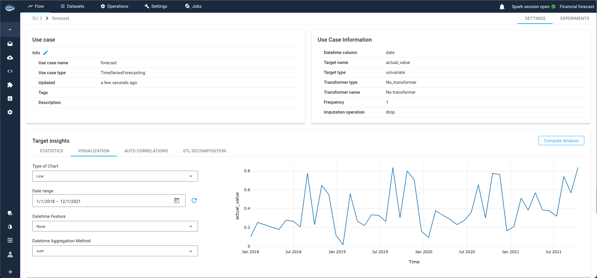
The TS Analysis module provides a wealth of insights and graphical representations to aid in drawing meaningful conclusions from your data, setting the stage for the subsequent construction of a Machine Learning (ML) pipeline.
To initiate the process, click on the dataset earmarked for your TS analysis and select the ML icon in the left sidebar. This action will seamlessly transition you to the ML Lab, where you can meticulously construct your ML pipeline, experimenting with various models to pinpoint the one best suited for your specific use case.
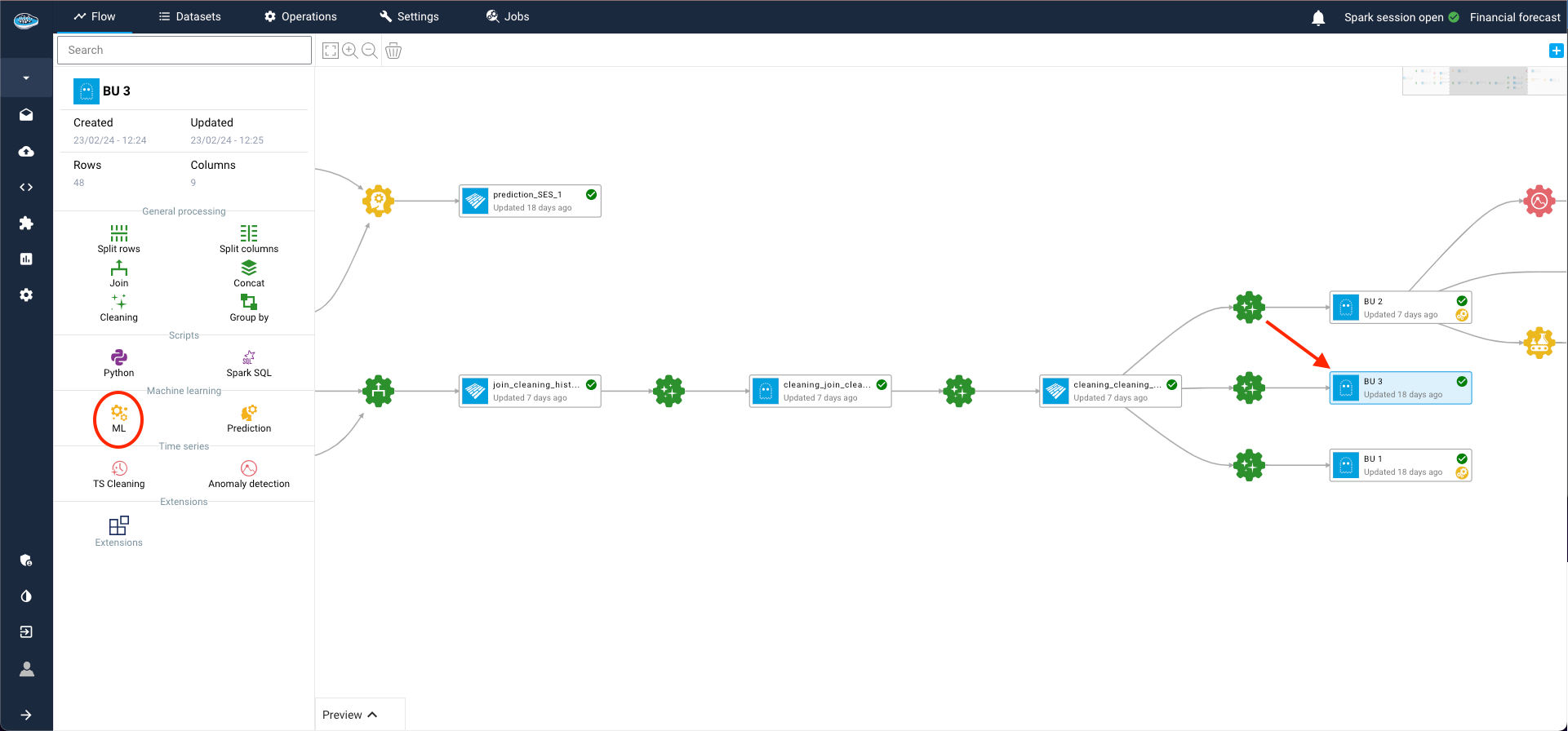
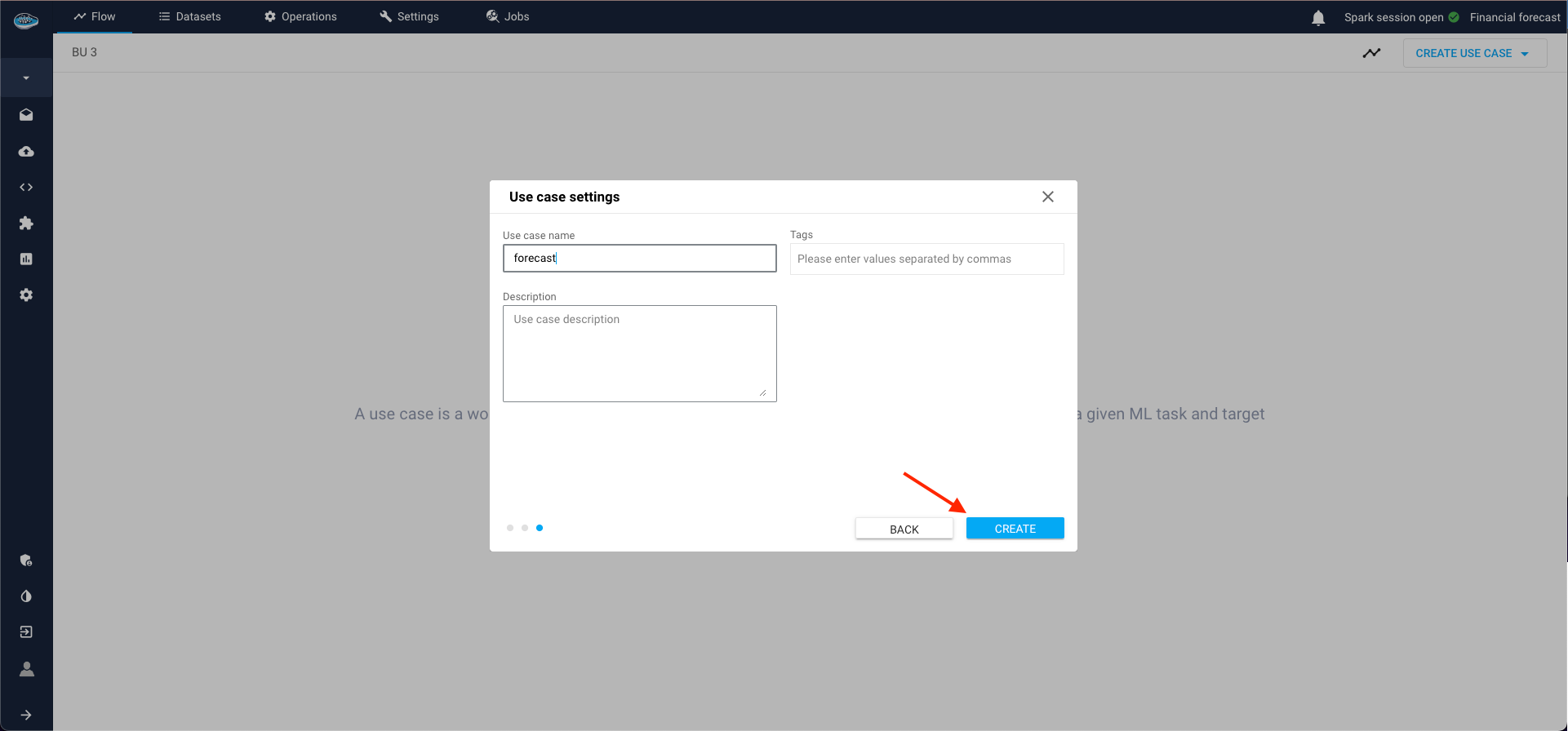
Within the ML Lab, creating your use case is a straightforward process. Simply click the Create use case button and opt for the Blank use case selection in the ensuing pop-up.
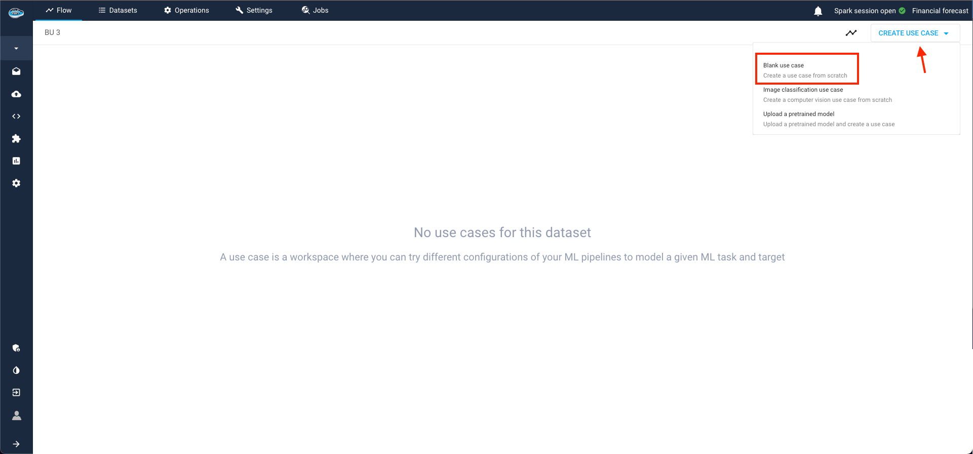
The process unfolds across three steps:
- Specify the ML Task (in our case, TS Forecasting) and click Next;
-
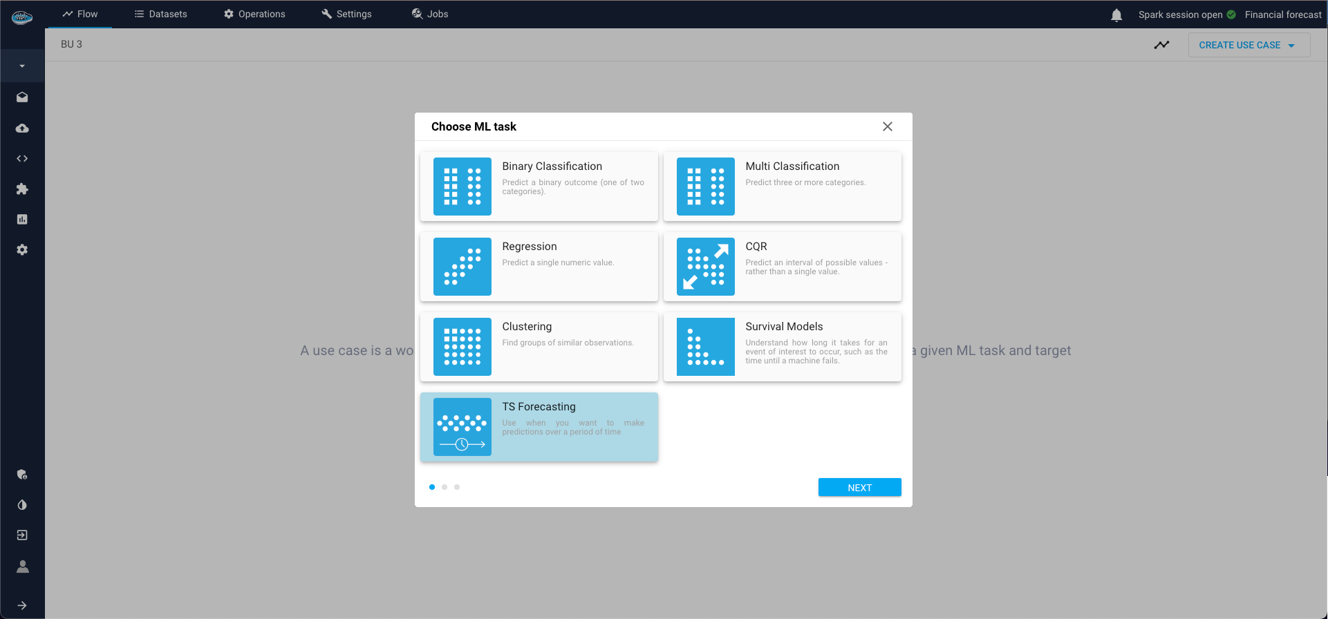
Define:
- Date-time column (column that contains timestamps that index the series),
- Target column (measurement columns that needs to be forecasted, must be numerical),
- Target transformer (it is possible to keep "No transformer", but very important for some types of models like deep learning to normalise the data),
-
Type of series:
- Single series is one continuous sequence of data points over time,
- Panel series involves multiple sequences grouped by one or more categorical variables. So if panel series is selected, Group by field must be filled with grouping columns.
- Finally, select a name for your use case and as options you can put some description and tags also.
Time Series Forecasting Use Cases
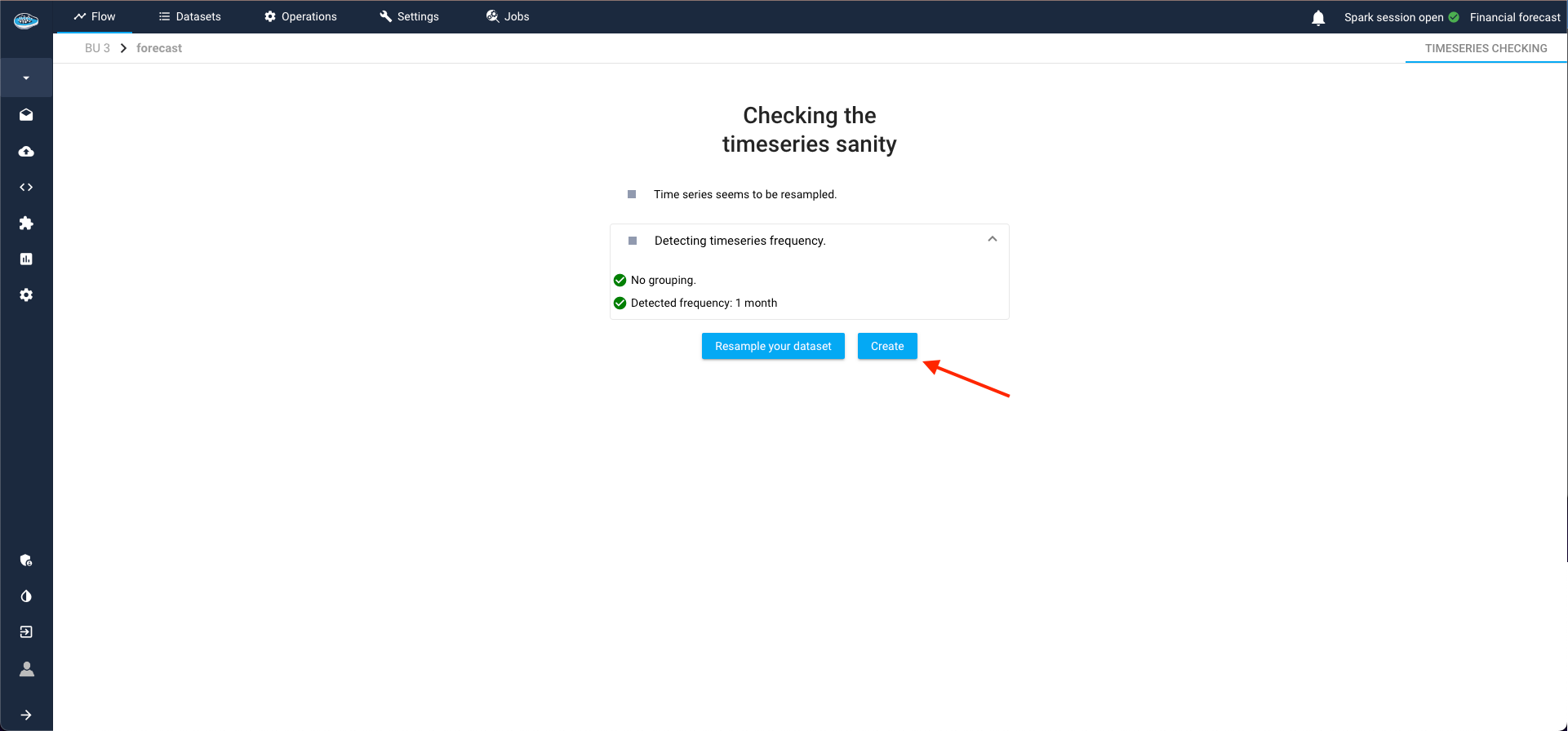
Time series (TS) forecasting use cases are not directly created; they must first meet certain validation criteria. During this phase, these use cases are considered to be in an "intermediate state." This process, known as the TS Sanity Check, is where papAI autonomously detects the time-series frequency and verifies correct resampling.
TS Sanity Check
- Frequency Detection: papAI automatically detects the frequency of the time series data.
- Resampling Verification: papAI ensures that the time series has been resampled correctly.
If the TS Sanity Check passes (as in our case), papAI allows us to complete the creation of the use case. Alternatively, we can opt to resample our series with a different frequency than the one detected by the module.
Handling Check Failures
The TS Sanity Check can fail under two primary conditions:
-
Incorrect Resampling:
- If the series is not correctly resampled, papAI will provide a list of recommended frequencies, ordered by suitability.
-
Duplicated Timestamps:
- If the series contains duplicated timestamps, papAI will suggest that the series might be a panel series.
By addressing these issues, we ensure that the time series data is accurately prepared for forecasting, enhancing the reliability of the predictions made by papAI.
Warning
If the sanity check is failed due to an inconsistency of the detected frequency, you can resample your dataset by clicking the button Reample your dataset to access to the TS cleaning interface and apply your new resampling according to your likings.
Now, onto the TS Analysis section, where results are automatically computed and displayed, providing a comprehensive overview of the use case and time-series.
TS Visualization
The first analytical tool at your disposal is the data visualization of the time-series, offering customization options for a tailored exploration.
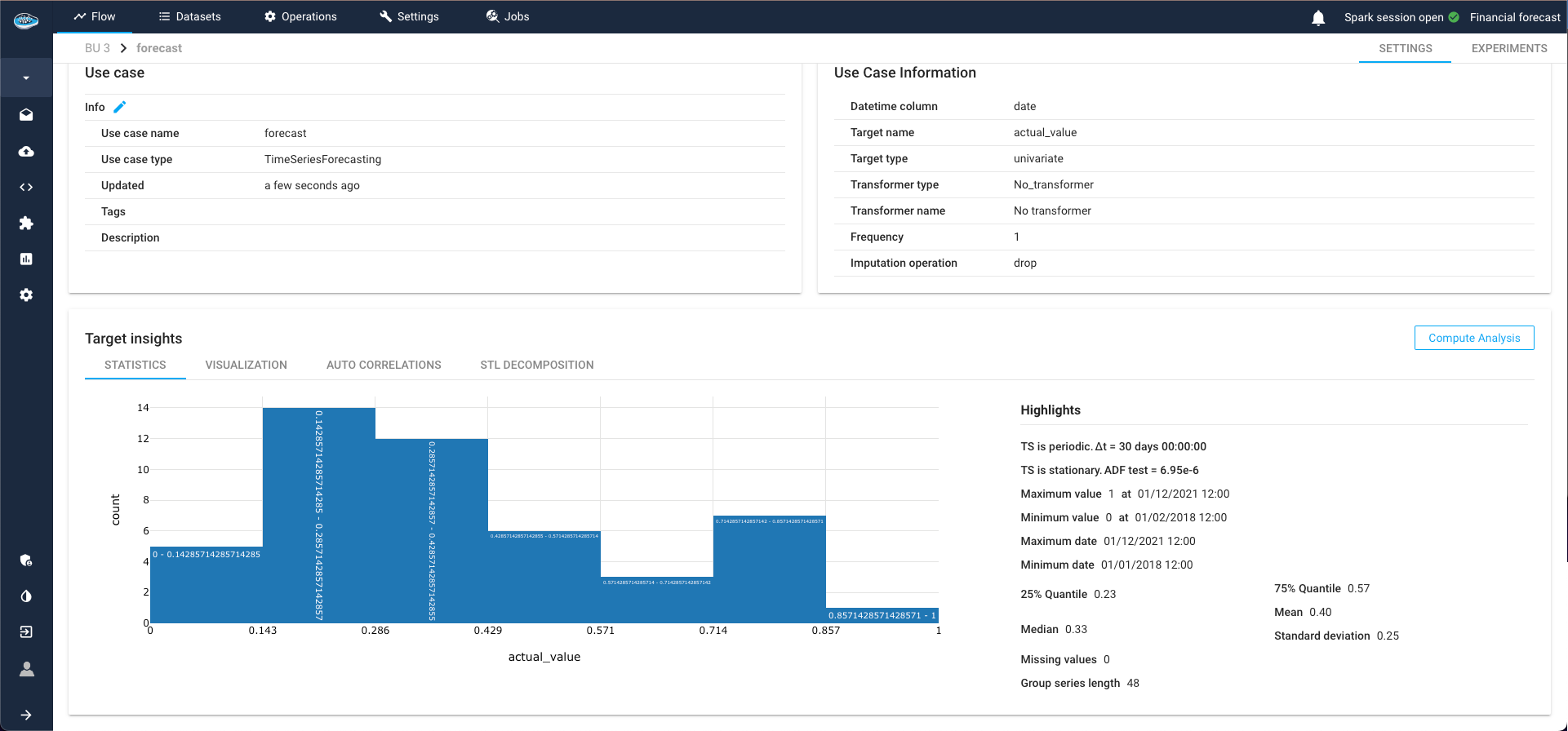
TS Statistics
Delve into statistics related to the target and time-series, including minimum and maximum values of the target class, as well as specific TS indicators such as periodicity and stationarity.
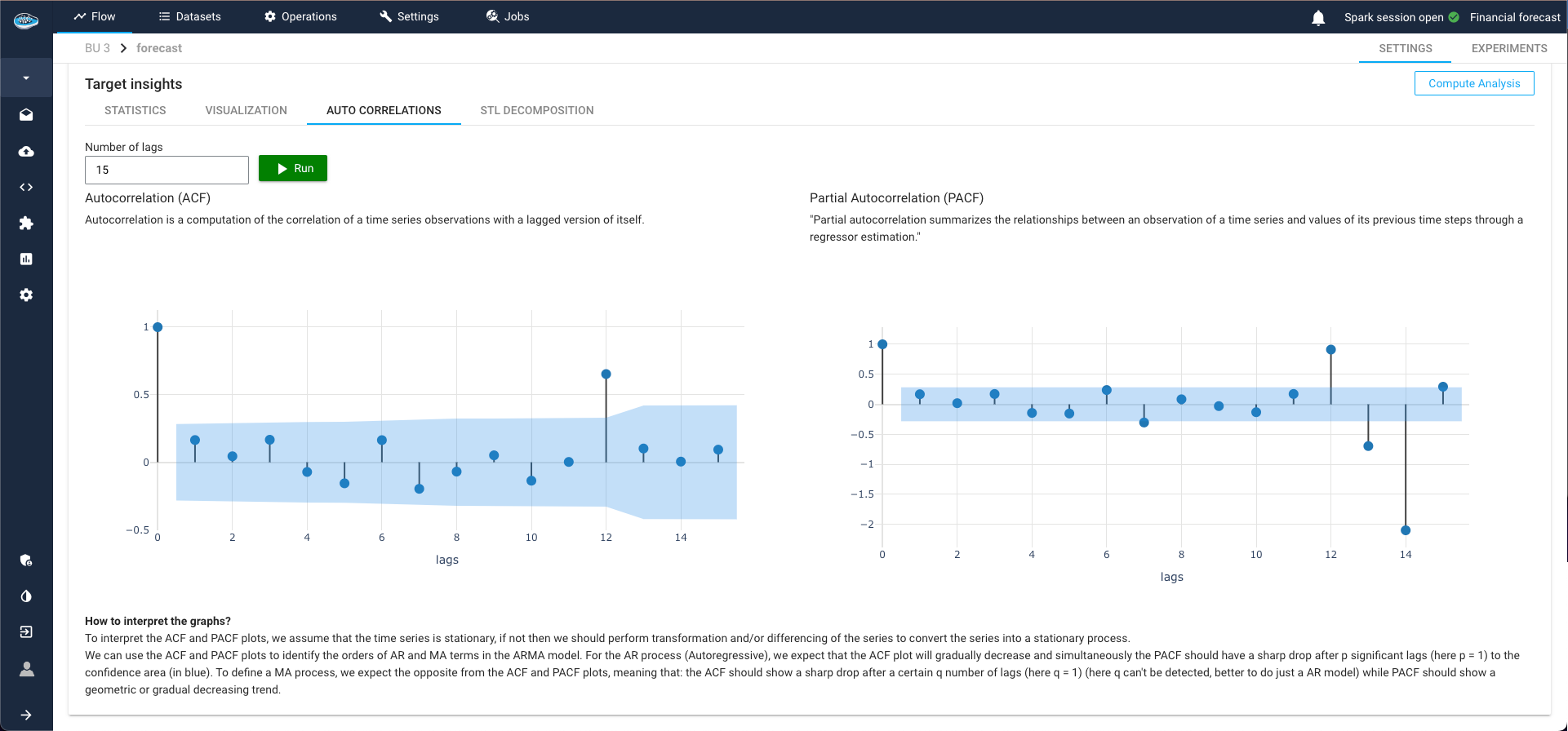
ACF and PACF Plots
ACF (Autocorrelation Function) and PACF (Partial Autocorrelation Function) plots are essential tools for time series analysis. They help measure the correlation between a time series and its lags, providing key insights into:
-
Stationarity:
-
ACF Plot: Shows if the series is stationary. Rapidly decreasing autocorrelation values indicate stationarity.
-
PACF Plot: Identifies the exact lag at which the series becomes stationary.
-
Auto Regression (AR) Parameters:
-
PACF Plot: Indicates the order of the autoregressive component in an ARIMA model.
-
Moving Average (MA) Parameters:
-
ACF Plot: Indicates the order of the moving average component in an ARIMA model.
Use ACF and PACF plots to identify AR and MA terms, detect trends and seasonality, and enhance forecast accuracy by ensuring proper modeling of time series data.
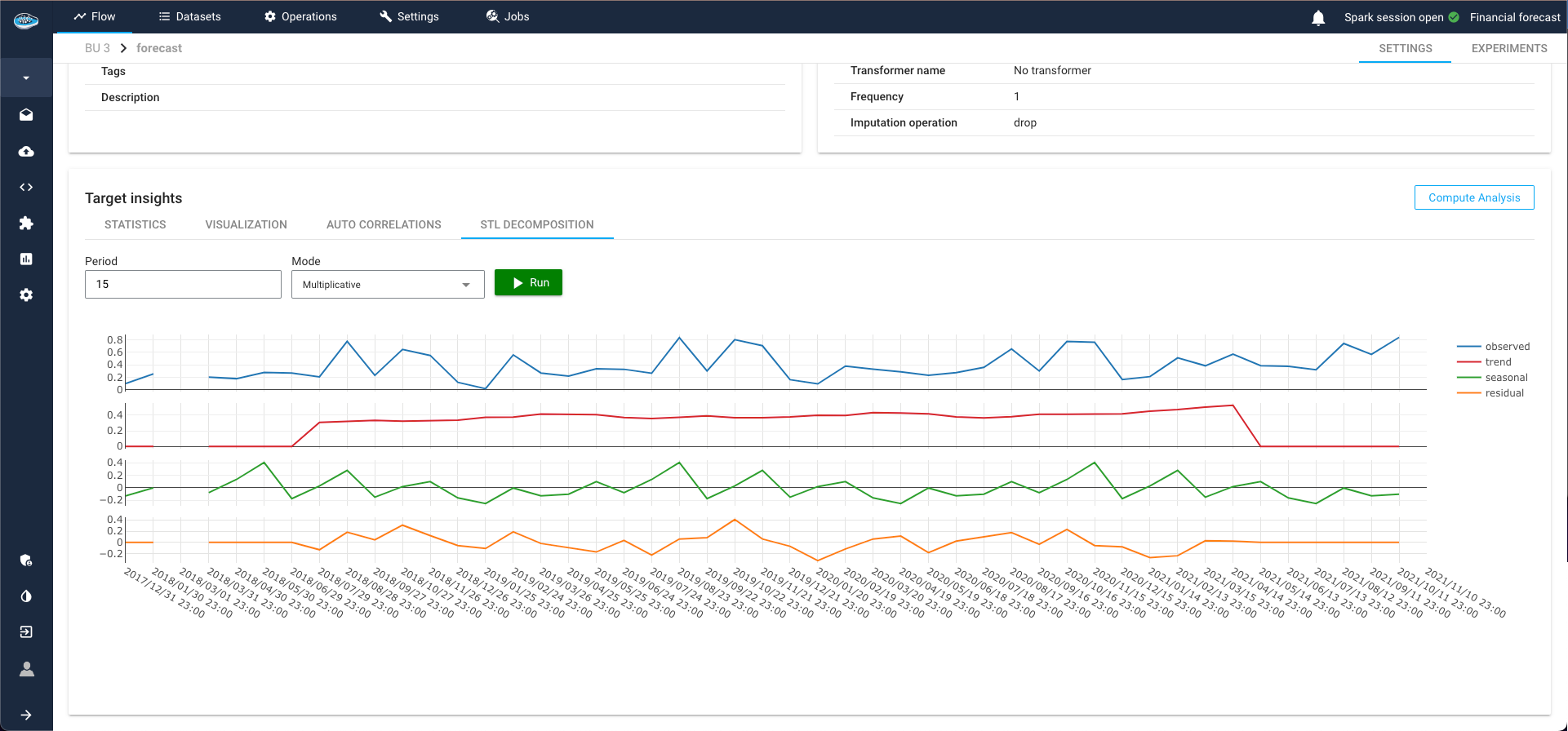
STL Decomposition
STL (Seasonal-Trend decomposition using LOESS) decomposition is a powerful tool for time series analysis. It separates the time series into three distinct components:
- Seasonal: Repeated patterns or cycles that occur at regular intervals.
- Trend: Long-term progression or movement in the data.
- Residual: Remaining noise after removing the seasonal and trend components.
This method helps in understanding the underlying patterns in the data, guiding the selection of appropriate models and parameters. By isolating these components, STL decomposition provides clearer insights into the behavior of the time series, enhancing the accuracy and reliability of forecasting models.
Here is a vido showcasing the TS Analysis module
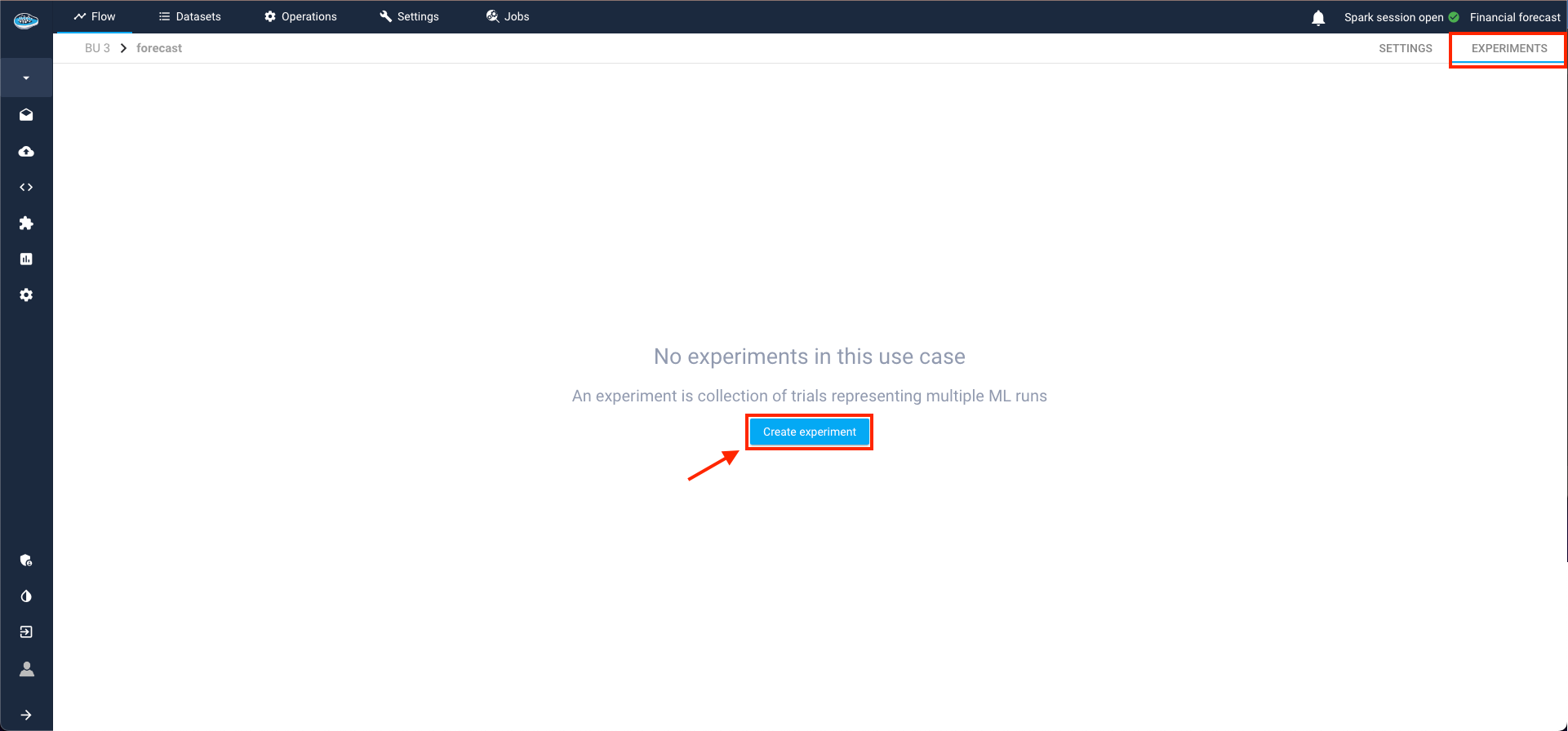
Time-Series Forecasting
After meticulously creating your use case and thoroughly analyzing your time-series, the next step involves crafting your Machine Learning pipeline. This journey commences within the Experiments tab in the top right corner and initiate the process by selecting the Create Experiment button.
Building Your Time Series Pipeline
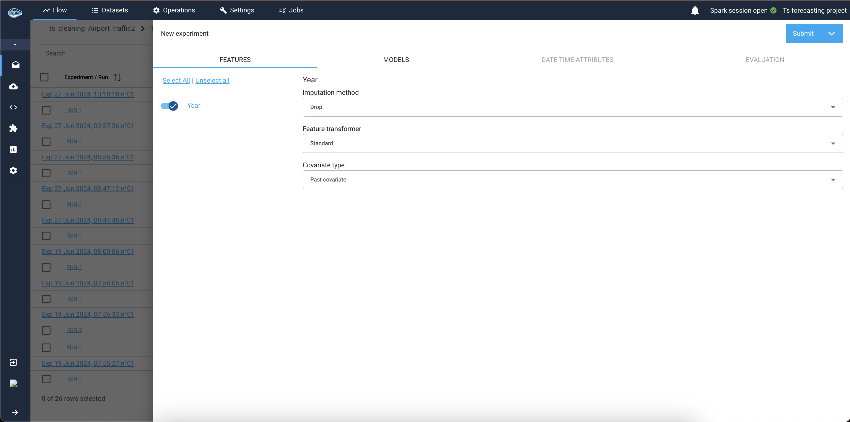
A pop-up window guides you through the following steps to construct your pipeline and experiment with various models:
-
Features Tab:
This tab appears if your input dataset contains columns other than the datetime column, the target column, and the group by columns (if panel forecasting). These additional columns are known as covariates in time series forecasting.1.1. Covariate Types: Select the type for each covariate—past, future, or static.
1.2 Transformation and Imputation: Choose the appropriate transformer and imputation method for the covariates.
1.3 Model Compatibility: Note that not all models support every type of covariate. Check the Models Tab to see which covariate types are supported by each model.
Evaluation step for TS pipeline -
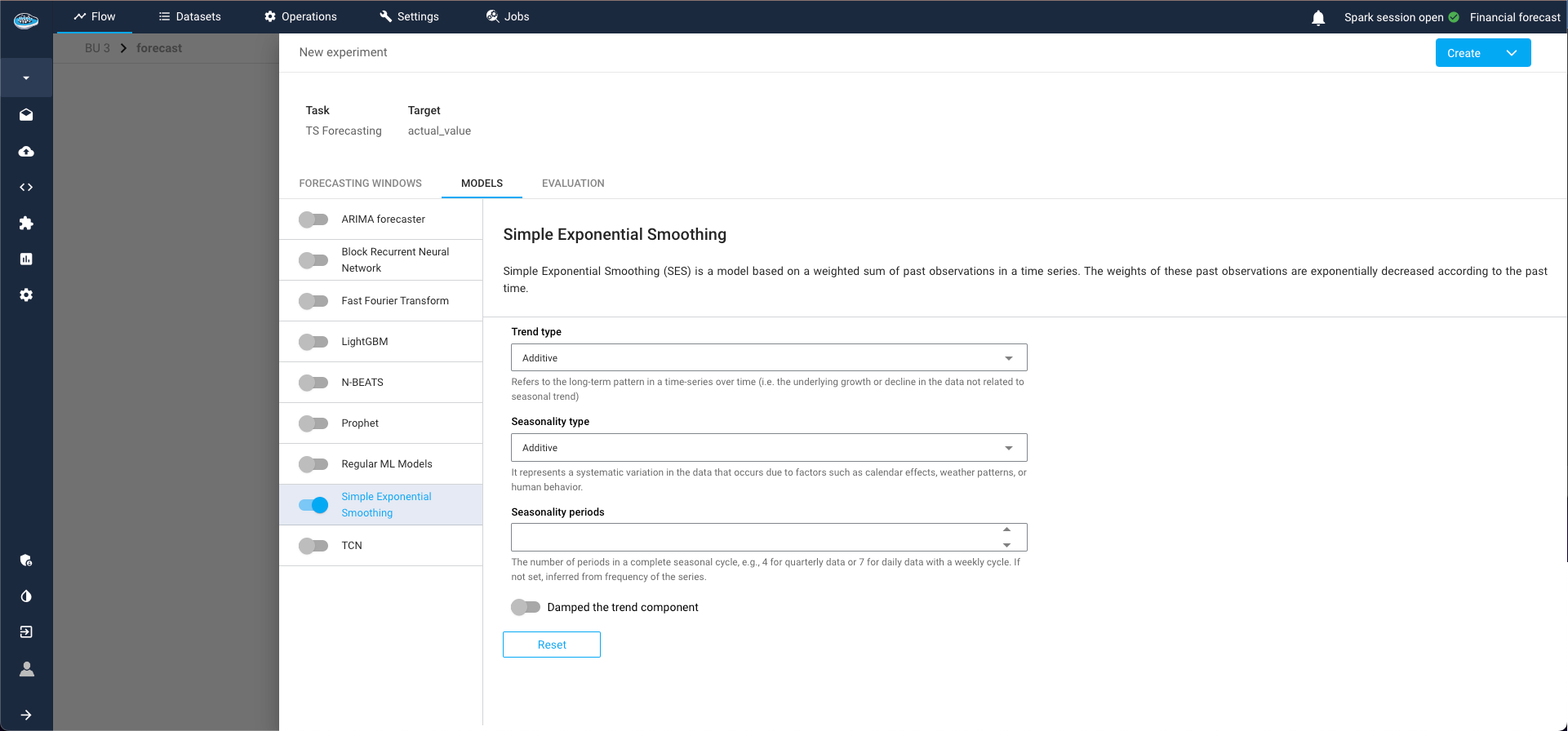
Models Tab:
Select the type of model for your experiment and the parameters to train with. For example, you might choose the Simple Exponential Smoothing model. Multiple models can be selected and trained simultaneously.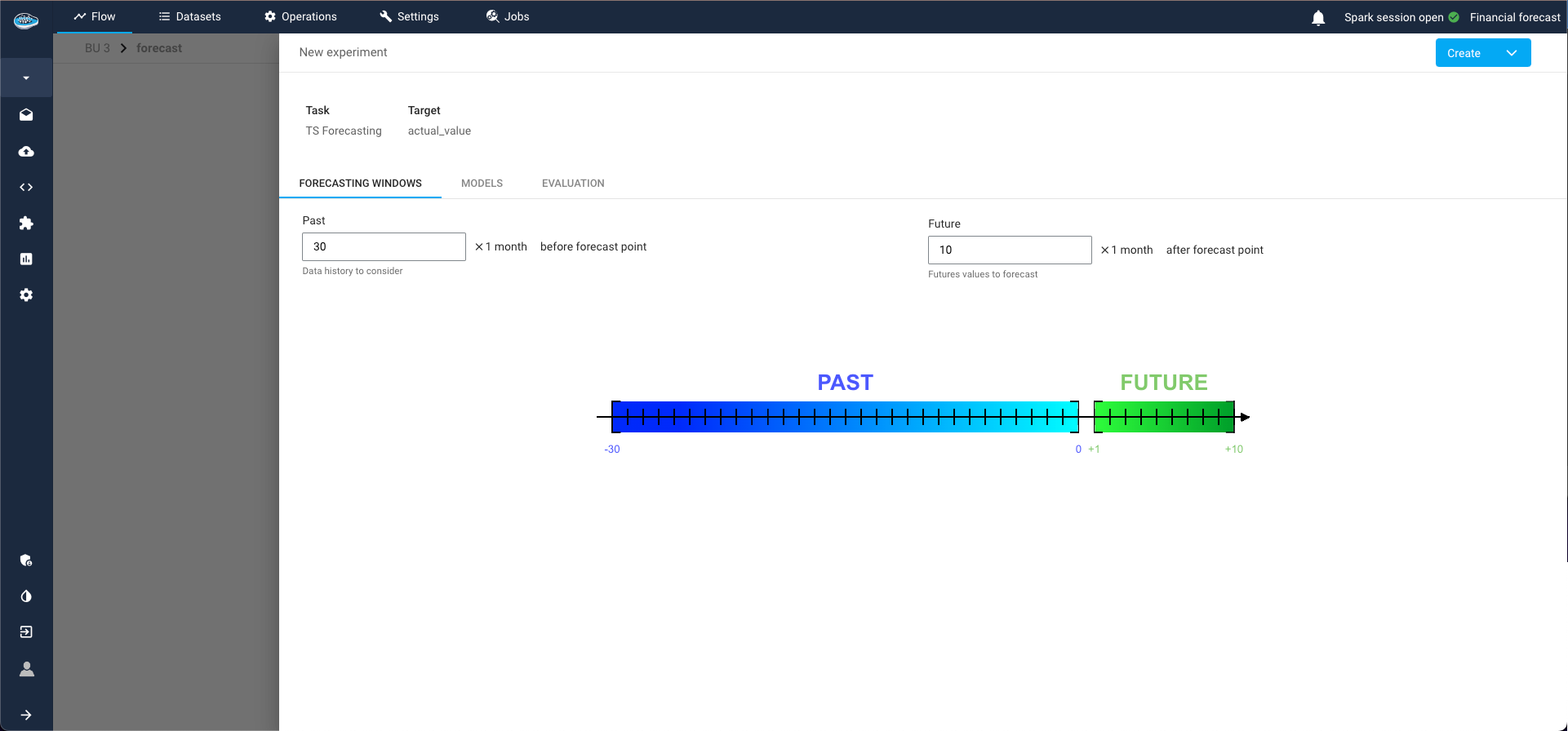
Model selection step for TS pipeline The different TS available models in papAI are :
The ARIMA (AutoRegressive Integrated Moving Average) model is a widely-used statistical method for time series forecasting. papAI provides an implementation of the ARIMA model, allowing users to leverage its capabilities with ease and flexibility.
The ARIMA model combines three key components:
- AutoRegression (AR): This component models the relationship between an observation and a specified number of lagged observations (previous time points).
- Integration (I): This component makes the time series stationary by differencing the observations (i.e., subtracting the current observation from the previous one).
- Moving Average (MA): This component models the relationship between an observation and a residual error from a moving average model applied to lagged observations.
The ARIMA model is denoted as ARIMA(p, d, q), where:
- p is the number of lag observations in the model (the order of the AR term).
- d is the number of times that the raw observations are differenced (the degree of differencing).
- q is the size of the moving average window (the order of the MA term).
In addition to these primary components, our ARIMA model also supports seasonal differencing through the Seasonal Orders parameters. This allows the model to handle seasonal time series data by specifying seasonal ARIMA (SARIMA) terms.
The Seasonal Orders parameters are denoted as (P, D, Q, s), where:
- P is the number of seasonal autoregressive terms.
- D is the number of seasonal differences.
- Q is the number of seasonal moving average terms.
- s is the periodicity (e.g., 12 for monthly data with a yearly seasonal pattern).
The Exponential Smoothing model is a powerful and versatile method for time series forecasting, particularly effective for data with trends and seasonal patterns. papAI provides an implementation of the Holt-Winters variant of this model, enabling users to leverage its capabilities with ease and flexibility.
The Holt-Winters Exponential Smoothing model extends the Simple Exponential Smoothing (SES) model to account for both trends and seasonality in the time series data. It combines three components:
- Level: The average value in the series.
- Trend: The increasing or decreasing value in the series.
- Seasonality: The repeating short-term cycle in the series.
The model comes in two variants:
- Additive: Suitable when the seasonal variations are roughly constant over time.
- Multiplicative: Suitable when the seasonal variations change proportionally with the level of the series.
The model is defined by four main parameters:
- Trend type: type of trend component. Either additive, multiplicative, or None. Defaults to additive.
- Damped: if should the trend component be damped. Defaults to False.
- Seasonality type: type of seasonal component. Either additive, multiplicative, or None. Defaults to additive.
- Seasonal periods: The number of periods in a complete seasonal cycle, e.g., 4 for quarterly data or 7 for daily data with a weekly cycle. If not set, inferred from frequency of the series.
This model performs forecasting on a TimeSeries instance using FFT, subsequent frequency filtering (controlled by the Number of frequencies parameter) and inverse FFT, combined with the option to detrend the data (controlled by the trend argument) and to crop the training sequence to full seasonal periods.
The Fast Fourier Transform is a mathematical algorithm that converts a time series from the time domain into the frequency domain. This transformation allows the model to identify and utilize the periodic components of the time series for forecasting future values. By focusing on significant frequency components, the FFT model can reconstruct the time series and predict future points based on its periodic behavior.
Key aspects of FFT in the context of forecasting include:
- Frequency Decomposition: Identifies significant periodic components in the time series.
- Signal Reconstruction: Reconstructs the time series using the identified frequency components for accurate forecasting.
- Periodicity Utilization: Leverages the periodic patterns in the data to forecast future values.
The model is defined by three main parameters:
- Trend: if set, indicates what kind of detrending will be applied before performing DFT. Possible values: 'polynomial', 'exponential' or None, for polynomial trend, exponential trend or no trend, respectively.
- Number of frequencies: the total number of frequencies that will be used for forecasting.
- Polynomial degree for trend: the degree of the polynomial that will be used for detrending, if trend='polynomial'.
The Prophet model is a powerful tool for time series forecasting, designed to handle various forecasting challenges with a focus on simplicity and interpretability. papAI includes an implementation of the Prophet model, allowing users to leverage this robust algorithm for their forecasting needs.
Prophet is an additive model developed by Facebook that is specifically designed for forecasting time series data with daily observations that display strong seasonal effects and several seasons of historical data. It is particularly adept at handling missing data and outliers, and it can easily incorporate holiday effects.
Key aspects of Prophet in the context of forecasting include:
- Additive Model: Decomposes time series into trend, seasonality, and holiday components, making it easy to understand and interpret.
- Robustness to Missing Data and Outliers: Can handle irregularities and missing observations without significant loss of accuracy.
- Custom Seasonality and Holidays: Allows for the inclusion of custom seasonal patterns and holidays to improve forecast accuracy.
Here is a list of some key parameters used by the Prophet model:
- Growth: Specifies the trend growth type, which can be 'linear' or 'logistic'. For logistic growth, a cap parameter must be specified to define the carrying capacity.
- Seasonality Modes: Determines how seasonal components are handled. Options include 'additive' (default) and 'multiplicative'.
- Changepoints: Allows for specifying dates where the trend can change. If not set, Prophet automatically detects potential changepoints.
- Changepoint Prior Scale: Controls the flexibility of the trend by adjusting the strength of the changepoint regularization. Higher values allow for more flexibility in the trend.
- Seasonality Prior Scale: Controls the strength of the seasonality regularization. Higher values allow for more flexibility in seasonal patterns.
- Holidays: A data frame containing holidays or events that can affect the time series. Prophet allows modeling of these effects explicitly.
- Daily/Weekly/Yearly Seasonality: Enables or disables specific seasonal components. Prophet can automatically detect and model these seasonalities, but they can also be manually configured.
- Fourier Order: Determines the number of Fourier terms to generate for seasonalities, controlling the complexity of the seasonal component.
- Interval Width: Defines the uncertainty interval for the forecasts, typically set between 0 and 1 (e.g., 0.8 for an 80% interval).
The LightGBM (Light Gradient Boosting Machine) model is a high-performance and efficient method for time series forecasting. papAI includes an implementation of the LightGBM model, allowing users to utilize this powerful machine learning algorithm for their forecasting tasks.
LightGBM is a gradient boosting framework that uses tree-based learning algorithms. It is designed to be efficient and capable of handling large datasets with high dimensionality. In the context of time series forecasting, LightGBM leverages its strengths in handling complex relationships and interactions within the data to provide accurate predictions.
Key aspects of LightGBM in the context of forecasting include:- Gradient Boosting: uses an ensemble of weak learners (decision trees) to create a strong predictive model.
- Efficiency: optimized for speed and performance, suitable for large datasets.
- Handling Complexity: Capable of capturing intricate patterns and interactions in the data.
Here is a list of some parameters needed by the model:
- Target lags: specifies the number of past observations to use as features for forecasting. This parameter determines how many previous time steps are considered for making predictions.
- Past covariates lags: if one value is filled it defines the number of past values of past covariates selected features, and if more than one value it corresponds to the list of lags to take. This helps in incorporating additional time series data that might influence the target series.
- Future covariates lags: if one value is filled it defines the number of future values of future covariates selected features, and if more than one value it corresponds to the list of lags to take. This is useful when future information about external factors is available and can improve forecast accuracy.
- Look after length: determines the number of future time steps that the model will predict in a single step. This parameter controls the forecast horizon.
- Learning rate: controls the step size at each iteration while moving towards a minimum of the loss function. Smaller values lead to slower training but can result in better performance.
- Number of estimators: number of boosted trees to fit. It can also be seen as the number of boosting iterations
- Likelihood: can be set to quantile or poisson. If set, the model will be probabilistic, allowing sampling at prediction time.
The Linear Regression model is a straightforward and widely-used method for time series forecasting, offering simplicity and interpretability. papAI includes an implementation of the Linear Regression model, enabling users to apply this basic yet effective statistical technique for their forecasting tasks.
Linear Regression is a fundamental predictive modeling technique that establishes a linear relationship between the dependent variable (target) and one or more independent variables (features). In the context of time series forecasting, it can model the relationship between past observations and future values to provide forecasts.
Key aspects of Linear Regression in the context of forecasting include:
- Simplicity: Easy to understand and implement, making it an ideal starting point for time series forecasting.
- Interpretability: Provides clear insights into the relationships between variables through coefficients.
- Efficiency: Computationally efficient and suitable for smaller datasets or as a baseline model.
Here is a list of some key parameters used by the Linear Regression model:
- Target Lags: Specifies the number of past observations to use as features for forecasting. This parameter determines how many previous time steps are considered for making predictions.
- Past Covariates Lags: Defines the number of past values of additional covariates (independent variables) to include as features. This helps in incorporating relevant external data that might influence the target series.
- Future Covariates Lags: Specifies the number of future values of covariates to include as features, useful when future information about external factors is available.
- Regularization: Techniques like Lasso (L1) or Ridge (L2) can be applied to prevent overfitting and enhance model generalization.
- L1 Regularization (Lasso): Adds a penalty equal to the absolute value of the magnitude of coefficients to the loss function.
- L2 Regularization (Ridge): Adds a penalty equal to the square of the magnitude of coefficients to the loss function.
- Fit Intercept: Determines whether to calculate the intercept for the model. If set to False, no intercept will be used in the calculations.
- Normalize: If set to True, the regressors (features) will be normalized before fitting the model.
- Look Ahead Length: Determines the number of future time steps that the model will predict in a single step. This parameter controls the forecast horizon.
The Random Forest model is a versatile and robust method for time series forecasting, known for its ability to handle complex data structures and interactions. papAI includes an implementation of the Random Forest model, enabling users to utilize this powerful ensemble learning technique for their forecasting needs.
Random Forest is an ensemble learning method that constructs multiple decision trees during training and merges their outputs to improve the accuracy and robustness of predictions. In the context of time series forecasting, Random Forest can capture nonlinear relationships and interactions within the data, making it suitable for complex and high-dimensional datasets.
Key aspects of Random Forest in the context of forecasting include:
- Ensemble Learning: Combines multiple decision trees to form a stronger predictive model, reducing the risk of overfitting and improving generalization.
- Handling Nonlinearity: Capable of capturing intricate patterns and relationships that linear models might miss.
- Robustness: Offers high resilience to noise and outliers in the data.
Here is a list of some key parameters used by the Random Forest model:
- Number of Trees: Specifies the number of decision trees to include in the forest. More trees can improve performance but increase computational cost.
- Target Lags: Indicates the number of past observations to use as features for forecasting. Determines how many previous time steps are considered for making predictions.
- Past Covariates Lags: Defines the number of past values of additional covariates (independent variables) to include as features. This helps in incorporating relevant external data that might influence the target series.
- Future Covariates Lags: Specifies the number of future values of covariates to include as features, useful when future information about external factors is available.
- Max Depth: Limits the maximum depth of each tree. Constraining the depth can prevent overfitting and reduce model complexity.
- Min Samples Split: The minimum number of samples required to split an internal node. Higher values can make the model more conservative.
- Min Samples Leaf: The minimum number of samples required to be at a leaf node. Setting this can help smooth the model by preventing it from learning overly specific patterns.
- Max Features: Determines the number of features to consider when looking for the best split. Can be set as a fraction of the total number of features.
- Bootstrap: Specifies whether bootstrap samples are used when building trees. Bootstrapping increases randomness and can improve model performance.
- Look Ahead Length: Determines the number of future time steps that the model will predict in a single step. This parameter controls the forecast horizon.
The N-Beats (Neural Basis Expansion Analysis Time Series) model is a highly effective and flexible deep learning method for time series forecasting. papAI includes an implementation of the N-Beats model, providing users with access to this state-of-the-art neural network-based forecasting technique.
N-Beats is a deep neural network architecture specifically designed for univariate time series forecasting. It combines the strengths of deep learning with the interpretability of traditional statistical methods by using a stack of fully connected layers and basis expansion blocks. This architecture enables the model to capture both long-term and short-term dependencies in the data.
Key aspects of N-Beats in the context of forecasting include:
- Interpretable Architecture: Utilizes basis expansion blocks that can be interpreted similarly to traditional statistical models, providing insights into the forecast components.
- Flexibility: Can handle a wide range of time series patterns, including trend, seasonality, and irregular variations.
- Performance: Delivers state-of-the-art accuracy for univariate time series forecasting tasks.
Here is a list of some key parameters used by the N-Beats model:
- Stack Types: Specifies the types of blocks to be used in the model. Common stack types include 'trend', 'seasonal', and 'generic', each tailored to capture different components of the time series.
- Number of Stacks: Defines the number of stacks in the model. Each stack consists of multiple fully connected layers and basis expansion blocks.
- Number of Blocks per Stack: Indicates how many blocks each stack contains. More blocks can capture more complex patterns but increase computational requirements.
- Number of Layers per Block: Specifies the number of fully connected layers within each block. This controls the depth of the network.
- Number of Units per Layer: Determines the number of neurons in each fully connected layer. More neurons can capture more details but also increase model complexity.
- Target Lags: Indicates the number of past observations to use as features for forecasting. Determines how many previous time steps are considered for making predictions.
- Past Covariates Lags: Defines the number of past values of additional covariates (independent variables) to include as features, helping to incorporate relevant external data that might influence the target series.
- Look Ahead Length: Determines the number of future time steps that the model will predict in a single step. This parameter controls the forecast horizon.
- Loss Function: Specifies the loss function used during training, which can be tailored to different forecasting objectives (e.g., mean squared error, quantile loss).
- Learning Rate: Controls the step size at each iteration while optimizing the model. Smaller values lead to slower training but can result in better performance.
The Block Recurrent Neural Network (BRNN) model is a sophisticated and powerful method for time series forecasting, leveraging the capabilities of recurrent neural networks (RNNs) with additional block structures to capture complex temporal dependencies. papAI includes an implementation of the BRNN model, enabling users to apply this advanced deep learning technique to their forecasting tasks.
BRNN extends the traditional RNN by incorporating blocks of recurrent units, allowing the model to capture more intricate patterns and long-term dependencies within the time series data. This architecture is particularly effective for sequences with complex temporal structures and varying patterns over time.
Key aspects of BRNN in the context of forecasting include:
- Recurrent Structure: Utilizes RNNs to capture sequential dependencies, making it suitable for time series data.
- Block Architecture: Enhances the model's ability to learn complex patterns by organizing recurrent units into blocks.
- Long-Term Dependencies: Capable of modeling long-term dependencies more effectively than standard RNNs, improving forecast accuracy for longer horizons.
Here is a list of some key parameters used by the BRNN model:
- Number of Blocks: Specifies the number of blocks in the model. Each block contains multiple recurrent units and can capture distinct temporal patterns.
- Recurrent Unit Type: Determines the type of recurrent unit used within each block, such as LSTM (Long Short-Term Memory) or GRU (Gated Recurrent Unit). These units help in capturing long-term dependencies and mitigating issues like vanishing gradients.
- Number of Layers per Block: Indicates the number of recurrent layers within each block. More layers can capture more complex patterns but increase computational requirements.
- Number of Units per Layer: Specifies the number of recurrent units (neurons) in each layer. More units can capture more details but also increase model complexity.
- Target Lags: Determines the number of past observations to use as features for forecasting. This parameter sets how many previous time steps are considered for making predictions.
- Past Covariates Lags: Defines the number of past values of additional covariates (independent variables) to include as features, incorporating relevant external data that might influence the target series.
- Look Ahead Length: Specifies the number of future time steps that the model will predict in a single step. This parameter controls the forecast horizon.
- Dropout Rate: Sets the dropout rate for regularization, helping to prevent overfitting by randomly dropping units during training.
- Learning Rate: Controls the step size at each iteration during model optimization. Smaller values lead to slower training but can improve model performance.
- Batch Size: Determines the number of samples per gradient update, affecting the training speed and stability.
The DeepAR model is a cutting-edge method for time series forecasting, leveraging the power of autoregressive recurrent neural networks to handle complex and diverse datasets. papAI includes an implementation of the DeepAR model, enabling users to utilize this advanced deep learning technique for their forecasting needs.
DeepAR, developed by Amazon, is designed to perform probabilistic forecasting on a large number of related time series. By using an autoregressive recurrent neural network architecture, DeepAR is capable of capturing intricate temporal patterns and providing accurate forecasts along with uncertainty estimates.
Key aspects of DeepAR in the context of forecasting include:
- Autoregressive Structure: Uses past values of the target series as inputs to predict future values, capturing temporal dependencies effectively.
- Probabilistic Forecasting: Provides not only point forecasts but also quantiles, enabling the estimation of forecast uncertainty.
- Handling Large Datasets: Scales well to large collections of time series, making it suitable for applications involving numerous related series.
Here is a list of some key parameters used by the DeepAR model:
- Number of RNN Layers: Specifies the number of recurrent layers in the model. More layers can capture more complex patterns but increase computational requirements.
- Number of RNN Units: Determines the number of recurrent units (neurons) in each layer. More units can capture more details but also increase model complexity.
- Target Lags: Indicates the number of past observations to use as features for forecasting. Determines how many previous time steps are considered for making predictions.
- Past Covariates Lags: Defines the number of past values of additional covariates (independent variables) to include as features, helping to incorporate relevant external data that might influence the target series.
- Future Covariates Lags: Specifies the number of future values of covariates to include as features, useful when future information about external factors is available.
- Look Ahead Length: Determines the number of future time steps that the model will predict in a single step. This parameter controls the forecast horizon.
- Learning Rate: Controls the step size at each iteration during model optimization. Smaller values lead to slower training but can improve performance.
- Batch Size: Determines the number of samples per gradient update, affecting the training speed and stability.
- Dropout Rate: Sets the dropout rate for regularization, helping to prevent overfitting by randomly dropping units during training.
- Likelihood Function: Specifies the likelihood function to be used, such as Gaussian or negative binomial, which determines the distribution of the forecasts.
- Scaling: Ensures that the input time series are scaled to a similar range, improving the training process and forecast accuracy.
- Context Length: Defines the length of the context window used for making predictions. A longer context length allows the model to consider more historical data.
The Temporal Convolutional Network (TCN) model is a highly efficient and scalable method for time series forecasting, utilizing convolutional neural network (CNN) architectures to capture temporal dependencies. papAI includes an implementation of the TCN model, enabling users to leverage this advanced deep learning technique for their forecasting tasks.
TCN is designed to handle sequence modeling tasks by applying convolutional layers over time series data. It offers advantages over traditional RNNs by providing parallel processing, stable gradients, and flexible receptive fields, making it suitable for long-term dependency capture and large-scale data.
Key aspects of TCN in the context of forecasting include:
- Convolutional Architecture: Uses dilated causal convolutions to model temporal dependencies, ensuring that predictions only depend on past data.
- Parallel Processing: Convolutional operations allow for parallel computation, making TCNs more efficient and faster to train compared to RNNs.
- Stable Training: Avoids issues like vanishing gradients commonly encountered in RNNs, resulting in more stable and reliable training.
Here is a list of some key parameters used by the TCN model:
- Number of Layers: Specifies the number of convolutional layers in the model. More layers can capture more complex temporal patterns but increase computational requirements.
- Number of Filters: Determines the number of filters (or channels) in each convolutional layer. More filters can capture more details and improve model performance.
- Kernel Size: Defines the size of the convolutional filters. Larger kernel sizes can capture broader temporal dependencies.
- Dilations: Specifies the dilation rates for the convolutional layers, controlling the spacing between the filter taps and allowing the model to capture long-term dependencies.
- Residual Blocks: Utilizes residual connections to facilitate training deeper networks and improve model performance by allowing gradient flow through skip connections.
- Dropout Rate: Sets the dropout rate for regularization, helping to prevent overfitting by randomly dropping units during training.
- Target Lags: Indicates the number of past observations to use as features for forecasting. Determines how many previous time steps are considered for making predictions.
- Past Covariates Lags: Defines the number of past values of additional covariates (independent variables) to include as features, incorporating relevant external data that might influence the target series.
- Look Ahead Length: Determines the number of future time steps that the model will predict in a single step. This parameter controls the forecast horizon.
- Learning Rate: Controls the step size at each iteration during model optimization. Smaller values lead to slower training but can result in better performance.
- Batch Size: Determines the number of samples per gradient update, affecting the training speed and stability.
- Weight Normalization: Applies weight normalization to improve training dynamics and convergence.
The Temporal Fusion Transformer (TFT) model is a sophisticated and highly effective method for time series forecasting, combining the strengths of transformers with specialized components for handling temporal data. papAI includes an implementation of the TFT model, allowing users to leverage this advanced deep learning technique for their forecasting needs.
TFT is designed to capture both long-term and short-term temporal dependencies in time series data while incorporating multiple sources of information, including static covariates, known future inputs, and observed historical inputs. It uses attention mechanisms to selectively focus on relevant parts of the input data, enhancing forecast accuracy and interpretability.
Key aspects of TFT in the context of forecasting include:
- Attention Mechanisms: Uses self-attention and multi-head attention to capture temporal dependencies and relationships within the data.
- Handling Multiple Inputs: Integrates static covariates, past observed values, and known future inputs to improve forecasting performance.
- Interpretability: Provides insights into the importance of different features and time steps, making the model more interpretable compared to traditional deep learning models.
Here is a list of some key parameters used by the TFT model:
- Hidden Size: Specifies the number of hidden units in the model's layers. Larger hidden sizes can capture more complex patterns but increase computational requirements.
- Number of Heads: Determines the number of attention heads in the multi-head attention mechanism. More heads allow the model to focus on different parts of the input data simultaneously.
- Number of Layers: Specifies the number of layers in the transformer encoder and decoder. More layers can capture more complex dependencies.
- Dropout Rate: Sets the dropout rate for regularization, helping to prevent overfitting by randomly dropping units during training.
- Static Covariates: Includes static features that do not change over time, providing context to the model.
- Known Future Inputs: Specifies known future covariates that will be available during the forecast period, helping the model to make more informed predictions.
- Past Observed Inputs: Includes past values of the target variable and other observed covariates, capturing historical patterns.
- Maximum Encoder Length: Determines the length of the input sequence used by the encoder. Longer sequences allow the model to consider more historical data.
- Maximum Decoder Length: Specifies the length of the output sequence generated by the decoder, controlling the forecast horizon.
- Learning Rate: Controls the step size at each iteration during model optimization. Smaller values lead to slower training but can improve performance.
- Batch Size: Determines the number of samples per gradient update, affecting the training speed and stability.
-
Datetime Attributes Tab:
This tab allows you to train your model with datetime covariates (e.g., year, month, day of the week) automatically, without the need for prior cleaning steps or Python recipes.3.1. Past and Future Datetime Attributes: These need to be specified separately, and duplications are allowed. An attribute can be used as both a past and future covariate.
Date time attributes step for TS pipeline -
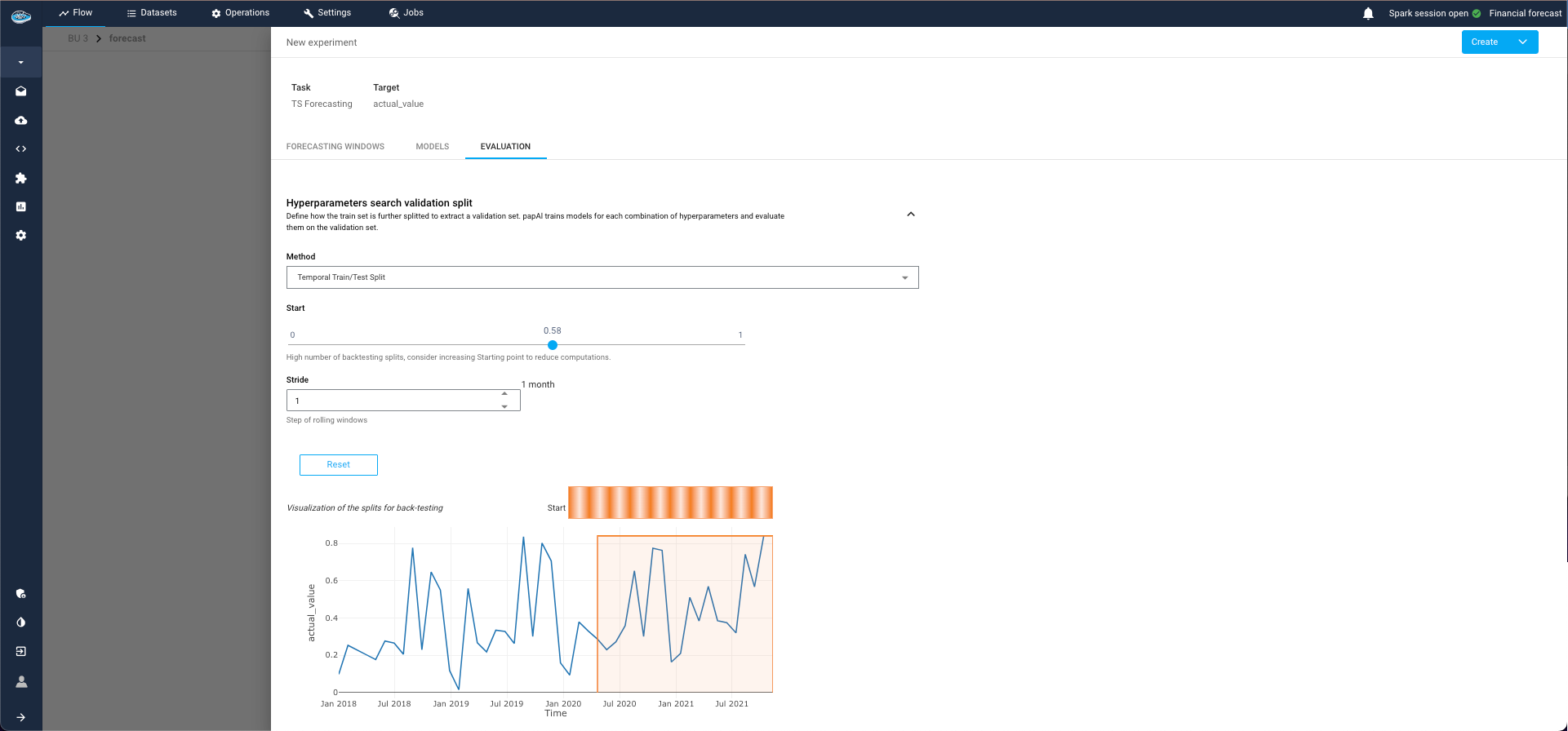
Evaluation Tab:
This tab is divided into two sections:4.1. Evaluation Split:
- Select the point from which to start the test split for computing evaluation metrics.
- You can split by ratio (e.g., 80% training, 20% evaluation) or by start date (only available for single series, as panel series may have different date ranges for each group).
4.2. Backtest Configuration:
- This optional step simulates historical predictions to evaluate model performance as if it had been used in the past.
- This process can be time-consuming, especially if the model is re-trained at each simulated prediction point (retrain parameter).
- Simulated forecasts are defined with respect to a forecast horizon, which is the length of the forecast generated at each stride point.
Warning
This splits are used only for the first training to train and evaluate the model, but the final model will be retrained at the end of the pipeline with all the series.
Evaluation step for TS pipeline
By following these steps, you can effectively construct and evaluate your time series forecasting pipeline, ensuring accurate and reliable model performance.
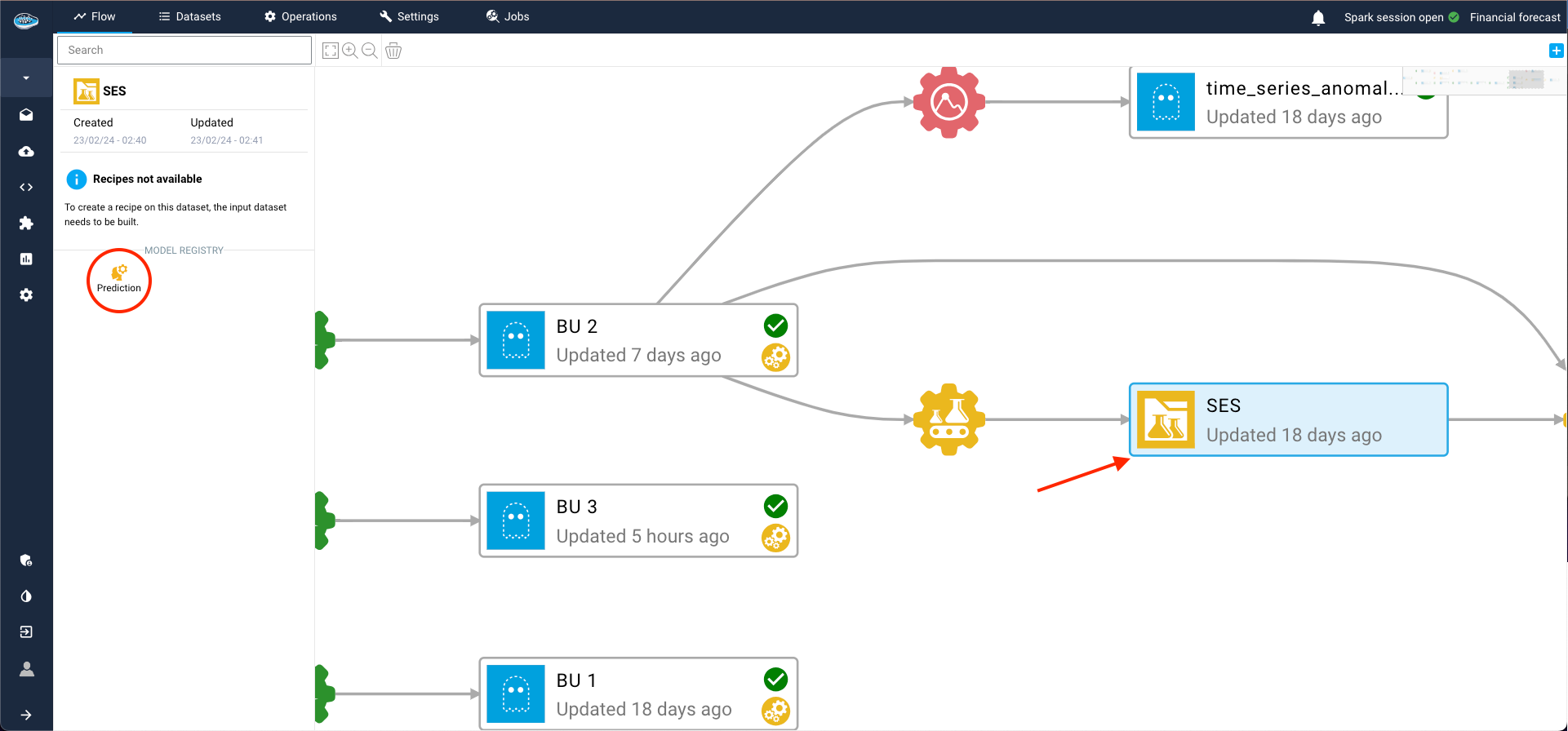
Post-training assessment, you can add the model to your Flow by creating a model registry. This is essential for making predictions on other datasets within the flow and deploying the model into production.
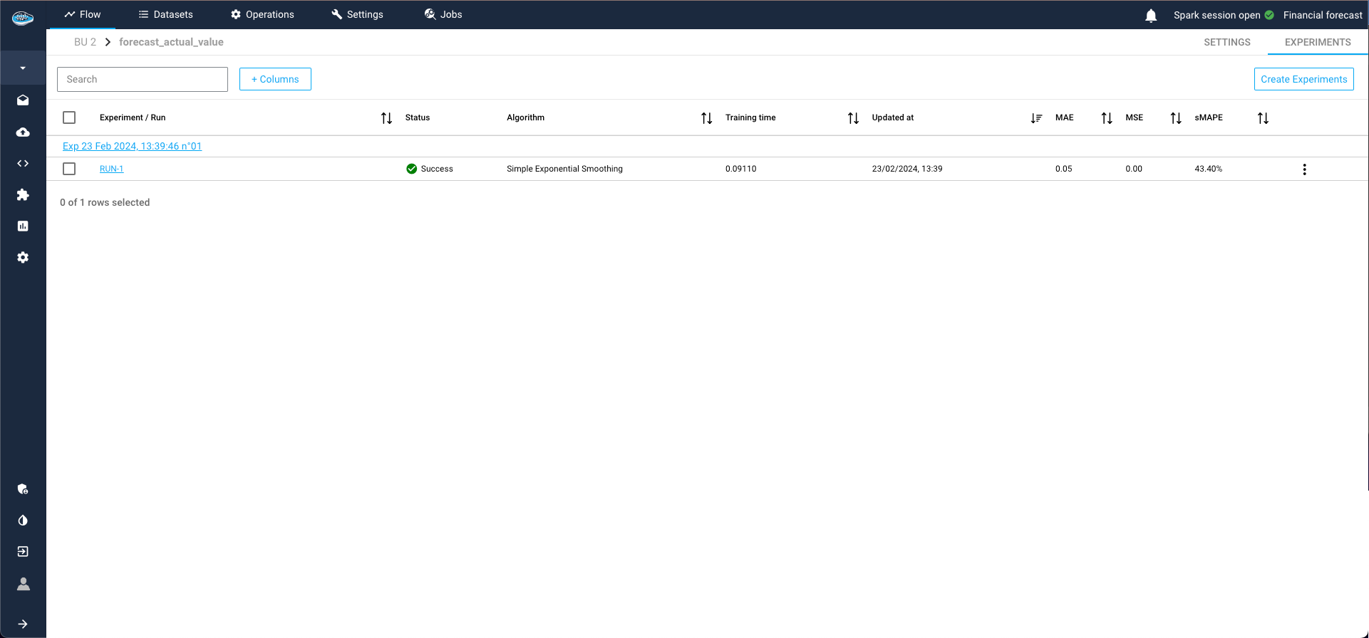
To achieve this, select the three dots on the right of the model run, then click Add model to the flow. Complete the required details for the recipe and registry, and click Submit. Returning to the Flow, you'll find the model registry, containing the desired model from the ML Lab, ready for use.
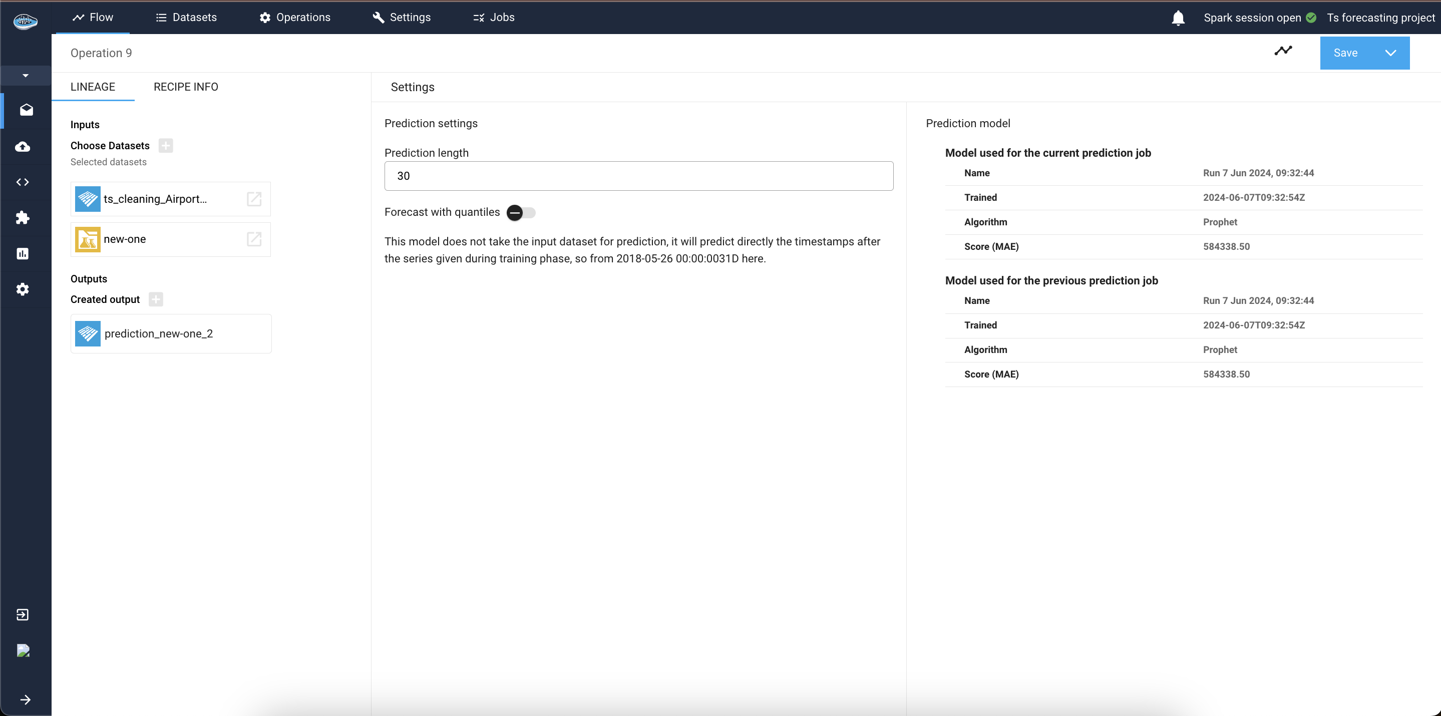
Now, let's apply a prediction operation using this new model and a dataset from the flow. Simply select the new model registry and click on the prediction operation. Add an input dataset and an output dataset on the left sidebar, then click Continue.
The subsequent interface provides information about the model and modifiable parameters. Here, specify the prediction length, you can also specify if you want to generate your forecasts with some confidence bounds or not by checking the check-box. And if your model was trained using past or future covariates you will be asked to select how to find this covariates, it can be from the input dataset itself, or from an external source.
Then initiate the process by selecting Save recipe and save it now under the Save button. Monitor the process through the green check next to the output dataset.
To inspect real and predicted values, access the created dataset and navigate to the Visualization tab. Utilize the data visualization module to craft a line plot showcasing the predicted values from the model. Select Line as the plot type, designate the datetime column as the X-axis, choose the target class, and assign the prediction tag for color-coding real and predicted values.
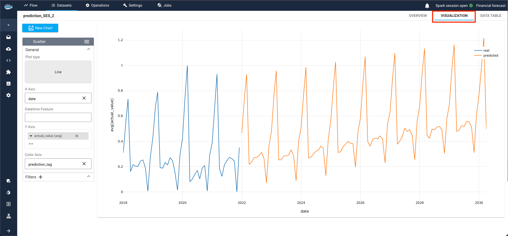
The resultant plot vividly illustrates the model's ability to replicate the behavior of the trained time-series, depicting a discernible upward trend over the years in this example.
Here is a video showcasing the TS Forecasting tool
TS Local Interpretability
Warning
Local interpretability is available only for some types of TS models such as Regression models or TFT. Make sure if you used the right model in your prediction step in order to access to that tool.
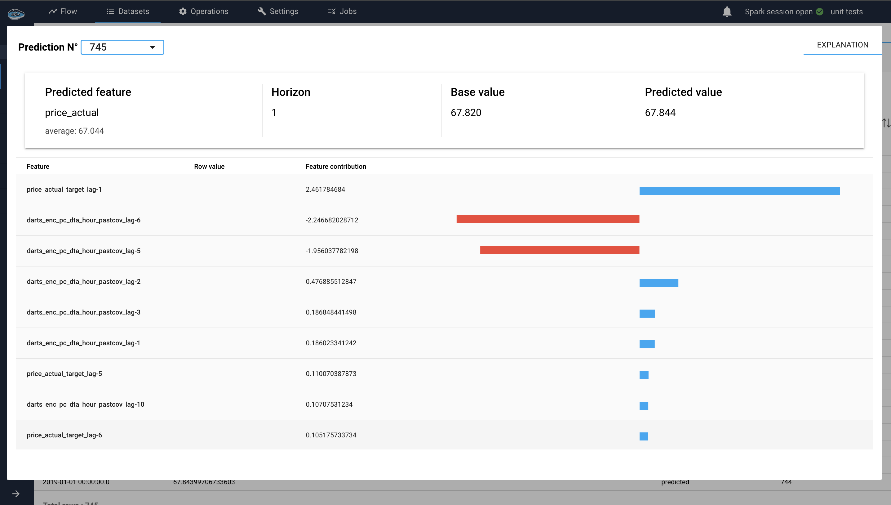
Local interpretability is available for some TS Forecasting models (Regression models and TFT), so if you have a prediction dataset that was generated using one of these models you will be able to click on a predicted row (a row where prediction_tag is predicted) from the dataset and check out its local interpretability. If the model is not interpretable or the clicked row is not predicted, you will see a warning message to indicate the case.
For regression models (SHAP values)
SHAP (SHapley Additive exPlanations) is a unified approach to interpreting the predictions of machine learning models. Based on cooperative game theory, SHAP assigns each feature an importance value for a particular prediction, allowing for a detailed understanding of the model's output.
In a Time-Series use case, when applying regression models to time series forecasting, understanding the contributions of various features (e.g., past values, external covariates, generated datetime attributes) to the model's predictions is crucial. SHAP provides a way to break down these contributions, offering clear insights into the model's decision-making process.
Each feature lag's contribution to the prediction is quantified by a SHAP value. These values can be positive (indicating a positive contribution) or negative (indicating a negative contribution).
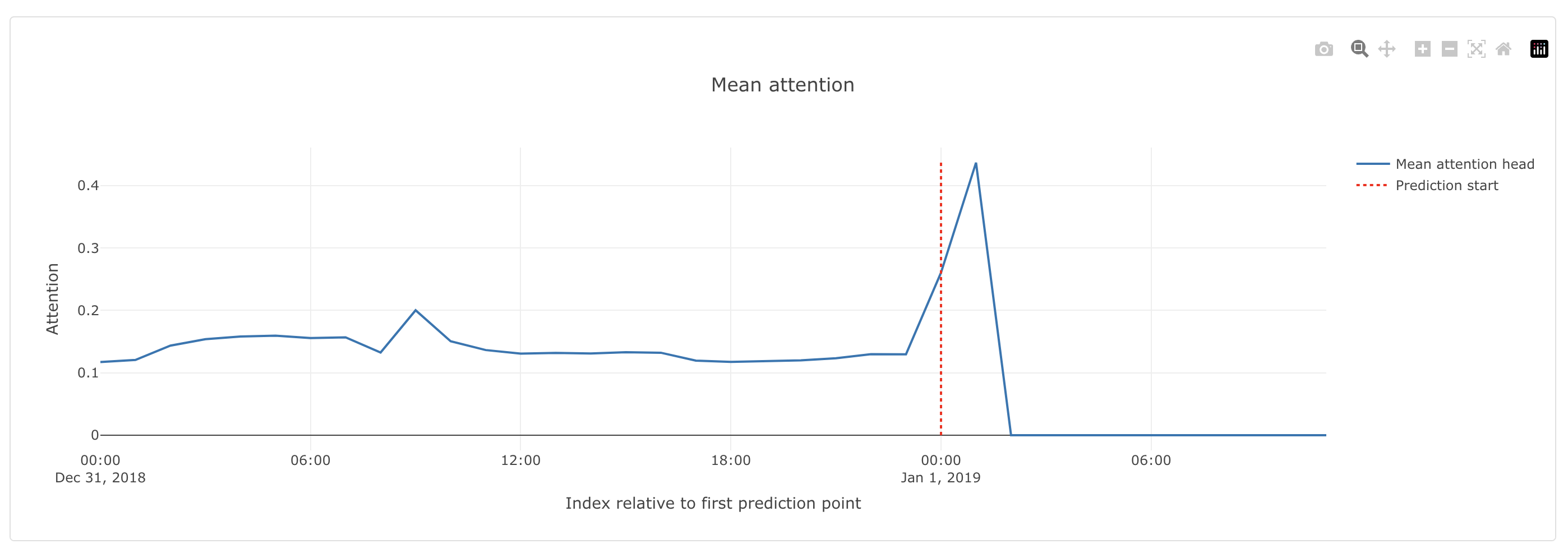
For TFT model (attention heads)
The TFT explainer facilitates the interpretability of the Temporal Fusion Transformer model by offering plots to analyze the importance of different features and the attention mechanisms used by the model, 2 plots are present on that case :
-
Variable Importance Plot:
The Variable Importance Plot in the TFT explainer module is divided into three bar plots: Encoder Variable Importance, Decoder Variable Importance, and Static Covariates Importance. These plots illustrate the relative importance of different variables used by the model in different contexts.
-
Encoder Variable Importance :
This plot shows the importance of features used in the encoder part of the model, which processes historical data : target past values and past covariates values (input chunk). Features with higher importance in the encoder indicate that they play a significant role in understanding historical patterns and trends. This plot helps identify which historical features are most influential for the model's predictions.
For example, if the 'temperature' feature has a high importance in the encoder, it means that historical temperature data significantly impacts the model's understanding of past patterns. -
Decoder Variable Importance :
This plot displays the importance of features used in the decoder part of the model, which generates the forecasts. It contains the future covariates importance on the decoder (output chunk). This plot highlights which variables are most influential in the forecasting process.
Example
If the 'holiday' feature has a high importance in the decoder, it indicates that whether a day is a holiday significantly influences the model's future predictions.
-
Static Covariates Importance :
This plot highlights the importance of static covariates, which are features that do not change over time. Static covariates with higher importance are crucial for the model's overall understanding and performance. This plot helps identify which static features (e.g., location, product type) are most impactful.
Example
If the 'store location' feature has a high importance, it means that the geographical location of the store is a significant factor in the model's predictions.
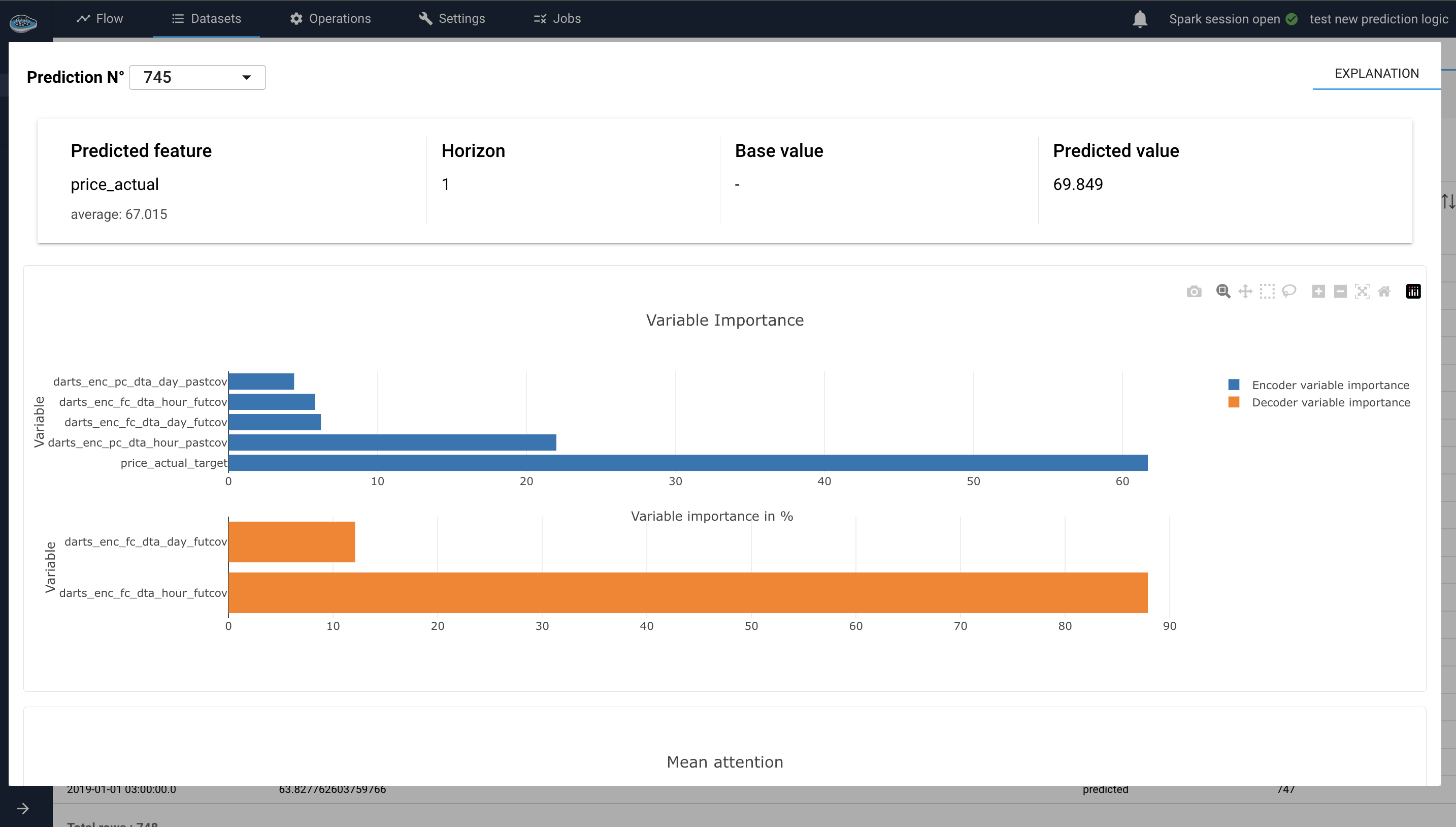
Variable importance plots interface for TS local interpretability -
-
Mean Attention Plot:
This plot shows the average attention weights assigned to different time steps or features during the forecasting process. It provides insights into how the model distributes its focus over the input sequence, revealing which time steps or features are considered most critical for the forecast.
Example
If the model assigns higher attention weights to recent time steps, suggesting that recent data points are more critical for making accurate predictions.
Time-Series Anomaly Detection
This feature proves highly beneficial as its primary objective is to distinguish between regular expected behavior and irregular unexpected behavior within the data. Unsupervised algorithms employed in this process analyze temporal patterns and trends to establish a baseline of normal behavior, flagging any deviation from this baseline as an anomaly.
To initiate the anomaly detection process, simply select a time-series dataset from your flow and click on the Anomaly Detection icon in the left sidebar.
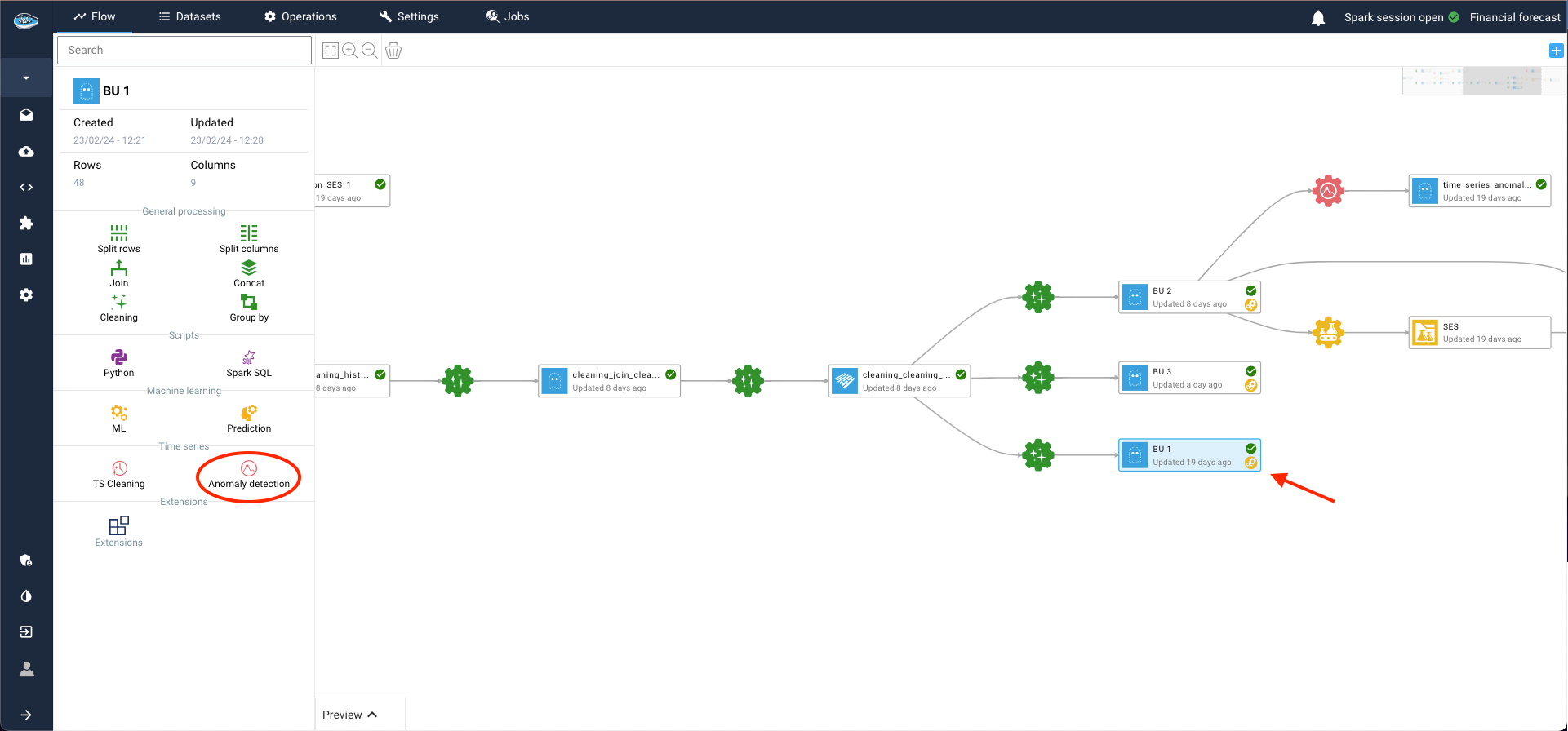
Within the same area, set up input and output datasets by clicking on the plus logo and then on Continue to proceed.
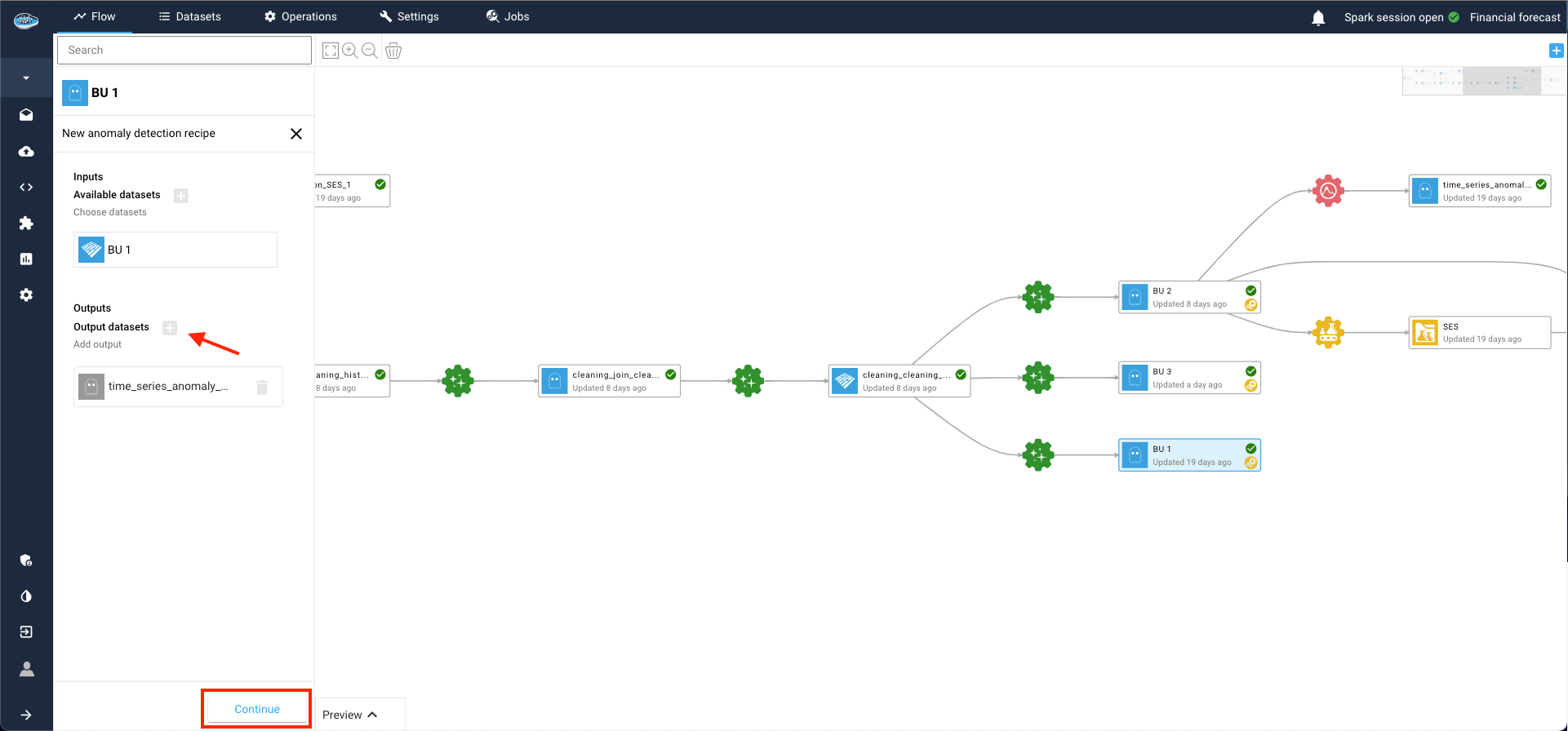
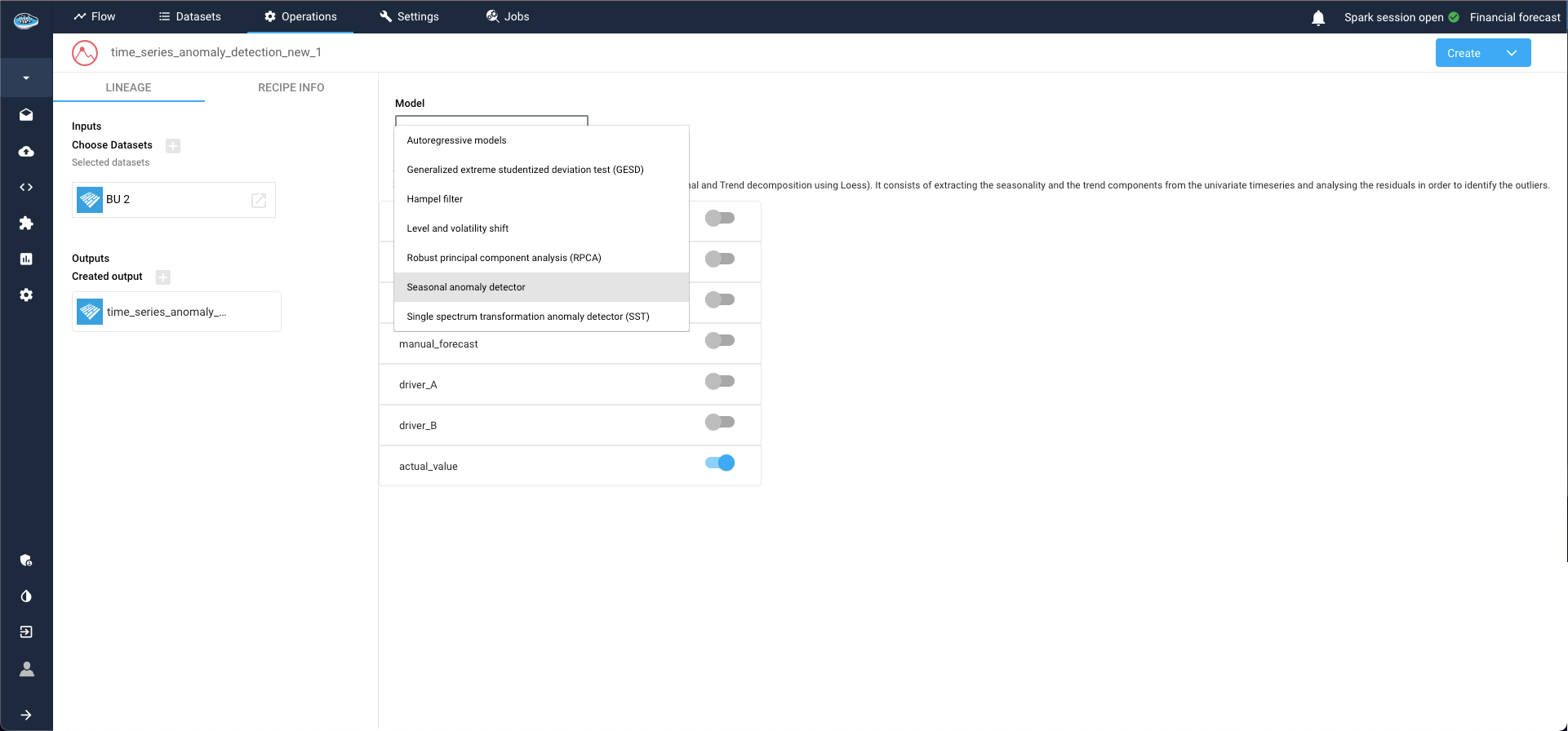
This action opens a new window where you can configure your model and define the targets. Select the target column to apply your anomaly detection and choose your desired model from a comprehensive catalog of state-of-the-art models.
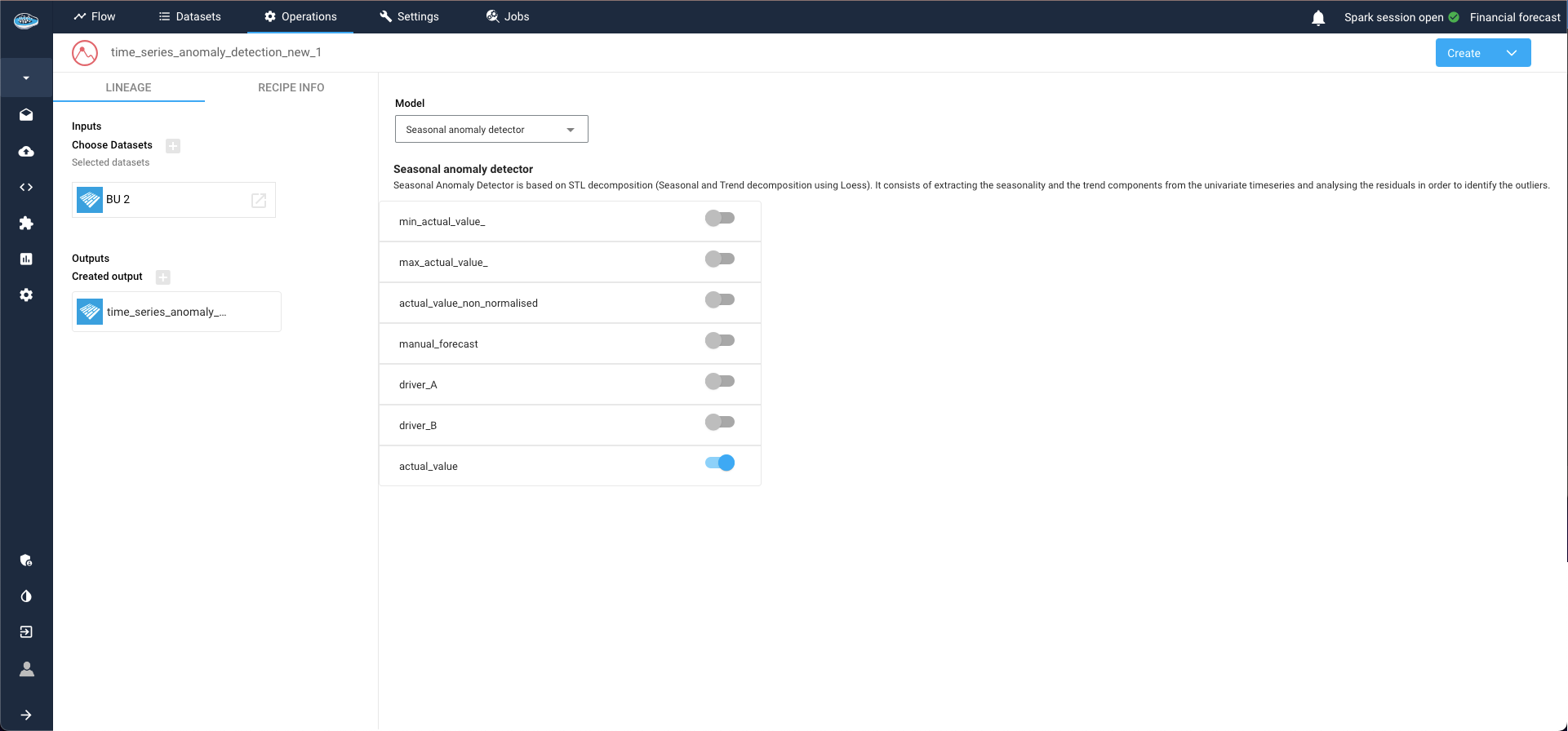
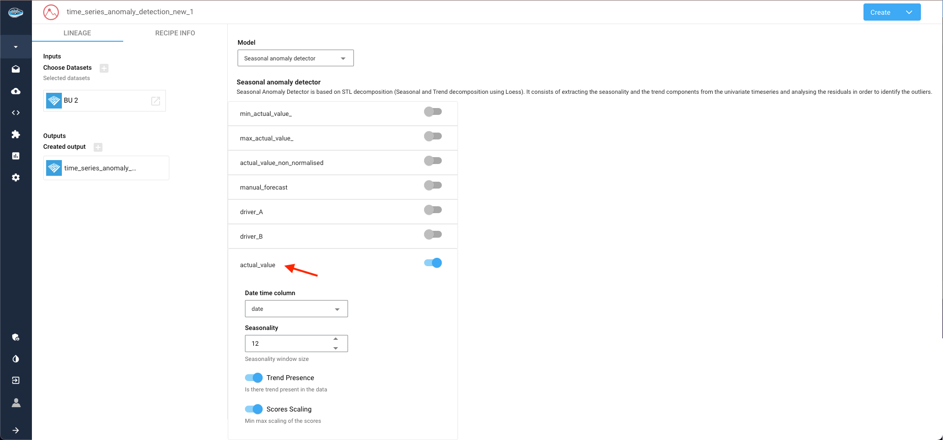
In this instance, we opt for the Seasonal anomaly detector. Clicking on the selected target column to unveils additional parameters related to model configuration.
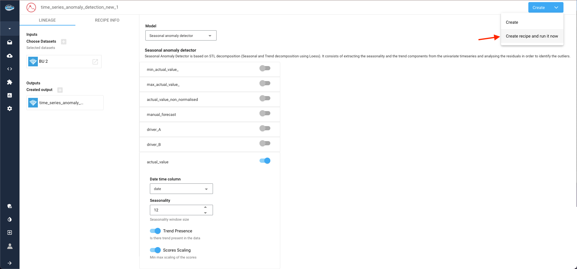
Once configuration is complete, select the Create recipe and run it now option within the Create button to launch the process.
As the process initiates, await the completion of the output dataset. To visualize the results, access the visualization tab by double-clicking on your dataset. Here, create a new line plot by selecting the line plot type, with the date column as the X-axis and the anomaly target column as the Y-axis. Leveraging the color axis option, anomalies within the series are highlighted in red, while normal data points remain blue.
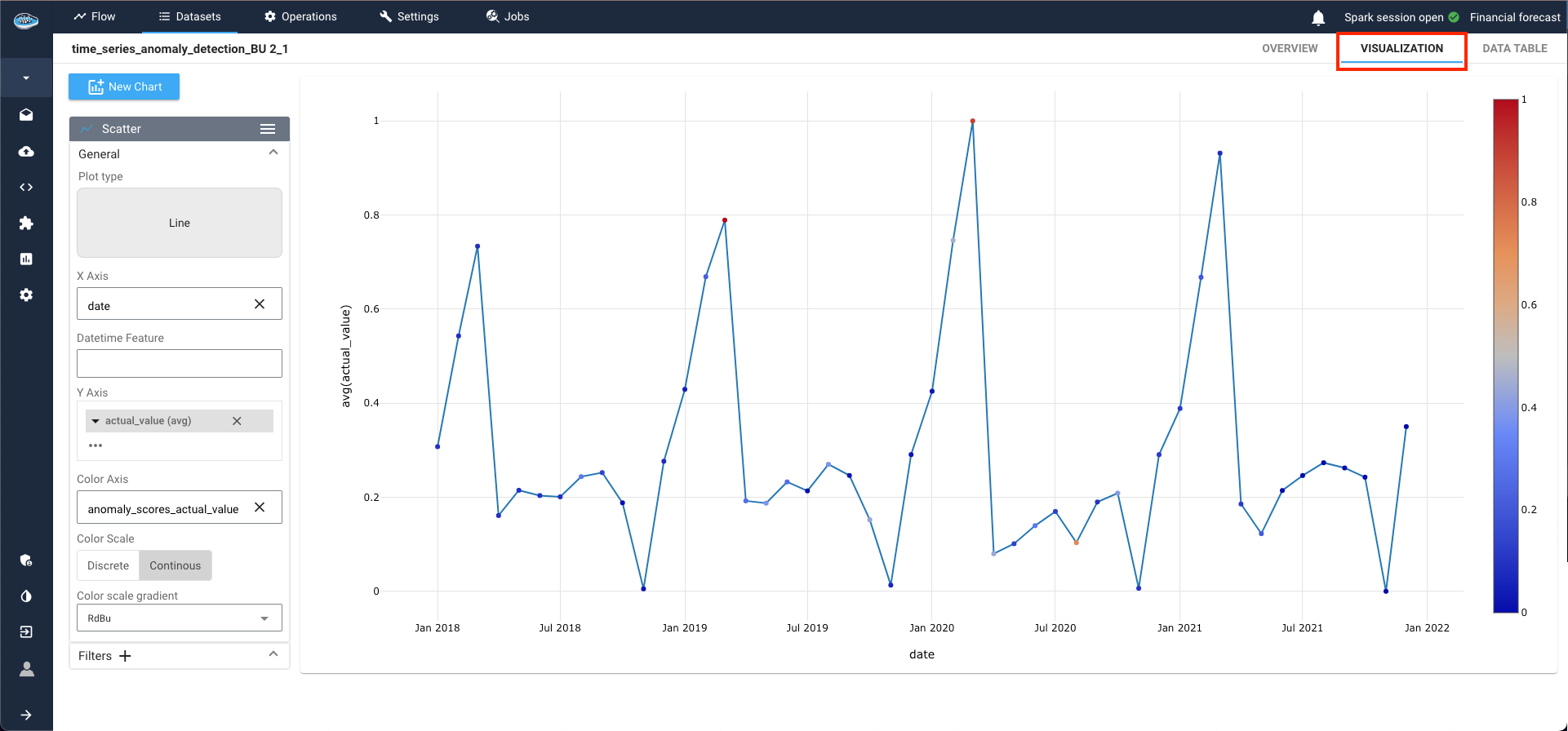
For instance, data points in March 2020 and March 2021 are flagged as anomalies due to their significant deviation from the norm.
Here is a video showcasing the TS anomaly detection