Data Visualisation
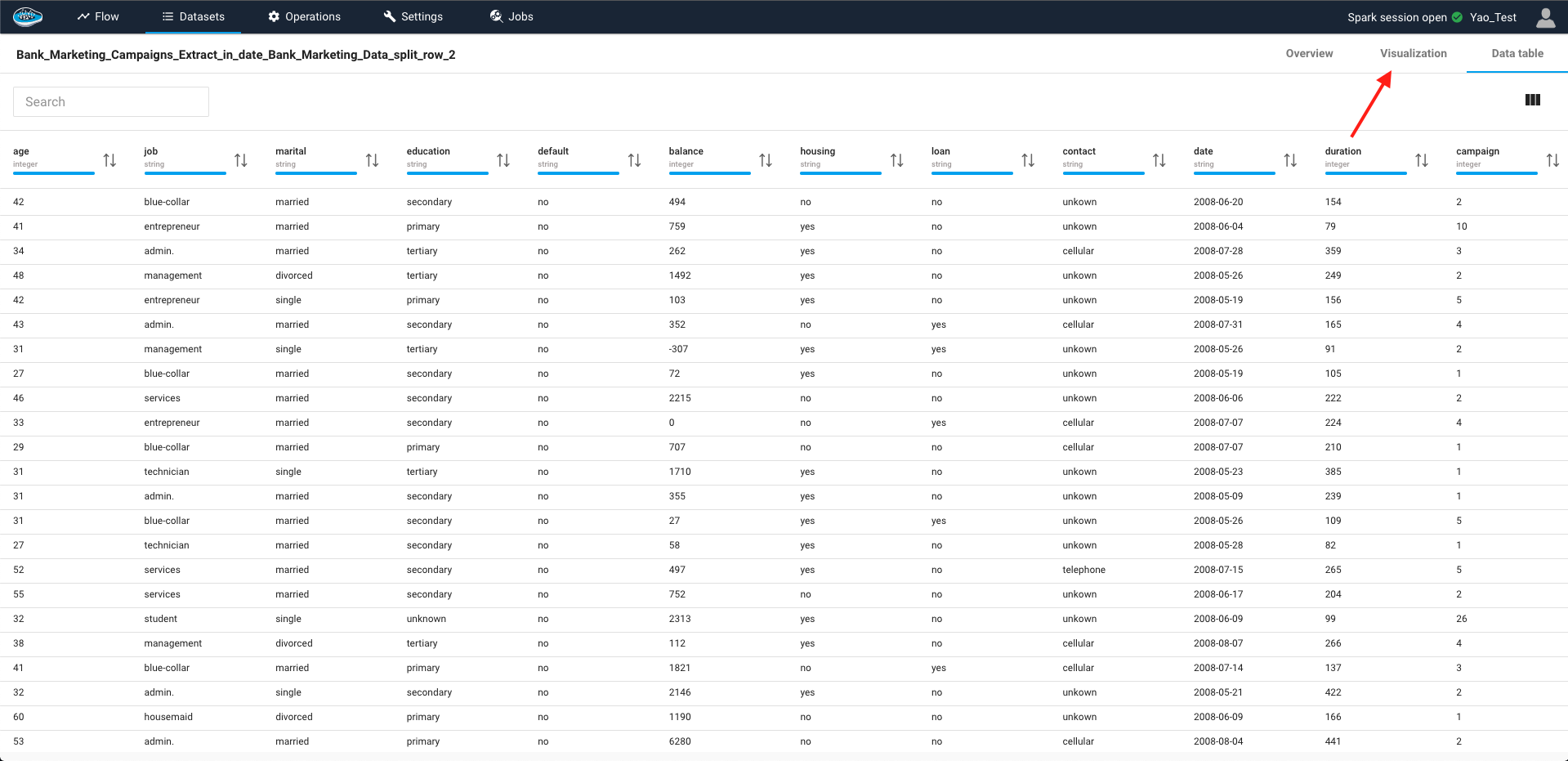
Raw data can be intimidating for most people since it has a complex structure and a huge quantity to analyse. To enhance the comprehension of this data, we provide a catalogue of different types of graphs and charts to add more flexibility to inspect the data. To access to this feature, you just double-click on the desired dataset and when it shows you the data table, you just click on the visualisation tab to begin the visualisation process.
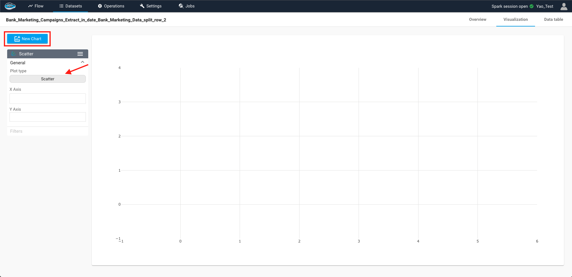
To select which chart you want to use, you click to the Create Chart button to create one and you just select the Plot type box in the left section tab and a pop-up with different charts will be displayed.
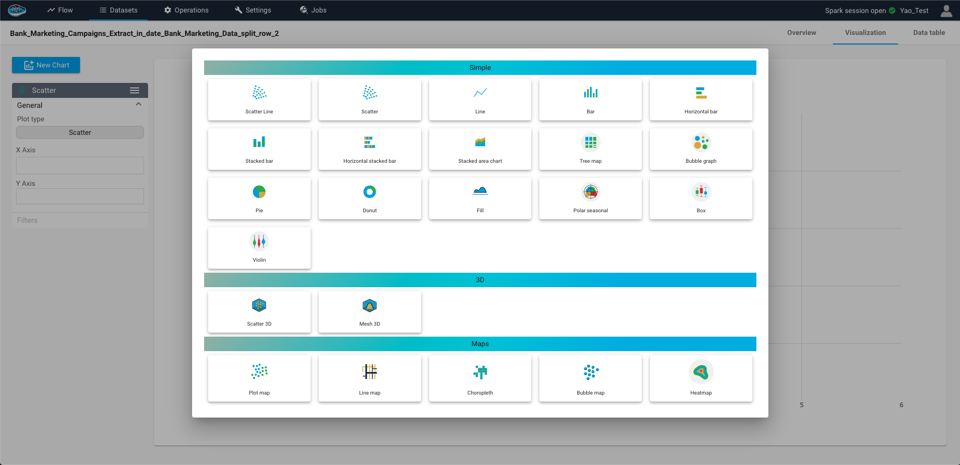
There are three types of charts available to you :
| Simple Charts | 3D Charts | Geospatial Maps |
|---|---|---|
Scatter |
Scatter 3D |
Plot Map |
Bubble Graph |
Mesh 3D |
Line Map |
Line |
Choropleth |
|
Fill Area |
Bubble Map |
|
Stacked Area Chart |
Heatmap |
|
Stream Chart |
Animated Heatmap |
|
Vertical / Horizontal Bar |
Calendar Heatmap |
|
Stacked Bar / Horizontal Stacked Bar |
||
Pie |
||
Donut |
||
Polar Seasonal |
||
Tree Map |
||
Box plot |
||
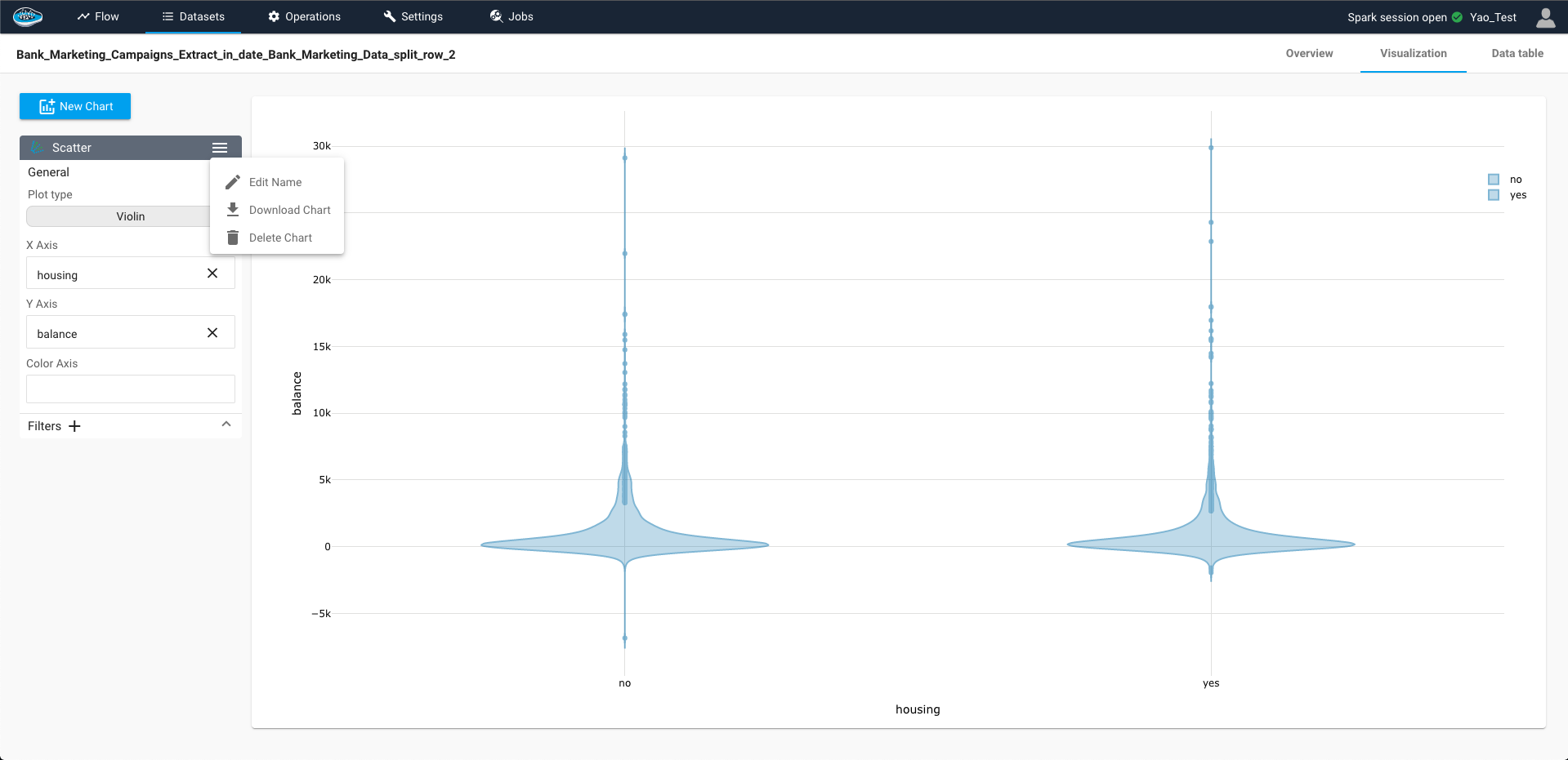
Violin |
According to the type of graphs, a number of axes on which the user should select the column to represent will be displayed. Adding to that, many settings are available for the user to select to personnalize the chart to his preferences such as filtering the data or changing the color axis among others.
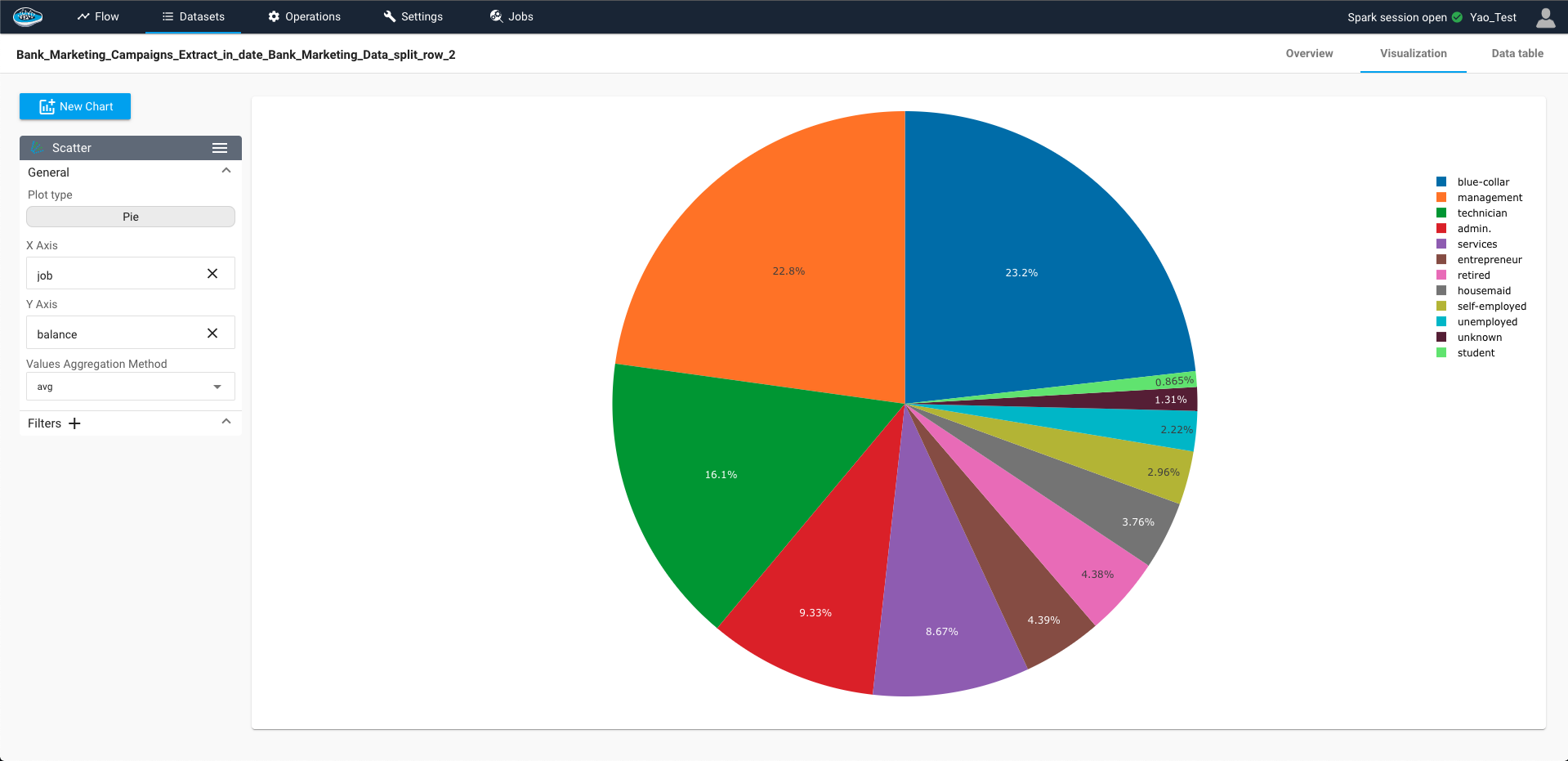
One of these settings are the aggregation method used for handling multiple points of the feature into a smaller group of points that will be displayed on the second axis. The aggregation methods are minimum, maximum, sum, median, stddev, count, first, and last. By default, depending of the selected chart, either no aggregation or sumaggregation is applied on the second axis. Finally, you can reset the applied method by simply clicking the Reset button in the aggregation box.
Info
For the categorical features, there is only two types of aggregation methods : count (default) and countuniq
Tip
Selecting the icon on the top right of the sidebar give you the opportunity to edit the name of your chart in order to identify it or delete if it's not longer required but also you can download the chart as a JSON file to use it externally from the platform.
Note
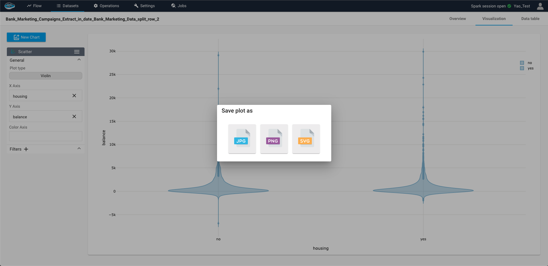
You can still download the chart as an image through the plotly toolbar located on the top right corner of the chart and select which format is required between JPEG, PNGand SVG type file.