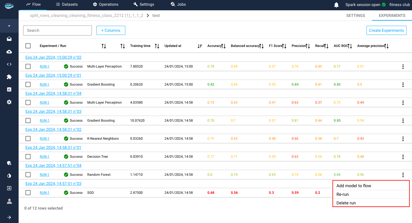
List your experiments / runs
When creating your use case, you access to a new interface where all your ML experiments and runs related to your use case are stored. This panel is used to monitor and compare the different model performances through some small indicators.
Experiments
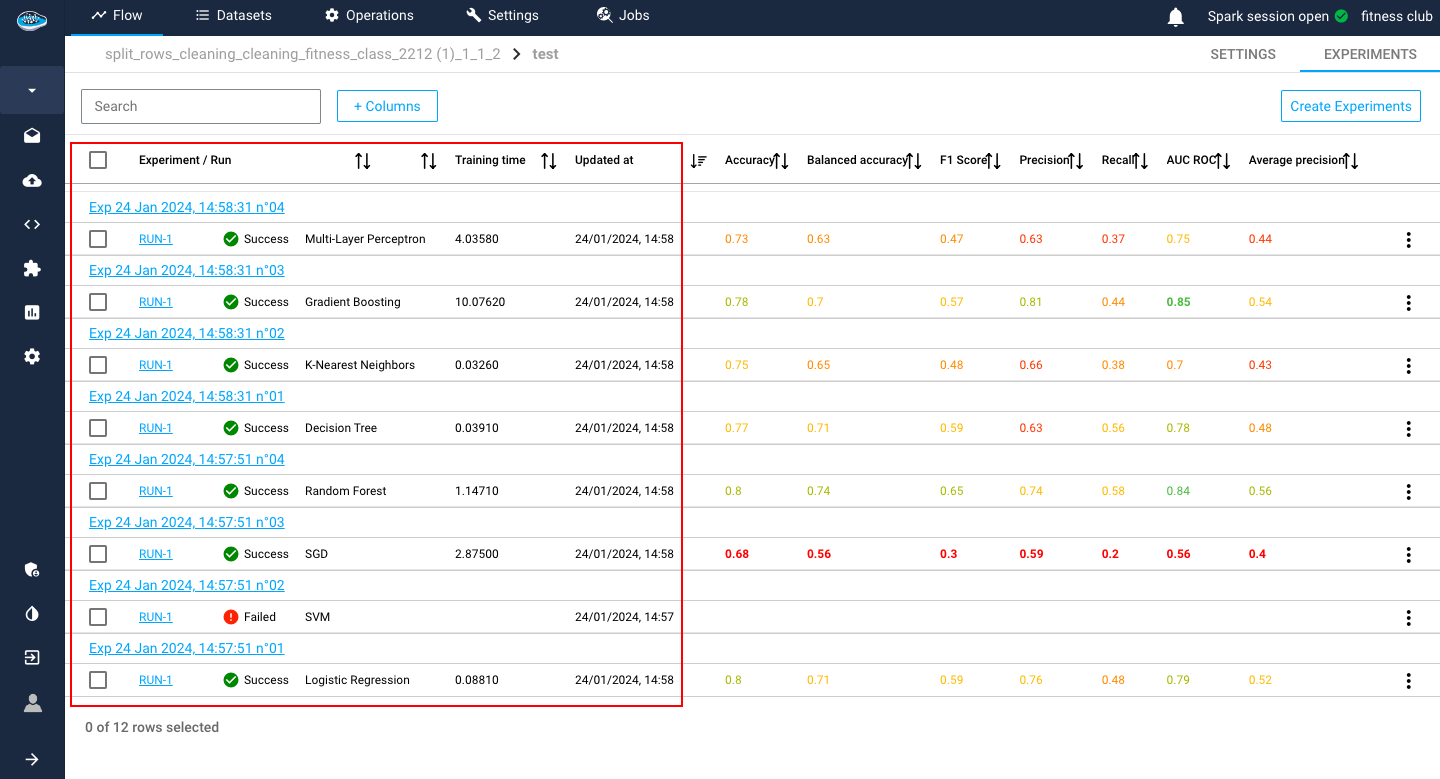
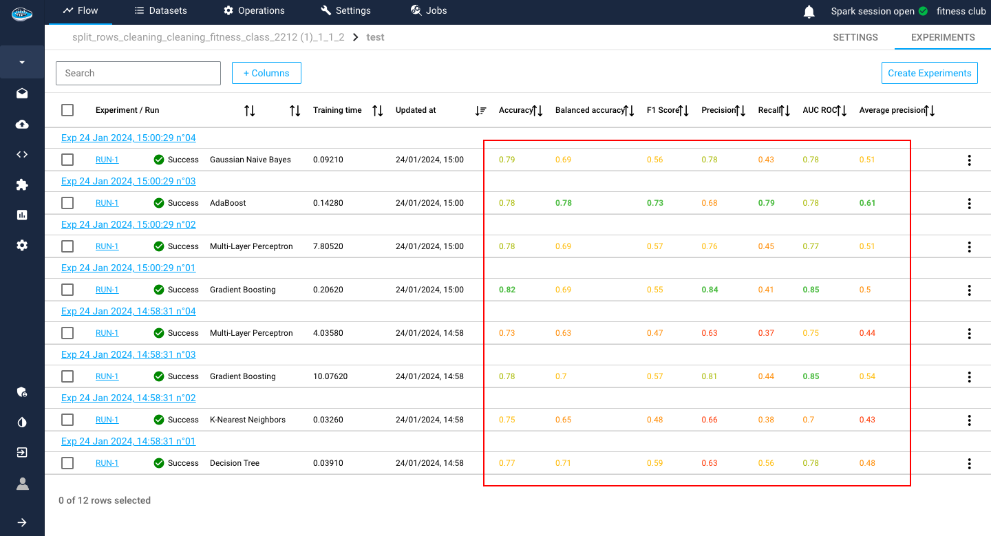
The first panel presents all the created experiments and their metadata but also some evaluation metrics, helpful for the model comparison.
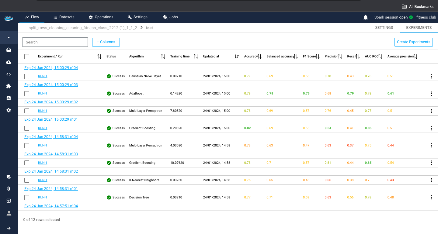
The metadata displayed consists of the algorithm used, the status of the run (Running, Success, Failed and Cancelled), the date and time of creation of the experiment / run and the training duration in seconds.
For the evaluation metrics, papAI uses the most common ones in ML depending on the ML type selected for your use case.
Note
You can check the whole list of metrics here.
Tip
To indicate the best models, papAI includes a color system to indicate from best to worst metrics. Green being the best, yellow being average and red being the worst.
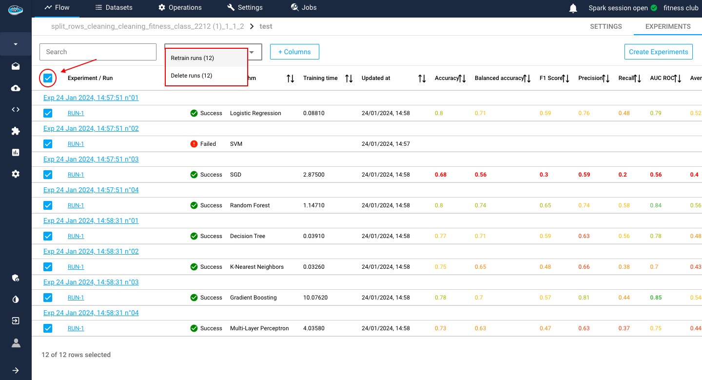
At the end of the row, there is the icon with some actions to apply on a run. These different actions include re-running, deleting, promote or deploy the model.
Tip
To apply these action on multiple experiments, you can select each experiment with the tick boxes next to the experiment / run and select the white bow an the top of the table panel to apply one of the available action as a bulk action.
Tip
In case you want to change some settings on your existing experiment, you can select the experiment row and the same interface of experiment creation is displayed and when you are done with your changes, you click on the Update button to apply your changes and finally on the Train to create another run with the new changes.
If you want to go in-depth with the evaluation of your model, you select the desired run and access to the evaluation process, which you can check it out here.
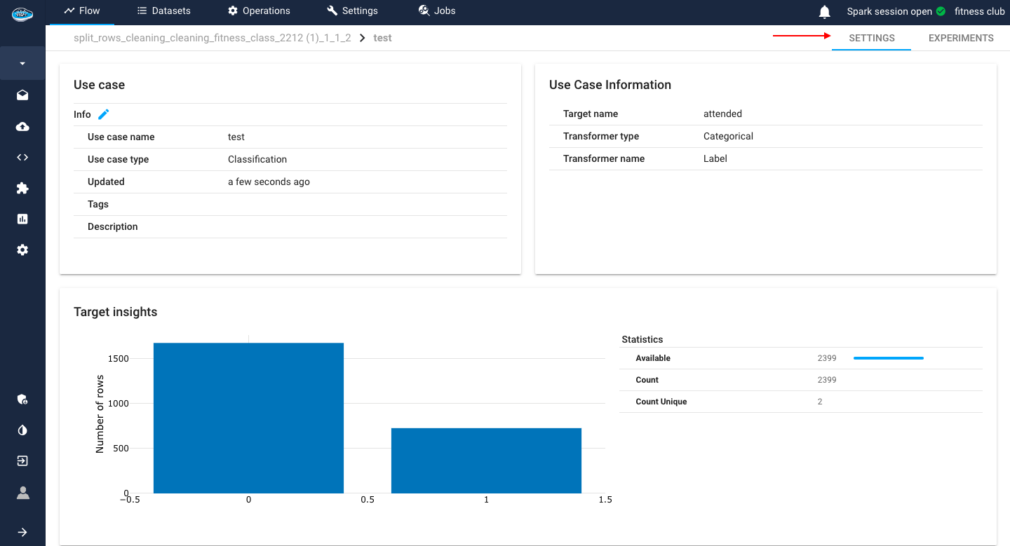
Settings
Regular ML Settings
The second section allows you to check some general information on the selected use case. The first panel describes the use case name, type, the last time it was updated, the tags and description while the second one displays the target name, and type. On the last panel at the bottom of the screen, you have insights about the target class such as a bar plot representing the distribution of the target data and some descriptive statistics.
Info
The descriptive statistics include the minimum, the maximum, the mean, the median, the 1st and 3rd quartile, the standard deviation and the count.
!!! tip Did you know?
There is an option to schedule any experiment from your use case through the Model Scheduling panel where you select the desired experiment and click on the Define a training scheduling to set up the schedule and apply it.
The logs of your run will be sent to your email.
Moreover, the settings interface may vary across distinct machine learning tasks, notably in the realms of Survival Analysis and Time-Series Forecasting. This divergence is intentional, designed to present task-specific analyses that accentuate and illuminate unique insights tailored to each domain.
Survival insights
In the context of a Survival use case, our considerations diverge from conventional machine learning tasks, focusing on unique targets: the Survival Duration column and the Event Status column. The former encapsulates the temporal aspect, marking the occurrence time of the event, while the latter signifies the status of event occurrence. Both critical parameters are seamlessly integrated into the interface, enriching the user experience with two elucidating plots. The first plot manifests as a bar plot, meticulously illustrating the distribution of Survival Duration. Concurrently, the second plot delineates the proportions of the Survived and Not-Survived populations, providing a comprehensive visual insight into the dynamics of the survival analysis. These visualizations serve as invaluable tools for discerning patterns, trends, and key characteristics associated with the targeted survival outcomes.
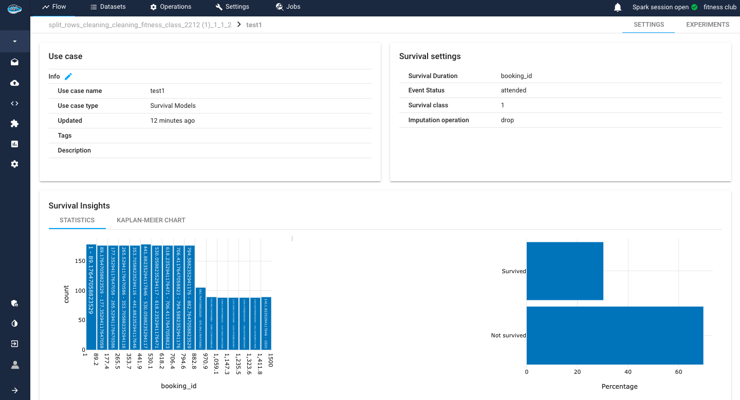
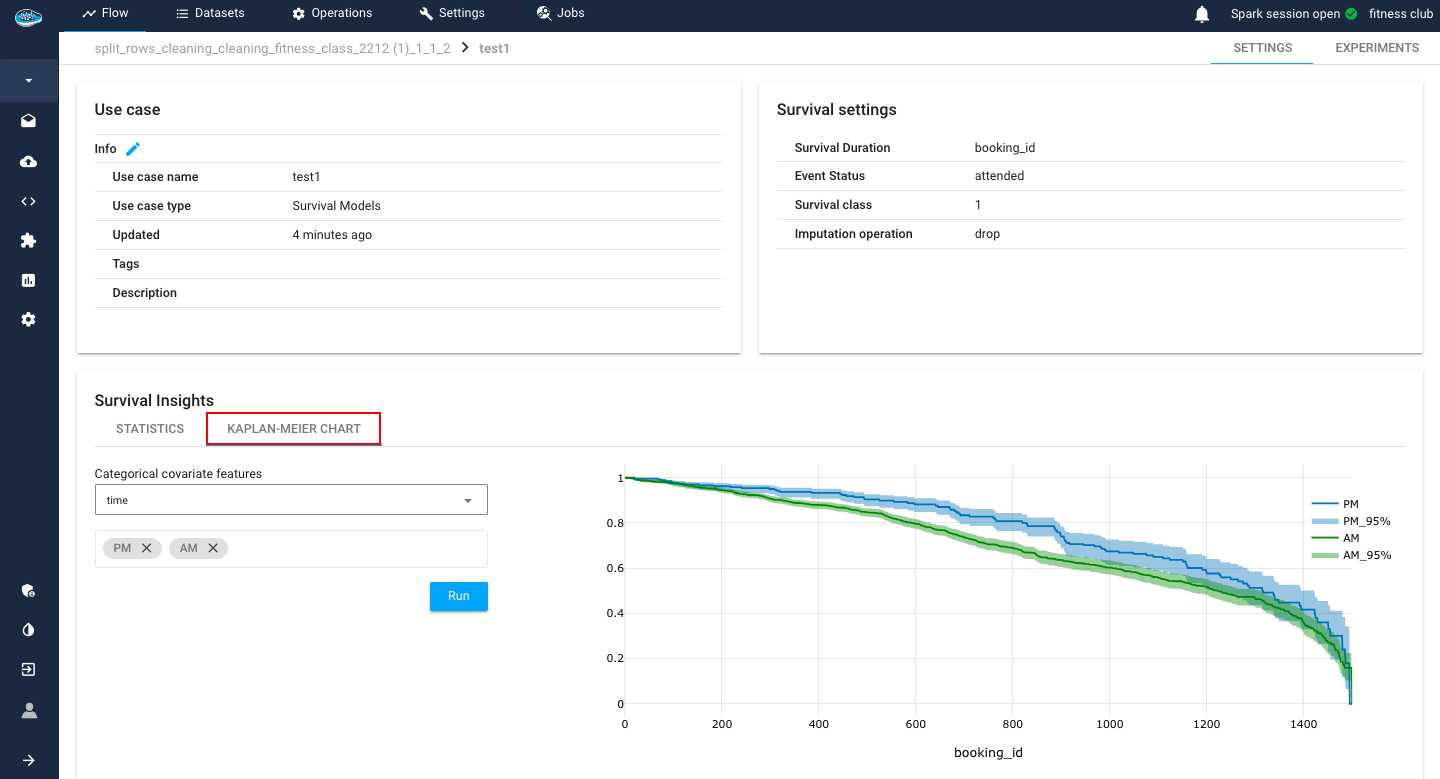
Another tool included is the Kaplan-Meier plot.
The Kaplan-Meier plot is a fundamental tool in survival analysis, widely employed to estimate the probability of an event occurring over time. Specifically designed for censored data, which occurs when the event of interest is not observed for all subjects, the Kaplan-Meier estimator provides a non-parametric method to analyze and visualize time-to-event data.
In this plot, time intervals are divided into discrete steps, and at each step, the probability of survival beyond that point is calculated based on the observed data. The resulting curve, often referred to as the survival curve, graphically illustrates the cumulative survival probability as a function of time. Additionally, the plot accommodates censored data points, denoted by vertical ticks, indicating instances where the event has not occurred by the end of the study period.
What sets our implementation apart is its dynamic adaptability to categorical column values. Users have the flexibility to select and represent different survival functions based on specific categorical column values of interest. This nuanced feature empowers users to stratify and compare survival experiences across diverse subgroups or conditions within their dataset. Each survival function becomes a visual representation of the probability of survival tailored to the user's chosen categorical column values.
This level of customization enhances the interpretability of the Kaplan-Meier plot, enabling users to uncover nuanced insights and patterns associated with distinct groups, conditions, or variables in their data, making it an indispensable tool in survival analysis.
Note
The displayed Kaplan-Meier plot contains not only the survival probability throughout the duration time but also a 95% confidence bound margin.