Heart disease detection use case tutorial
Welcome to papAI, a cutting-edge platform that empowers you to build your own Data Science pipeline from start to finish. With papAI, you can collect data, preprocess it, train models, and deploy them with ease. In this tutorial, we will guide you through a binary classification problem, specifically about the detection of potential cardiovascular diseased patients, demonstrating how to leverage the various operations and tools available on the platform to build your first project.
Whether you're a seasoned Data Scientist or just starting out, papAI is the perfect tool to help you achieve your goals. With its intuitive interface and powerful features, you can quickly and easily create custom workflows that suit your specific needs. So, let's get started and explore the full potential of papAI!
Note
The dataset used in this tutorial represents a group of 918 patients suffering or not from any cardiovascular disease and for each patient, 11 columns representing some of their characteristics such as demographics and medical records.
You can download here the dataset example used in this tutorial and to follow it step by step !
Create a project
As a user of papAI, you will be directed to your project homepage upon logging in. This page displays all the projects that you have either created or are collaborating on with other members. To start a new project, simply click on the New project button, which will open a pop-up window with various settings to fill in. These settings include the name of your project, a brief description, the persistency setting, and the sampling technique you wish to apply. You can choose the number of samples to be displayed and the order selection, such as the first or last N rows or randomly. Once you have filled in all the necessary settings, you can finalize the process by clicking on the Create button. Your new project will then be automatically added to your main page, ready for you to start working on. With papAI, starting a new project has never been easier!
Here is a video showcasing the creation of a project on papAI
Import datasets
Thanks to the variety of data sources available, you have the flexibility to import data from virtually anywhere into your papAI project for analysis and visualization. Whether it's from your local machine, an external database (SQL or NoSQL), cloud storage, or an API, papAI makes it easy to bring in data for analysis. Additionally, you can even create a completely new dataset using the specialized Python or SQL recipe editor.
To get started with importing your data, you can use the tools provided in the papAI interface. For our specific use case, we'll be importing our dataset from our local machine using the appropriate tool. You can access this tool by clicking the plus button located in the top right corner of the interface or by using the Import dataset button in the Flow interface.
Once you've selected the local import option, a new interface will appear that allows you to easily import any tabular file in CSV or XLSX format. You can import your desired files either by clicking the Import button or by using the drag-and-drop feature. Once your data has been imported, you can preview a subset of the data to verify that it was imported correctly. After ensuring that everything is in order, you can simply select the Import button to start the uploading process. A progress bar will keep you informed of the status of the upload, and when it's complete, your dataset will be ready for use in your project's flow.
Here is a video showing you the process of data import
Visualizing and analyzing the dataset
Once you've imported your dataset into papAI, you can begin exploring its content and obtaining an initial analysis to determine the cleaning steps necessary to extract the most valuable insights from your data. However, before diving into preprocessing, it's essential to explore the structure of the data through data visualization.
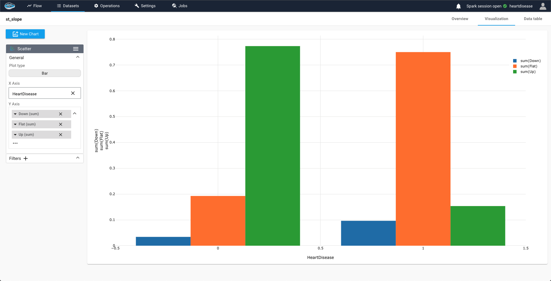
Thankfully, papAI makes it easy to visualize your data with a dedicated module accessible by double-clicking on the desired dataset and selecting the Visualization tab located on the top right-hand side of the interface. From there, you can select from a variety of graph options and choose which columns or aggregation of columns to represent and display in your desired graph. For some graphs, you can even define a colormap for a legend and filter out specific values to focus on specific aspects of your data.
By visualizing your data, you can gain insights into the underlying patterns and trends that might not be immediately apparent from just looking at the raw data. This can help you to identify potential issues or opportunities to improve the quality of your data before diving into preprocessing and modeling.
In our case, for example, we can see that people without any disease have more likely a ST slope in a upper trend compared to the people who are diagnosed with a heart disease that have more likely a flat ST slope.
If you want to take your data analysis to the next level, you can also use descriptive statistics to uncover trends and better understand how your data is distributed. In papAI, you can easily access these statistics by selecting the Statistics tab from the table interface.
This interface allows you to quickly view the key statistics for each column in your dataset, including the median, mean, and standard deviation. Additionally, you can view graphs that illustrate the distribution of your data, such as box plots and histograms, to get a more comprehensive understanding of its characteristics.
By analyzing these descriptive statistics, you can gain a deeper understanding of your data and identify any potential outliers or trends that may require further investigation. This information can then be used to inform your preprocessing and modeling decisions to create more accurate and reliable results.
Here is a video showing you the dataset's statistics
Clean your data
After running your different data exploration steps, you are ready to configure your cleaning steps in order to obtain a ready-to-use dataset and develop the most robust model. In order to access the cleaning module on papAI, you just need to select the desired dataset from the flow and select from the green operations of preprocessing on the left sidebar the cleaning icon. When selecting it, a new interface will be displayed with a preview of the dataset and a right bar where all your cleaning steps will be stored. Starting your cleaning process comes through the plus button on the top right. The different cleaning steps are classified by categories such as Cast, Format, Filter, Extract.... In the case of the selected dataset for the heart disease use case, we only have two simple operations to apply which are column cast, or in other terms to change the column type of columns Cholesterol and FastingBS from double to String. All you need for this operation is selecting the Cast category in the list of steps and choose the Cast column step. Afterwards you just need to select the column Cholesterol and choose the column type as String. Repeat the process for the other column. When you are done, press the save and run button to launch the process.
Here is a video showcasing the cleaning steps applied on the dataset
Note
You can apply more complex operations through Python or SQL scripts if you are more familiar with these programming languages.
In this video, we use the Python recipe in order to create numerical only columns through the get_dummies function of Pandas library.
Train and test the model
At this stage, your dataset is set be used for training and testing some models and choose the right one in the end to be deployed in production. Prior to accessing the Machine Learning module, we split the dataset into two separate datasets : one for training and the other for testing. The splitting can be triggered by selecting the dataset and then the split rows operation from the green icons in the left sidebar. Clicking on the icon will display a pop-up to tune up some settings related to the split such as the name of the two newly created datasets, the splitting order (for our case it will be 80 and 20%) and the splitting method. When all set up, we click on the Save and run button to apply the split.
Here is a video showcasing the split operation applied to our dataset
After splitting and creating the training and testing set, we can launch the ML process by pressing the training dataset and then the ML Lab icon. It will give you access to the ML Lab where you will be testing different models. But first you will need to define the use case you want to tackle. Creating a ML use case is very simple since you need to click on the New use case button. Through a pop-up, you can choose the type of the use case required to answer it, for our case, it's a binary classification problem. For a classification, you will also need to fill up some fields such as the target, HeartDisease here, a transformer (if necessary) and a positive case, 1 here. Finally, you just name your use case and click on Create to access to the ML Lab and save your runs.
When accessing your use case, you are able to create and build your own ML pipeline easily through the ML Lab. The ML Lab gives you the ability to create a pipeline from scratch with multiple models and parameters to optimize the process and extract the best model without any code. To start the process, you need to select Create Prototypes and a new interface will appear with the first step to sill which is the feature selection. Through this step, you select the features to be taken into account in the model training and also apply some preprocessing to ensure better results. We are going to select all the features here and select the numerical columns to apply a Standard transformer. Following the feature selection comes the model selection where we are going to simply select the regular ML models with their default parameters such as logistic regression, Random Forest and Gradient Boosting. To add them, simply toggle the button next to the model to activate them. Finally, we go into the Evaluation step where we are modifying the size of the validation set at 0.2. When all these steps are respected, you can launch the training process by clicking on the Train button. With the process launched, the progress of each run are stored in a table to follow the performance of each model.
Here is a video showing the ML pipeline creating process
Evaluate and Interpret the model
The evaluation of each model is crucial since one fo them will be used for our prediction of patients potentially having cardiovascular disease and our prediction needs to be accurate and avoid potential errors that could lead into serious issues. Thanks to the ML explainability module, we can display a number of tools and plots that explains in detail the model decisions for the prediction and understand the underlying mechanism that the algorithm went through. In order to access to that module, you only need to select a run from the list of runs in your use case.
Warning
The run needs to be successful in order to access to the module. If it's not the case, either rerun your pipeline or check any parameters that could affect the process.
You will have access to the XAI module related to that trained model you chose. The first part of this module being the evaluation where you can monitor the performances of your model through metrics such as accuracy, precision, recall, ROC AUC score... but also plots such as confusion matrix, ROC curve... All of these tools are essential for the user to judge the model's robustness and decision making. For the second aspect, we focus more on the behind-the scenes of the model, i.e. how the features affected the decision making process of the model during training, and this is displayed by the Feature Impact and the Tree Surrogate. The feature impact tool classify each feature included into the model by degree of influence over its prediction and displays the target probability variation depending on the value of a single feature. For the last tool, it shows the leafs created by the model and gives us helpful insights about its decision-making process.
Test the prediction made by the model
Coming to the final step of this tutorial, you chose the right model to deploy it for your case but you still need to test it on the testing sample you created it earlier to get accurate predictions. To resolve this issue, you need to add the newly trained model into a model registry by identifying the model run, ticking the box next to it and selecting the Add to flow action from the Actions list on the top of the ML Runs list. This will trigger a small pop-up to set up the model registry and fill up some fields such as the registry name, the recipe name and the activation method. When done, you just hit the Create button and the model registry will be created and displayed on your Flow.
Here is a video showing the model registry creation process
Note
If you have already a model registry created, you have also the option of adding the model directly into the registry by simply toggling the Add model to existing registry option.
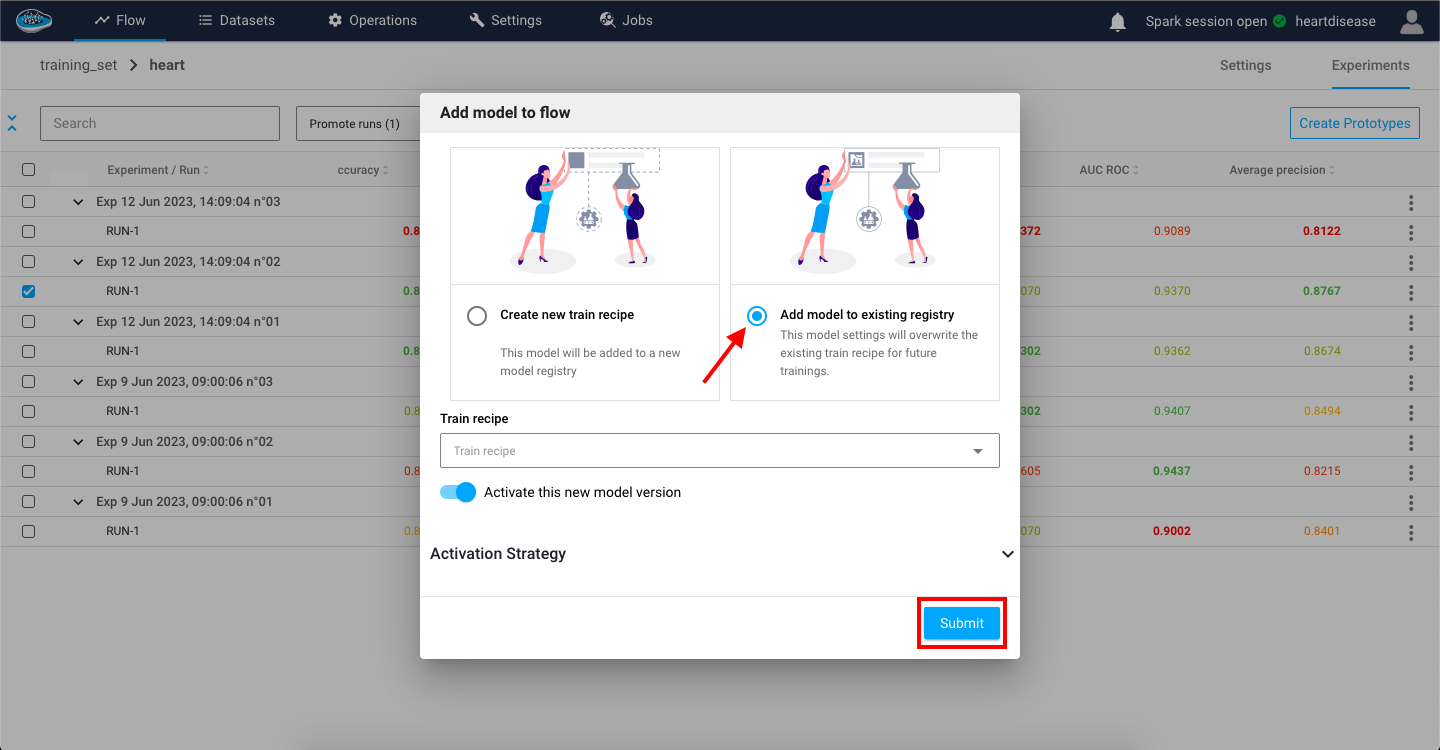
Creating a model registry will allow you to calculate any prediction on a chosen dataset. To trigger the prediction process, you will need to click on the dataset and choose the prediction option on the left sidebar and choose the registry you want to use and click Continue. A small popup will appear with some optional settings to tune up if necessary. When finished, you click on Save & Run button to activate the prediction process and created a new dataset included a column with the predictions of the target class.
Here is a video showcasing the prediction step triggered
In conclusion, by adhering to these straightforward steps, you can effortlessly accomplish your own data science project from inception to completion, without requiring any coding expertise. Despite the absence of code, you will obtain remarkably robust and precise results promptly, fully prepared to cater to your personal or business requirements!
We sincerely hope that this tutorial has proven beneficial to you. If you desire to delve deeper into the subject, we encourage you to explore the vast array of tutorials offered in the papAI catalogue, which elucidate additional features and functionalities.