Uber fare costs and customer demand forecast use case
In recent times, the growth of ride-hailing services like Uber has been remarkable, capturing the attention and preference of a vast number of commuters worldwide.
The convenience and efficiency offered by these services play a significant role in their ever-increasing popularity. Uber's user-friendly mobile application has revolutionized the way people book rides by allowing them to request a car with a simple tap and track its arrival in real-time.
This seamless experience, coupled with the flexibility to choose the type of vehicle and the cashless payment system, has attracted a massive user base.
Problem Statement
When using Uber as a client, having prior knowledge of the fare is immensely beneficial. The transparency provided by knowing the price in advance eliminates the need for negotiation or haggling, unlike in traditional taxis that rely on metered fares, which can be subjective and lead to disputes.
Uber calculates fares based on predetermined factors such as distance, time, and surge pricing if applicable. This level of transparency instills trust and eradicates any ambiguity surrounding the pricing structure, ultimately resulting in a smoother service experience.
Moreover, it's not just the fare information that is helpful for Uber. Data, such as the number of ride requests during a day, allows Uber to meet client demands effectively. By analyzing this data, Uber can efficiently allocate drivers and reduce waiting times. This ensures availability even during peak hours when the demand for rides is high. As a result, both the riders and driver benefit from this data-driven approach as it minimizes wait times and provides a more prompt service.
This project focuses on predicting the estimated price of an Uber ride, taking various factors into account. These factors include the distance of the ride, the time at which the demand is made, and the specific day on which the demand occurs. In addition, this project aims to forecast the hourly customer demand for a given date by analyzing past data.
Datasets
In this study, two datasets were used to gain insights into the Uber transportation system. The first dataset contains two hundred thousand Uber rides spanning six years from 2009 to 2015. It includes essential information like pickup and drop-off locations (latitude and longitude), pickup date and time, number of passengers, and fare amount. This dataset was specifically used to accurately predict fare estimates.
The second dataset is more comprehensive, consisting of an astounding one million and eight hundred thousand ride records. It covers a three-month period, specifically April, May, and June of 2014. The dataset contains crucial information such as pickup longitude, latitude, and the corresponding pickup time. This dataset played a significant role in determining the hourly customer demand patterns.
By analyzing both datasets, this study aims to provide valuable insights related to fare prediction and customer demand trends. The findings can prove instrumental in enhancing the efficiency and effectiveness of Uber's services, benefiting both the riders and the drivers.
Note
You can download here the dataset example used for Price Prediction
You can download here the dataset example used for April 2014 Demand Forecast
You can download here the dataset example used for May 2014 Demand Forecast
You can download here the dataset example used for June 2014 Demand Forecast
Create a project
Upon logging in to papAI, you will be directed to your project homepage. This page will display all the projects that you have either created or are collaborating on with other members.
To start a new project, simply click on the New project button. This will open a pop-up window with various settings that need to be filled in. These settings include the name of your project, a brief description, the persistency setting, and the sampling technique you wish to apply.
You can choose the number of samples to be displayed and the order of selection, such as the first or last N rows or randomly.
Once you have filled in all the necessary settings, you can finalize the process by clicking on the Create button. Your new project will then be automatically added to your main page, ready for you to start working on.
Here is a video showcasing the creation of a project on papAI
Import datasets
Thanks to the variety of data sources available, you have the flexibility to import data from virtually anywhere into your papAI project for analysis and visualization. Whether it's from your local machine, an external database (SQL or NoSQL), cloud storage, or an API, papAI makes it easy to bring in data for analysis.
Additionally, you can even create a completely new dataset using the specialized Python or SQL recipe editor.
To get started with importing your data, you can use the tools provided in the papAI interface. For our specific use case, we'll be importing our dataset from our local machine using the appropriate tool.
You can access this tool by clicking the button located in the top right corner of the interface or by using the Import dataset button in the Flow interface.
Once you've selected the local import option, a new interface will appear that allows you to easily import any tabular file in CSV or XLSX format. You can import your desired files either by clicking the Import button or by using the drag-and-drop feature.
Once your data has been imported, you can preview a subset of the data to verify that it was imported correctly. After ensuring that everything is in order, you can simply select the Import button to start the uploading process. A progress bar will keep you informed of the status of the upload, and when it's complete, your dataset will be ready for use in your project's flow.
Here is a video demonstrating the process of importing datasets
Data Preprocessing
When conducting our data analysis, one of the initial steps was to handle any missing values in our dataset. Upon closer inspection, we found that our data had remarkably few null values.
Here is a video demonstrating the process of dropping null values
To gain deeper insights, we used the Haversine formula in our research to calculate the distance covered by each trip. This distance measurement was then included as a new feature in our analysis, as it had promising potential to uncover a correlation with the ride price.
During our examination of the fare prediction dataset, we encountered a discrepancy when incorporating the distance column into our analysis.
After thorough investigation, we discovered inaccurately recorded essential information, resulting in longitude and latitude columns with 0 values. This unexpected anomaly raised concerns about the accuracy and reliability of the data.
Additionally, we identified another irregularity where trips with relatively short distances exhibited abnormally high fares.
To address these inconsistencies, we made the decision to exclude records with distances exceeding 50 kilometers or falling below 0.4 kilometers. Moreover, we removed trips with travel distances surpassing 3 kilometers but charging less than 10 dollars.
Here is a video demonstrating the process of data cleaning
import pandas as pd
from math import radians
from sklearn.metrics.pairwise import haversine_distances

# To read the dataset from flow
df = import_dataset("cleaning_uber")

#define function that calculates the distance
def distance(A,B) :
    bsas_in_radians = [radians(_) for _ in A]
    paris_in_radians = [radians(_) for _ in B]
    result = haversine_distances([bsas_in_radians, paris_in_radians])
    alpha = result * 6371000/1000
    return alpha[0][1]

df['distance parcouru']  = [distance([df['pickup_latitude'][i], df['pickup_longitude'][i]] , [df['dropoff_latitude'][i], df['dropoff_longitude'][i]]) for i in range(df.shape[0])]

# drop values
dst = df[df['distance parcouru']<=50].reset_index(drop=True)
dst = dst[dst['distance parcouru']>=0.4].reset_index(drop=True)
dst.drop(dst[(dst['distance parcouru']>=4)&(dst['fare_amount']<=10)].index, inplace = True)

# export dataset
export_dataset(dst, "fare_predict")
Shifting our focus to the dataset for demand forecasting, we initially concatenated the datasets.
Here is a video demonstrating the process of concatenating datasets
We added two columns: 'date_h', which records the date and hour when the demand was made, and 'sum_n_rides_', which was assigned a value of 1.
Following that, we used a group by method on the 'date_h' column to obtain a dataset displaying the sum of demands made each hour.
Here is a video demonstrating the group by process
We extracted various temporal attributes from the pickup date and time, including the day, month, day of the year, and week. These additional columns offered valuable insights into the temporal patterns within our dataset.
Here is a video demonstrating the feature extraction process
Data visualization
papAI offers a convenient data visualization module that allows you to easily visualize your data. Simply double-click on the desired dataset and select the Visualization tab located on the top right-hand side of the interface. From there, you can choose from a variety of graph options and select which columns or aggregation of columns to represent and display in your desired graph. Some graphs even offer the option to define a colormap for a legend and filter out specific values to focus on specific aspects of your data.
By visualizing your data, you can gain insights into the underlying patterns and trends that may not be immediately apparent from just looking at the raw data. This can help you identify potential issues or opportunities to improve the quality of your data before diving into preprocessing and modeling.
In our case, we observed interesting patterns that are illustrated in the following visualizations.
Plot of fare against distance traveled
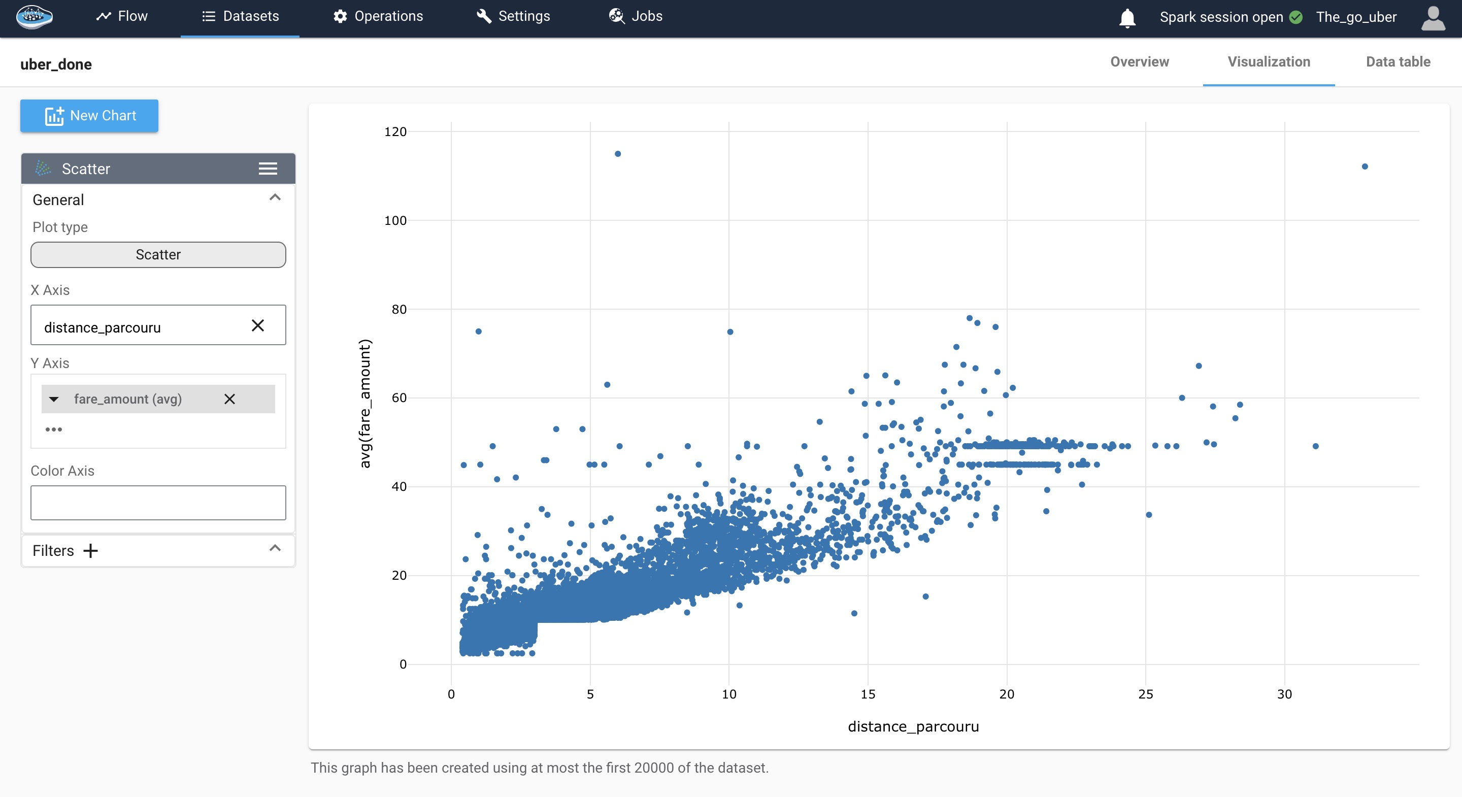
We can see that there is a linearity between the two variables, we also notice a complex interaction between the two features it could be explained by time of demand, number of demand, traffic conditions and other, though this graph gives us an idea to use linear regression for predicting the price of the ride, still it would be interesting to use other models like decision trees or random forest as they work good for outliers and also when the relationship between variables is complex.
Sum of hourly demand during a month for April, May and June
We used the complete dataset from April, May, and June 2014 to examine the distribution of the sum of numbers of Uber rides during the daytime hours. Upon analyzing the data, we observe the presence of two distinct peaks in the distribution curve. Notably, the second peak, which occurs in the evening, exhibits a higher count than the first peak.
Further investigation into the factors influencing this pattern could provide valuable insights into the demand dynamics and potential strategies for optimizing Uber's services during these peak hours.
Here is a video demonstrating the process of creating a visualization
Plot of the hourly demand from April to June 2014
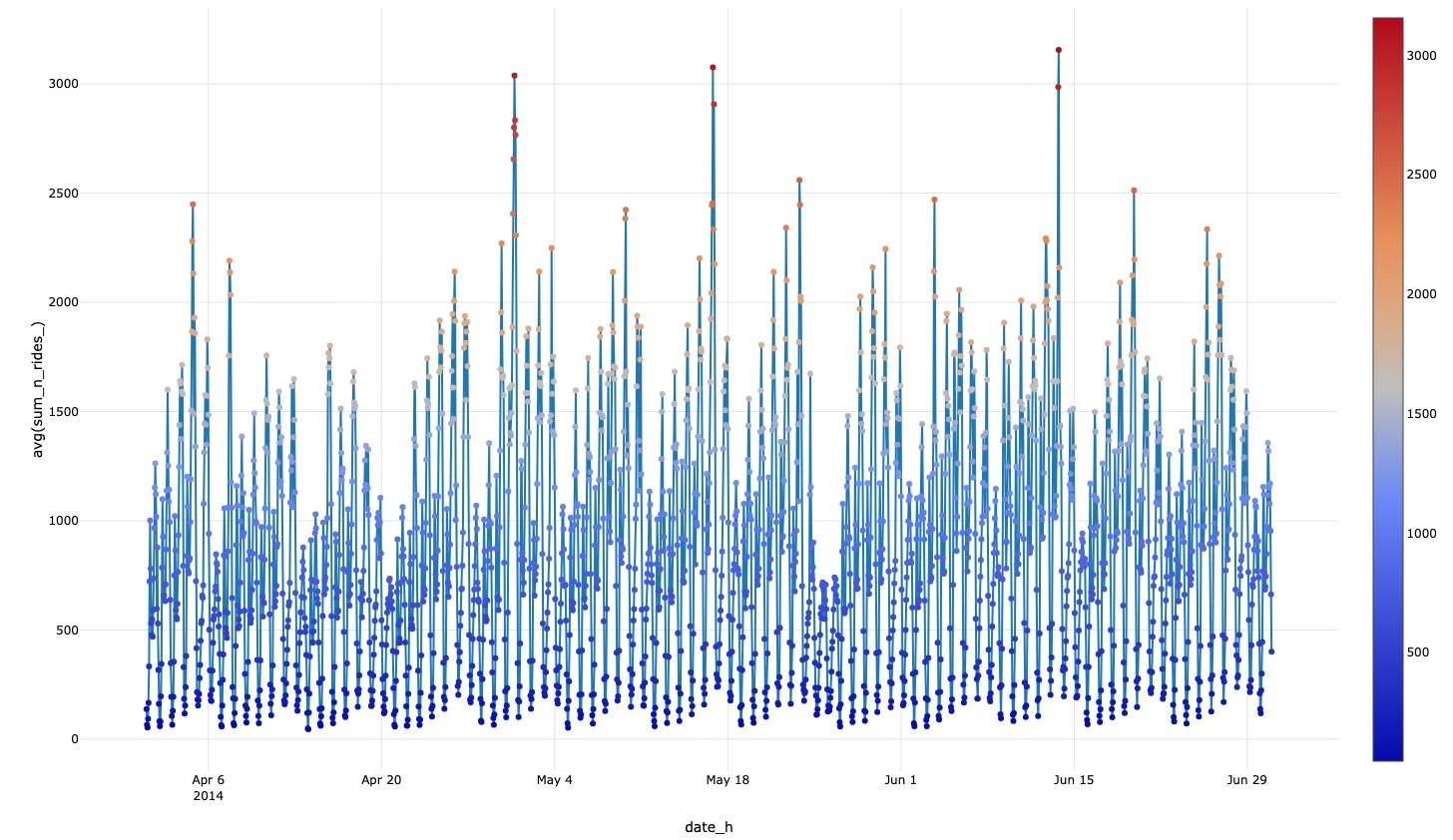
In this plot, we analyze the distribution of the hourly number of Uber rides and observe a consistent and stationary pattern. To enhance the accuracy of our forecasting models, it is crucial to perform a detailed mathematical verification of the stationarity.
By ensuring that the data exhibit stationarity, we can confidently apply various Time-Series analysis techniques, to make accurate predictions about future ride volumes. Stationarity verification involves assessing the mean, variance, and autocorrelation structure of the data, ensuring they remain constant over time.
By conducting a thorough mathematical verification of stationarity in the dataset, we can facilitate reliable and robust forecasting for Uber ride volumes.
Videos of the heat map portraying the demand for services from 4 PM to 8 PM, comparing the day with the highest volume to the day with the lowest volume
In our quest to unravel meaningful patterns within Uber's vast dataset, we embarked on an analysis aimed at identifying the days with the highest and lowest number of rides. Our investigation pinpointed April 30, 2014, as the day that recorded the maximum number of Uber rides, while May 26, 2014, marked the day with the least amount of activity.
Here is a video demonstration of the process for obtaining the minimum and maximum values
Seeking to gain further insights into the distribution of Uber rides during peak hours, we employed a visualization technique in the form of a heat map. This visual representation enabled us to discern a consistent and notable customer demand within downtown New York. Specifically, areas near Penn Station on 31st street and the proximity of Central Park emerged as hotspots for ride requests.
Here is a video showcasing the density heat map during the day with the highest demand volume
Here is a video showcasing the density heat map during the day with the least demand volume
Armed with these valuable findings, Uber drivers can strategically position themselves to optimize their service and ensure prompt and efficient rides for customers. By leveraging this information, drivers can align their availability and routes with the high-demand areas, contributing to a seamless and delightful experience for riders.
This analysis serves as a testament to the power of data-driven insights, aiding both drivers and the Uber community in delivering superior service and meeting the ever-evolving needs of urban transportation.
Train and test the model
At this stage, we are preparing our datasets for training and testing various models. Our goal is to select the most suitable model to be deployed in production.
Before using the Machine Learning module, we perform a dataset split to create separate datasets for training and testing.
To initiate the split, select the desired dataset and use the split rows operation found in the green icons on the left sidebar. Upon clicking the icon, a pop-up window will appear, allowing you to adjust the split settings. These settings include naming the newly created datasets, determining the split order (70% for training and 30% for testing in our case), and specifying the splitting method.
For the fare prediction dataset, we use a random splitting method, while for the demand forecast dataset, we apply an ordered method based on time. Once all settings are in place, click the Save and Run button to execute the split operation.
Here is a video demonstrating how to split the fare prediction dataset into separate training and testing sets
Once you have successfully split the dataset into training and testing sets, you can proceed with launching the Machine Learning (ML) process. To access the ML Lab, click on the training dataset and then the ML Lab icon. Here, you will have the opportunity to test different models. However, before diving into the ML Lab, it is important to define the specific use case you wish to address.
Creating an ML use case is a straightforward process. Simply click on the New use case button. A pop-up window will appear, allowing you to select the type of use case required. You will also need to provide some additional details, such as the target variable and a transformer if necessary. Finally, name your use case and click on Create to access the ML Lab.
Within the ML Lab, you can easily create and build your own ML pipeline. This can be done without any coding, giving you the flexibility to experiment with multiple models and parameters to optimize the process and identify the best model.
To begin the process, select Create Prototypes. A new interface will appear, starting with the first step: Feature Selection. Here, you can choose which features to include in the model training and apply pre-processing techniques to enhance results. In this step, we will select one feature.
Once feature selection is complete, you can proceed to the next step: Model Selection. Toggle the button next to each model to activate them and include them in the pipeline.
Once all these steps are completed, you can initiate the training process by clicking on the Train button. As the training progresses, the performance of each model will be recorded and displayed in a table, allowing you to monitor their progress.
Price Prediction using multiple predictive models
Training the models and interpretation of the results
For this task, we used multiple models:
-
Linear Regression: After visualizing the data, it became apparent that the variables exhibited a linear relationship. Therefore, we implemented linear regression and achieved favorable results with high R-squared score and low mean squared error.
-
Decision Tree: This model constructs a flowchart-like structure to predict continuous target variables. Decision trees excel in scenarios with complex relationships, robustness to outliers, and feature interactions. They perform exceptionally well in this case, delivering the best results in terms of R-squared and mean squared error.
-
Random Forest: Random Forest is an ensemble algorithm that combines multiple decision trees for improved predictions. It addresses overfitting concerns by aggregating predictions, enhancing generalization. By averaging the results of multiple trees, it also mitigates sensitivity to changes in the data. We obtained satisfactory results with good R-squared and mean squared error using Random Forest.
-
Adaboost: This model combines multiple weak classifiers (decision trees with a single split) to create a strong classifier. It did not perform well in this case, as the obtained R-squared and mean squared error values were not satisfactory.
Here is a video demonstrating the process of training the model
R-squared (R²) is a statistical measure that represents the proportion of the variance in the dependent variable that can be explained by the independent variable(s). It quantifies the goodness of fit of a regression model, with values between 0 and 1. A value closer to 1 indicates a higher level of explanation or prediction accuracy.
Evaluating the model with the test data
To handle this matter, we can add the newly trained model to a model registry. To do so, start by identifying the specific model run. Select the checkbox next to it, then choose the Add to flow action from the Actions list located at the top of the ML Runs list.
Upon selecting this action, a small pop-up will appear, allowing you to configure the model registry. You will need to provide a registry name, recipe name, and activation method in the respective fields. Once you have entered this information, simply click the Create button, and the model registry will be successfully established and visible within your Flow.
Here is a video showing the model registry creation and testing process
The model performed well on the test set, showcasing favorable results with an insignificant difference. To enhance the predictive capability, a larger dataset would be beneficial. Increasing the dataset size can potentially lead to improved predictions.
Hourly demand forecast
Feature Engineering
After exploring the dataset, we observed a stationary pattern in the hourly number of rides, indicating no significant trends, seasonality, or variation. To validate this observation, we conducted an ADF test, resulting in a p-value of 4.1066639175465434e-05, confirming the stationary pattern.
import pandas as pd

# import dataset
df = import_dataset("ts_cleaning_group_by_sum")

df = df.set_index('date_h')


target_M = df['sum_n_rides_'].to_dict()

for i in range(1,29):
    df['lag'+str(i)] = (df.index - pd.Timedelta(str(1*i)+' days')).map(target_M)
    # creating columns

df = df.dropna(subset=['lag'+str(i) for i in range(1,29)])

df = df.reset_index()

# To export a dataset to the flow,
# use export_dataset(<dataset>, <name_of_the_dataset_on_the_flow>), example :
export_dataset(df, "Out_TS_forecast")
We used multiple lags (time intervals between observations) of 7, 14, 21, and 28 to uncover dependencies and correlations within the time series data.
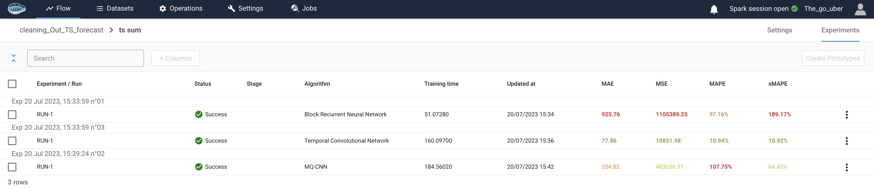
Training the models and interpretation of the results
For our analysis, we implemented various models, and the Temporal Convolutional Network (TCN) achieved promising results with a mean absolute error of 89.92.
Mean Absolute Error (MAE) is a statistical measure that calculates the average absolute difference between the predicted and actual values
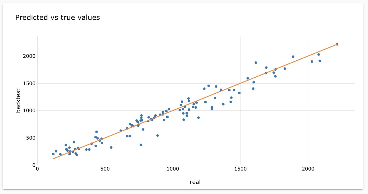
The forecast results indicate a strong correlation between the predicted and actual values, as depicted in the graph. The ratio of the two numbers approaches 1, suggesting a minimal difference between them.
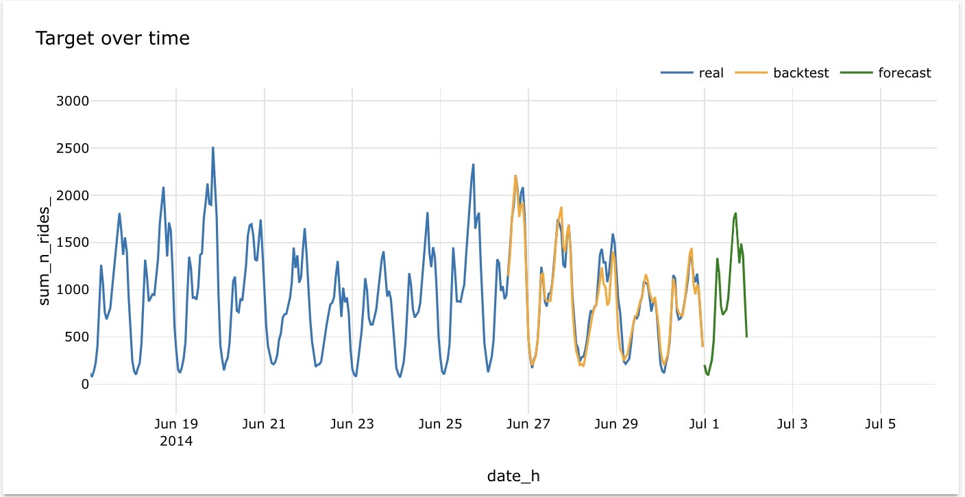
The graph illustrates the model's effective forecasting performance, as the backtest consistently aligns with the actual trend. This indicates that the model performs well in capturing the patterns of the real data.
Conclusion
In conclusion, this article presented the development and evaluation of models for predicting fare costs and forecasting hourly demand in the context of ride-hailing services.
Through our analysis, we have demonstrated the effectiveness of the models in capturing patterns and trends in the data. The results indicated that accurate fare predictions and demand forecasts can be achieved by leveraging advanced modeling techniques.
However, it is important to note that further improvements could be obtained by incorporating larger datasets and exploring additional factors that influence fare costs and demand patterns.
Overall, these models offer valuable insights for optimizing operations and providing better services in the ride-hailing industry.