Customer Relationship Management
A Customer Relationship Management (CRM) system is a powerful tool that enables businesses and organizations to effectively handle and understand their customer interactions.
Initially tailored for large corporations, the advent of the internet has extended the accessibility of CRM systems to small business owners. These tools facilitate the collection and organization of customer data within a centralized CRM database, unlocking the potential for sophisticated analysis techniques such as customer segmentation and comprehensive contact history.
Create a project
When you log in to papAI, you will be directed to your project homepage, where you can see all your created projects and collaborations. To begin a new project, simply click on the Create project button. This action will open a pop-up window with various settings that need to be filled out. These settings include the project name, a brief description, persistency options, you can also specify the number of samples to be displayed and choose the order selection, such as displaying the first or last N rows, or randomizing the order. Once you have completed filling in the necessary settings, you can finalize the process by clicking on the Create button.
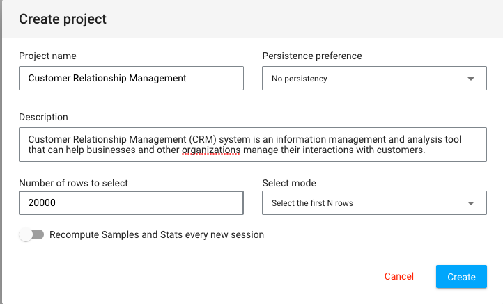
After clicking Create, your newly created project will automatically be added to your main page. You can now start working on it right away. With papAI, starting a new project has never been simpler!
Import dataset
Thanks to the variety of data sources available, you have the flexibility to import data from virtually anywhere into your papAI project for analysis and visualization. Whether it's from your local machine, an external database (SQL or NoSQL), cloud storage, or an API, papAI makes it easy to bring in data for analysis. Additionally, you can even create a completely new dataset using the specialized Python or SQL recipe editor.
To get started with importing your data, you can use the tools provided in the papAI interface. For our specific use case, we'll be importing our dataset from our local machine using the appropriate tool. You can access this tool by clicking the plus button located in the top right corner of the interface or by using the Import dataset button in the Flow interface.
Once you've selected the local import option, a new interface will appear that allows you to easily import any tabular file in CSV or XLSX format. You can import your desired files either by clicking the Import button or by using the drag-and-drop feature. Once your data has been imported, you can preview a subset of the data to verify that it was imported correctly. After ensuring that everything is in order, you can simply select the Import button to start the uploading process. A progress bar will keep you informed of the status of the upload, and when it's complete, your dataset will be ready for use in your project's flow.
importing data
You can download the dataset example used in this tutorial to follow it step by step.
Cohort Analysis
Once you've imported your dataset into papAI, you can begin exploring its content and obtaining an initial analysis to determine the cleaning steps necessary to extract the most valuable insights from your data. Cohort analysis involves segregating data within a dataset into comparable groups for analysis. These groups, known as cohorts, typically share similar qualities or experiences over a specific period.
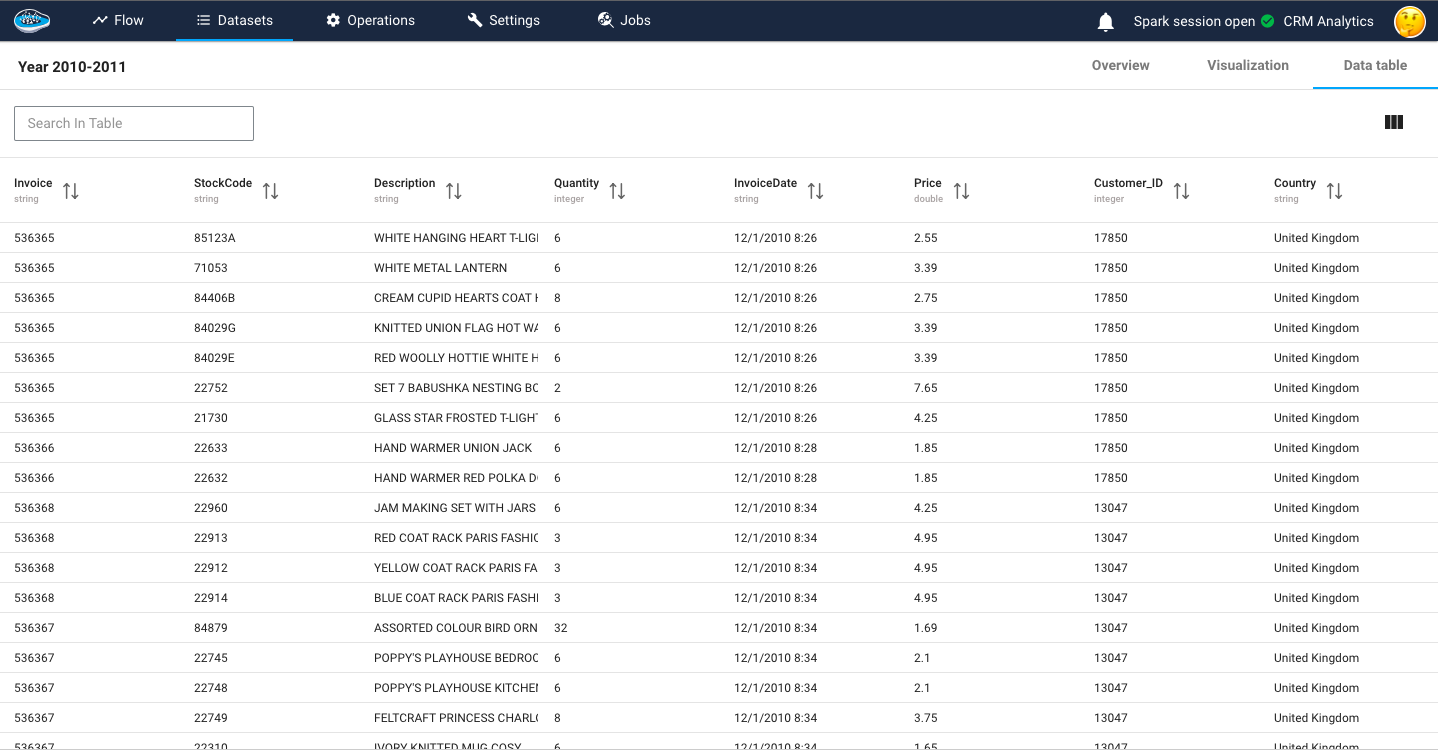
The dataset consists of several variables that provide detailed information about each transaction. The InvoiceNo variable represents a unique identifier for each transaction, distinguishing invoices from aborted operations indicated by a prefix C. The StockCode variable corresponds to a specific product code, uniquely identifying each item in the company's product catalog. The Description variable contains the name or description of the product. The Quantity variable indicates the number of products sold for each invoice, reflecting the quantity purchased. The InvoiceDate variable records the date and time of each invoice. The UnitPrice variable denotes the price of each product in British Pounds (GBP). The CustomerID variable represents a unique customer identification number. Lastly, the Country variable specifies the country where the respective customer resides. These variables collectively provide comprehensive details about the transactions, products, customers, and their locations.
In our tutorial we will need to add a new column total price that indicate the quantity multiplied by the unit price and to do so, our platform offer some basic operation as you can see in the following video.
Formula operation in papAI
Examining a customer's or user's behavior throughout their lifecycle can unveil significant trends. By dividing customers into smaller groups, patterns throughout each individual's journey can be observed more effectively. This approach contrasts with analyzing all clients uniformly, disregarding the natural cycle that a client undergoes.
For example we can divide the customers based on the country where they resides.
Here is a video showing a visualization of the customers distribution based on their country
We can also divide the customers based on the product description and filter them by descending order of bought products
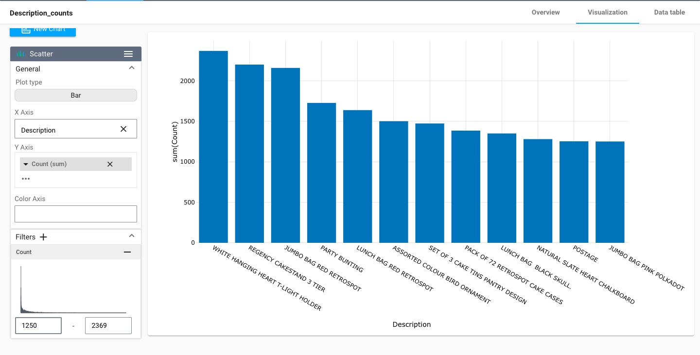
By visualizing the data, we can gain insights into the underlying patterns and trends that might not be immediately apparent from just looking at the raw data. This can help us to identify potential issues or opportunities to improve the quality of our data.
Customer Segmentation With RFM
Customer segmentation with RFM (Recency, Frequency, Monetary) analysis is a powerful technique used to categorize customers based on their transactional behavior. RFM analysis considers three key factors: recency, which measures how recently a customer made a purchase; frequency, which measures how often a customer makes purchases; and monetary, which measures the total monetary value of a customer's purchases. By analyzing these three dimensions, customers can be segmented into distinct groups that share similar characteristics and behaviors.
To calculate the RFM score we have to create a Python recipe, to do so just click on the dataset you want to calculate the RFM on then in the left menu you click on Python, a new script will be created in which you fill in your script.
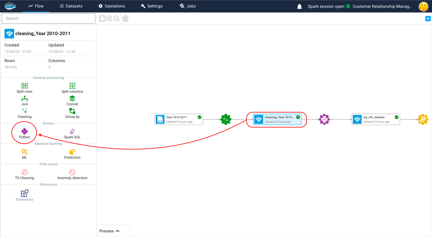
The code begins by importing a dataset. This dataset likely contains information about customer transactions, including the customer ID, invoice date, invoice details, and total price. The InvoiceDate column is then converted to datetime format to enable further calculations based on dates. The maximum date in the InvoiceDate column is also determined.
import datetime as dt
# Importing the dataset and assigning it to the variable 'df'
df = import_dataset("cleaning_Year 2010-2011")

# Converting the 'InvoiceDate' column to datetime format
df["InvoiceDate"] = pd.to_datetime(df["InvoiceDate"])

# Finding the maximum date in the 'InvoiceDate' column
df["InvoiceDate"].max()

# Defining the reference date as December 11, 2011
today_date = dt.datetime(2011, 12, 11)
RFM values are calculated for each customer by grouping the dataset based on the Customer_ID column and performing aggregations. The following RFM metrics are calculated:
- Recency: It represents the number of days between the latest invoice date and a reference date (December 11, 2011 in this case).
- Frequency: It represents the number of unique invoices for each customer.
- Monetary: It represents the sum of total prices for each customer.
To ensure meaningful segmentation, customers with zero monetary value (i.e., no purchases) are filtered out.
# Grouping the dataset by 'Customer_ID' and aggregating the values
# Calculating recency as the number of days between the latest invoice date and the reference date
# Calculating frequency as the number of unique invoices
# Calculating monetary value as the sum of total prices
rfm = df.groupby("Customer_ID").agg({
    "InvoiceDate": lambda InvoiceDate: (today_date - InvoiceDate.max()).days,
    "Invoice": lambda Invoice: Invoice.nunique(),
    "TotalPrice": lambda TotalPrice: TotalPrice.sum()
})
# Renaming the columns of the aggregated dataset
rfm.columns = ["recency", "frequency", "monetary"]

# Filtering out customers with zero monetary value
rfm = rfm[rfm["monetary"] > 0]
RFM scores are assigned to each customer based on their recency, frequency, and monetary values. The scores are divided into quintiles (5 bins) to create a relative ranking. The highest score indicates the best value for a particular RFM metric. The following steps are performed for scoring:
- Recency Score: The recency values are divided into 5 equal-sized bins, and labels from 5 to 1 are assigned, with 5 being the most recent purchases.
- Frequency Score: The frequency values are ranked and divided into 5 equal-sized bins, and labels from 1 to 5 are assigned, with 1 indicating the lowest frequency.
- Monetary Score: The monetary values are divided into 5 equal-sized bins, and labels from 1 to 5 are assigned, with 1 indicating the lowest monetary value.
The RFM scores for each customer are combined to create an overall RFM score. For example, if a customer has a recency score of 4 and a frequency score of 3, their RFM score will be 43.
# Assigning a recency score by dividing the 'recency' values into 5 equal-sized bins
# Labels are assigned from 5 to 1, with 5 indicating the most recent purchases
rfm["recency_score"] = pd.qcut(rfm['recency'], 5, labels=[5, 4, 3, 2, 1])
# Assigning a frequency score by ranking the 'frequency' values and dividing them into 5 equal-sized bins
# Labels are assigned from 1 to 5, with 1 indicating the lowest frequency
rfm["frequency_score"] = pd.qcut(rfm["frequency"].rank(method="first"), 5, labels=[1, 2, 3, 4, 5])
# Assigning a monetary score by dividing the 'monetary' values into 5 equal-sized bins
# Labels are assigned from 1 to 5, with 1 indicating the lowest monetary value
rfm["monetary_score"] = pd.qcut(rfm["monetary"], 5, labels=[1, 2, 3, 4, 5])
# Combining the recency and frequency scores to create the RFM score
rfm["RFM_SCORE"] = (rfm["recency_score"].astype(str) + rfm["frequency_score"].astype(str))
# Creating a dictionary to map RFM scores to customer segments
seg_map = {
r'[1-2][1-2]': 'hibernating',
r'[1-2][3-4]': 'at_Risk',
r'[1-2]5': 'cant_loose',
r'3[1-2]': 'about_to_sleep',
r'33': 'need_attention',
r'[3-4][4-5]': 'loyal_customers',
r'41': 'promising',
r'51': 'new_customers',
r'[4-5][2-3]': 'potential_loyalists',
r'5[4-5]': 'champions'
}
# Mapping the RFM scores to customer segments using regular expressions
rfm['segment'] = rfm['RFM_SCORE'].replace(seg_map, regex=True)
# To export a dataset to the flow, use the export_dataset function
# export_dataset(<dataset>, <name_of_the_dataset_on_the_flow>), example :
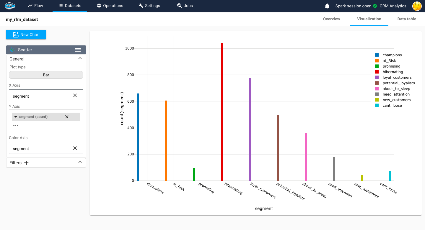
export_dataset(rfm, "my_rfm_dataset")
Recency score reflects the idea that customers who have made more recent purchases are likely to be more engaged and responsive to marketing efforts. Frequency score highlights the loyalty and engagement level of a customer, as frequent purchasers often represent the most valuable customers. Monetary score value provides insights into the spending power and profitability of a customer, as customers who have spent more are typically more valuable to the business.
Clustering
At this stage, your dataset is set be used for training and testing some models and choose the right one in the end to be deployed in production. we can launch the ML process by pressing the training dataset and then the ML Lab icon. It will give you access to the ML Lab where you will be testing different models. But first you will need to define the use case you want to tackle. Creating a ML use case is very simple since you need to click on the New use case button. Through a pop-up, you can choose the type of the use case required to answer it, for our case, it's a Clustering problem.
When accessing your use case, you are able to create and build your own ML pipeline easily through the ML Lab. The ML Lab gives you the ability to create a pipeline from scratch with multiple models and parameters to optimize the process and extract the best model without any code. To begin the process, you need to select Create Prototypes and a new interface will appear with the first step which is the feature selection. Through this step, you select the features to be taken into account in the model training and also apply some preprocessing to ensure better results. Following the feature selection comes the model selection where we are going to simply select the regular ML models such as Mean Shift or K-Means with their default parameters To add them, simply toggle the button next to the model to activate it.
Here is a video showcasing the training of a clustering model
here is a video to show the clustering result
Model evaluation
In the papAI AutoML module, we have several metrics to evaluate our models. The Davies-Bouldin Index measures the quality of clustering by computing the average similarity between each cluster and its most similar cluster while considering the average dissimilarity between each cluster and the least similar cluster. The index ranges from 0 to infinity, where a lower value indicates better clustering. A value closer to 0 indicates tight and well-separated clusters. The Silhouette Coefficient assesses the quality of clustering by evaluating how well each data point fits within its assigned cluster compared to other clusters. It computes the average silhouette coefficient for all data points, ranging from -1 to 1. A coefficient close to 1 indicates that the data point is well-matched to its own cluster and poorly matched to neighboring clusters, indicating a good clustering. Negative values indicate that data points might be assigned to the wrong clusters. The Calinski-Harabasz Index, also known as the Variance Ratio Criterion, is a measure of cluster separation and compactness. It calculates the ratio of between-cluster dispersion to within-cluster dispersion. A higher index value indicates better-defined and more separated clusters. It is often used to determine the optimal number of clusters by comparing index values across different cluster solutions. In our case, we focus mainly on the Silhouette Coefficient.
here is a video to show the segmented customers