Evaluate and Interpret your trained models
After going through the training process with all the created experiments from the previous step, you will need some indications as to the best model to choose for your use case and utilize it for a prediction or deploy it later for your industrial need.
Even though some metrics are displayed in front of you in the experiments list, there is also a necessity to look at the behind-the-scenes of a model's training.
That's why papAI allows you to go more in depth about the model performances and understand the decision making process behind every prediction made by the model. All of this is presented in the Explainability module.
This module is separated into two sections : the first one being the evaluation of trained models and the second one being the interpretability of the model's predictions.
Evaluation
In this section, we are focusing on the Evaluation side of the module where a whole interface is dedicated for you to look and analyze in-depth how well the model is trained. It is a really important part since it can help you decide the model choice to promote for your use case.
To access to this part, you need to be in the experiments lab interface with the list of trained models you desired to test. You select a run that you consider interesting from that list and automatically access to the evaluation interface.

Warning
You can only access to the Explainability interface when there is a successful run in your experiment or you will need to either create a new experiment or modify the settings of an existing one if it has failed.
In this panel, you will have access to a range of metrics and intuitive data visualizations that reflect your model's performances through its training. These metrics depend on the type of ML task selected during the use case creation process.
Here is a list of these different indicators for each task:
- a list of common evaluation metrics such as :
Accuracy: is the fraction of predictions that are correct. It is calculated as the number of correct predictions divided by the total number of predictions.Balanced Accuracy: a metric that is used to evaluate the accuracy of a classifier when the classes are imbalanced (i.e., there is a significant difference in the number of observations between the two classes). It is calculated as the average of the sensitivity (true positive rate) and specificity (true negative rate) of the classifier.Average Precision: a measure of a classifier's ability to rank predicted probabilities. It is calculated as the area under the precision-recall curve.F1 score: a metric that combines precision and recall. It is calculated as the harmonic mean of precision and recall.Precision: is the fraction of true positive predictions among all positive predictions. It is calculated as the number of true positive predictions divided by the total number of positive predictions.Recall: is the fraction of true positive predictions among all actual positive observations. It is calculated as the number of true positive predictions divided by the total number of actual positive observations.ROC AUC Score: is a measure of a classifier's ability to distinguish between positive and negative classes. It is calculated as the area under the ROC curve.
- a
Confusion Matrix: is a table that shows the number of true positive, true negative, false positive, and false negative predictions made by a classifier. It is used to evaluate the performance of a classifier. - The
ROC Curve: is a plot that shows the true positive rate (sensitivity) on the y-axis and the false positive rate (1 - specificity) on the x-axis for different classification thresholds. - The
Density Chart: is a graphical representation of the distribution of the target variable and used to compare the distributions of different groups or categories. - The
Decision Chart: is used to visualize the trade-off between the true positive rate and the false positive rate of a classifier as the classification threshold is varied.

- a list of metrics :
Accuracy: is the fraction of predictions that are correct. It is calculated as the number of correct predictions divided by the total number of predictions.Balanced Accuracy: a metric that is used to evaluate the accuracy of a classifier when the classes are imbalanced (i.e., there is a significant difference in the number of observations between the two classes). It is calculated as the average of the sensitivity (true positive rate) and specificity (true negative rate) of the classifier.F1 score: a metric that combines precision and recall. It is calculated as the harmonic mean of precision and recall.Precision: is the fraction of true positive predictions among all positive predictions. It is calculated as the number of true positive predictions divided by the total number of positive predictions.Recall: is the fraction of true positive predictions among all actual positive observations. It is calculated as the number of true positive predictions divided by the total number of actual positive observations.ROC AUC Score: is a measure of a classifier's ability to distinguish between positive and negative classes. It is calculated as the area under the ROC curve.
- the
Confusion Matrix: is a table that shows the number of true positive, true negative, false positive, and false negative predictions made by a classifier. It is used to evaluate the performance of a classifier.
- a list of metrics :
R2 score: is a measure of the goodness of fit of a model. It is calculated as the ratio of the explained variance to the total variance.Mean Absolute Error (MAE): a measure of the average magnitude of the errors in a prediction. It is calculated by taking the sum of the absolute differences between the predicted values and the true values, and dividing by the number of predictions.Mean Squared Error (MSE): a measure of the average magnitude of the errors in a prediction. It is calculated by taking the sum of the squares of the differences between the predicted values and the true values, and dividing by the number of predictions. MSE weighs large errors more heavily than small ones.Mean Absolute Deviation (MAD): a measure of the average magnitude of the errors in a prediction. It is calculated by taking the sum of the absolute differences between the predicted values and the true values, and dividing by the number of predictions. MAD is similar to MAE, but it is applied to data that has been transformed to be centered around zero.Explained Variance: a measure of the amount of variance in a predicted variable that is explained by the model. It is calculated as the ratio of the variance of the predicted values to the variance of the true values.Max Error: is the maximum absolute difference between the predicted and true values. It gives the highest error in the prediction.
- a graph representing a scatter plot of true values vs the predicted one
- a distribution of the residuals
- some statistics of the residuals like count, min, 25%, 50%, 75%, max, mean, stddev
- a Mean Error values per Prediction Group (Majority, Overestimation and Underestimation) with the stddev.
- a table displaying the Error Bias with the Mean/Most Common Feature value per Group

- a list of metrics :
Davies Bouldin Index: a measure of the compactness and separation of clusters in a clustering algorithm. It compares the average distance between clusters to the distance between the cluster centroids (the mean of all the points in the cluster). A lower DBI score indicates that the clusters are more compact and well-separated.Silhouette Coefficient: a measure of how similar an object is to its own cluster compared to other clusters. It ranges from -1 to 1, with a high value indicating that the object is well-matched to its own cluster and poorly matched to neighboring clusters.Calinski Harabasz Index: a measure of the compactness and separation of clusters in a clustering algorithm. It compares the within-cluster variance to the between-cluster variance, with a higher score indicating better separation between clusters.
- a graph representing the clusters distribution
- the cluster repartition according to each feature:
- for numerical column, it will be a box plot
- for categorical column, it will be an heatmap matrix
- a graph representing a scatter plot of a feature vs another one with clustering highlight
- a list of metrics :
Concordance Index: is a measure of the predictive accuracy of a survival model. It is calculated as the probability that, given a randomly selected pair of subjects, the subject with the shorter survival time has a higher predicted risk of death than the subject with the longer survival time. A higher concordance index indicates better predictive accuracy.AIC: is a measure of the relative quality of a statistical model. It balances the fit of the model to the data with the complexity of the model. A lower AIC indicates a better model.Log-likelihood ratio test: is a statistical test used to compare the fit of two models. It is based on the log-likelihood ratio, which is the difference between the log-likelihoods of the two models. A higher log-likelihood ratio indicates that the first model is a better fit than the second model.Mean survival time: is the average survival time of a group of subjects. It is calculated as the sum of the survival times of all the subjects divided by the number of subjects.Median survival time: is the survival time at which 50% of the subjects have survived. It is a measure of the central tendency of the survival time distribution.

- a list of metrics :
symmetric Mean Absolute Percentage Error (sMAPE):is a measure of the accuracy of a forecast. It is calculated as the mean of the absolute percentage errors, with positive and negative errors treated symmetrically.Mean Absolute Error (MAE): is a measure of the average magnitude of the errors in a prediction. It is calculated as the sum of the absolute differences between the predicted values and the true values, divided by the number of predictions.Mean Squared Error (MSE): is a measure of the average magnitude of the errors in a prediction. It is calculated as the sum of the squares of the differences between the predicted values and the true values, divided by the number of predictions.Mean Absolute Percentage Error (MAPE): is a measure of the accuracy of a forecast. It is calculated as the mean of the absolute percentage errors.R2 score: is a measure of the goodness of fit of a model. It is calculated as the ratio of the explained variance to the total variance.
- a graph representing the target over time with the real value, the backtest result and the forecasted values.
- a graph representing a scatter plot of true values vs the predicted one
- a distribution of the residuals
- some statistics of the residuals like count, min, 25%, 50%, 75%, max, mean, stddev

Through these different sets of tools you can monitor precisely the performances of your trained model in order to decide if the model is robust enough and sufficient to answer to your use case.
Info
In the case of Binary and Multi Classification, you can modify the probability threshold from the default 0.5 by using the slider and the metrics will update automatically according to the chosen threshold.
However, these evaluation metrics is not enough for some cases and you need to understand how your model performed its decision making and look at the training from under the hood. That's where the interpretability module comes in handy.
Interpretability
As explained earlier, the interpretability section is complimentary to the evaluation section in order to fully comprehend the training of any of your models and help lift off that black-box effect, which is quite common in ML workflows.
Through the evaluation section of your trained run, you can access to the interpretability section easily by simply clicking the Interpret section and a new panel will appear.
Warning
The Interpretability module is enabled only for Binary and Multi Classification, Regression and Survival models.
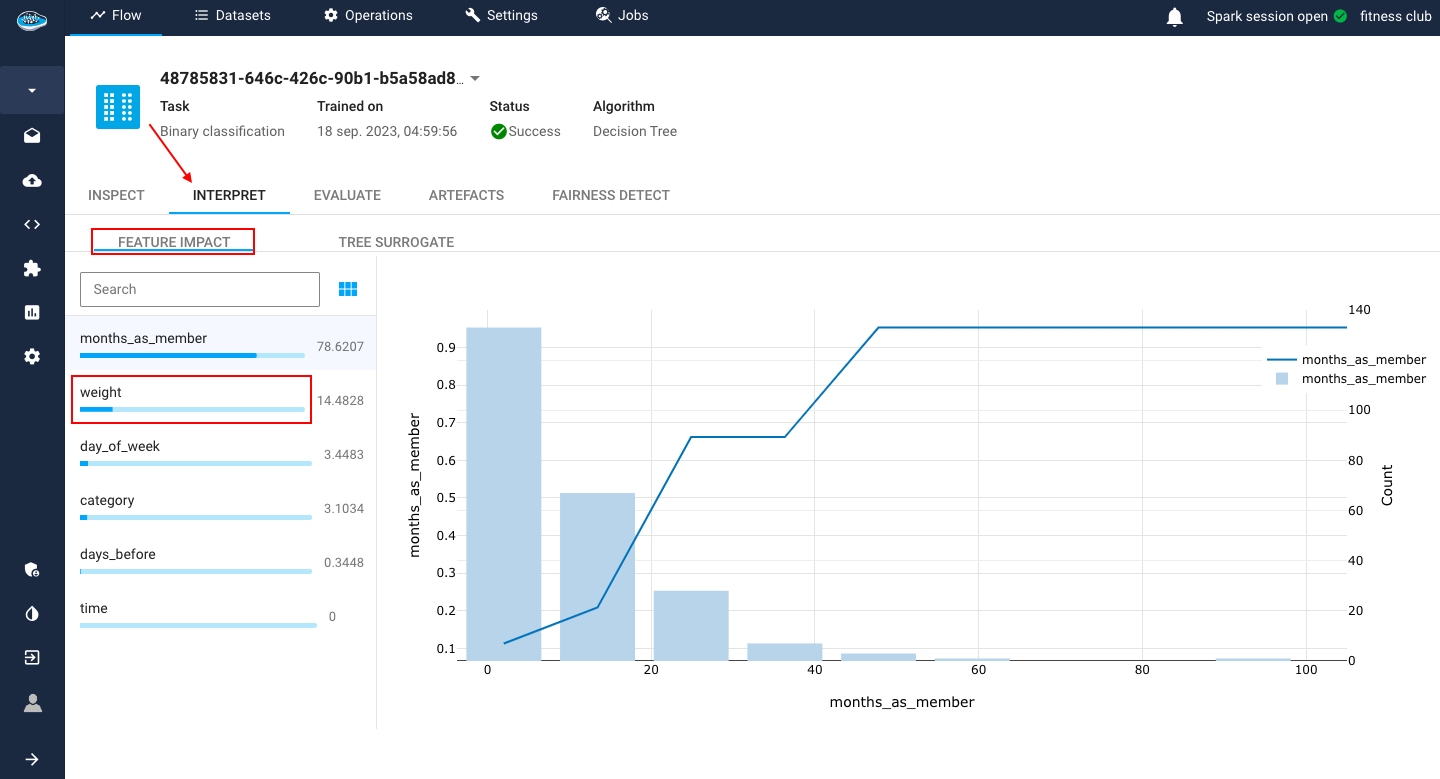
The interpretability module here includes two easy-to-understand tools :
- The
Feature Impact: is a method for calculating the importance of each feature in a machine learning model. The greater the value is, the more important the feature is considered to be. It includes also the PDP which is a graph used to inspect the relationship between a single feature and the target variable in a machine learning model. They show how the target variable changes as the value of the feature changes, while holding all other features constant.
- The
Tree Surrogate: is a simplified version of a decision tree model that is used to understand how the model is making predictions. It is typically created by pruning the original decision tree to remove branches that are not important for making predictions.

For these models, the interpretability is presented as the following :
- The
Features Coefficient: is a plot to compare the effect of each covariate (i.e feature) used in the model on the hazard ratio. if the value is higher than 1, the covariate is a risk factor else if the value is lower than 1 then it's a protective factor.
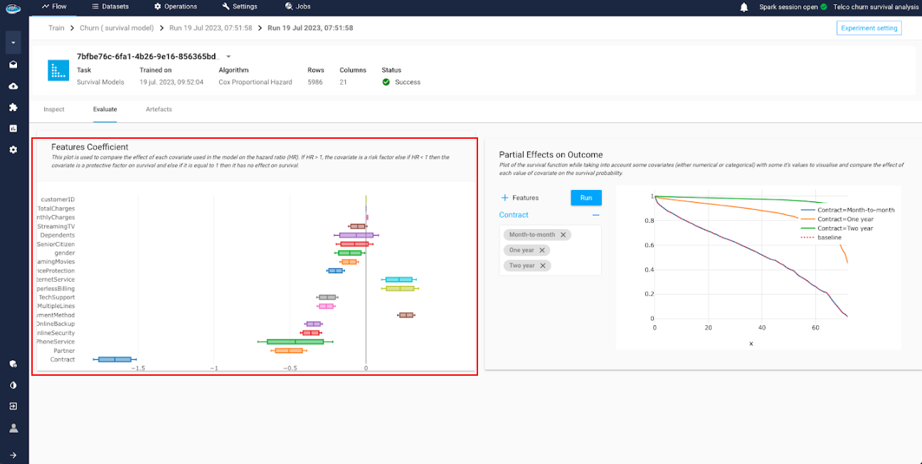
- The
Partial Effects on Outcome: is a tool to simulate the survival function while taking account the change on some covariates. This is useful to visualize and compare the effect of each value on the survival probability.

With this catalog of tools, this helps you really understand by detail the whole training process of your model and maybe modify if necessary some aspects to the experiment.
This two complementary sections are extremely beneficial to any type of industry because they are extremely intuitive and simple to understand.
Tip
In case you need to extract these information, you can do it through the model report tool. For more details, click here.
Did you know?
There is also another section we didn't present yet : the Inspect section.
This section is a summary of all the different settings you defined through the experiment creation process in order to train the model.